Andy Yeung
|
|
|
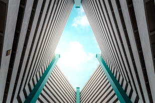
The artist that inspired us was a photographer called Andy Yeung. He is based in Hong Kong and focuses on cityscapes and aerial photography. With him having been raised in Hong Kong, he uses the everyday aspects of his city as inspiration.
Yeung says that he thinks commuters in Hong Kong are too busy looking at their phones and don't take time to appreciate the beautiful buildings around them. Therefore, he compiled the series "look up" where he hoped to get people to put down their phones and look up at the amazing architecture around them.
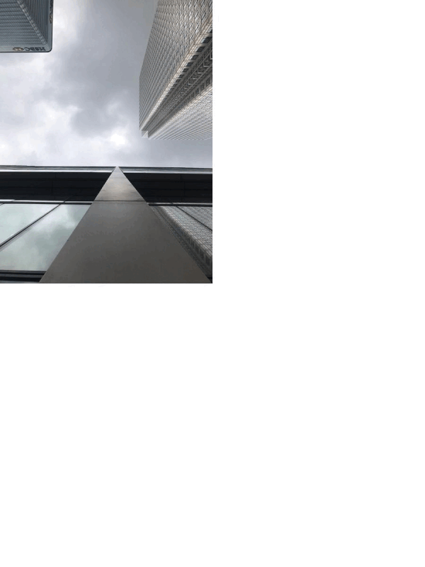
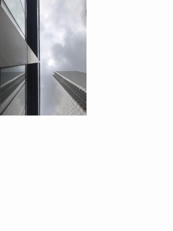
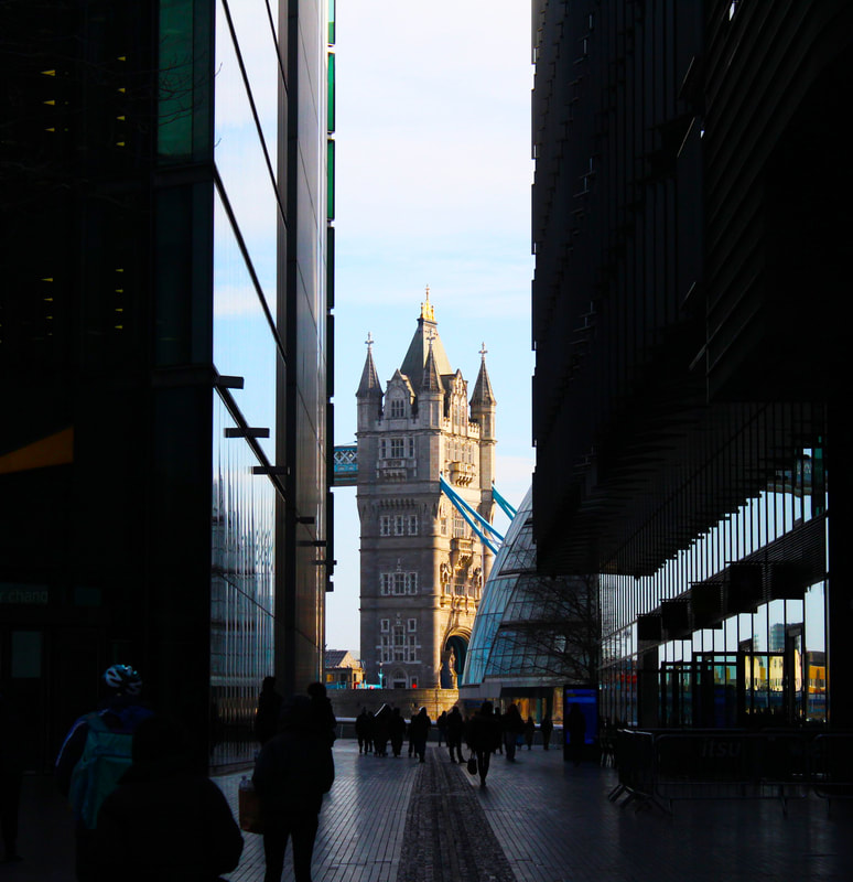
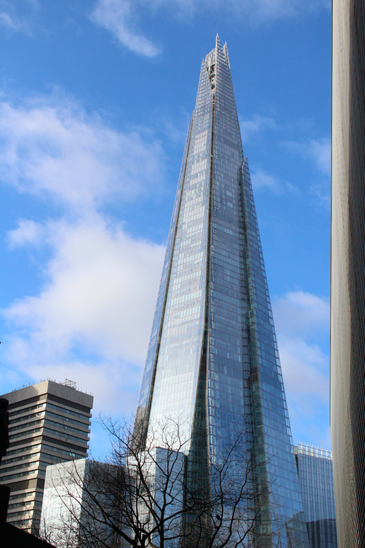
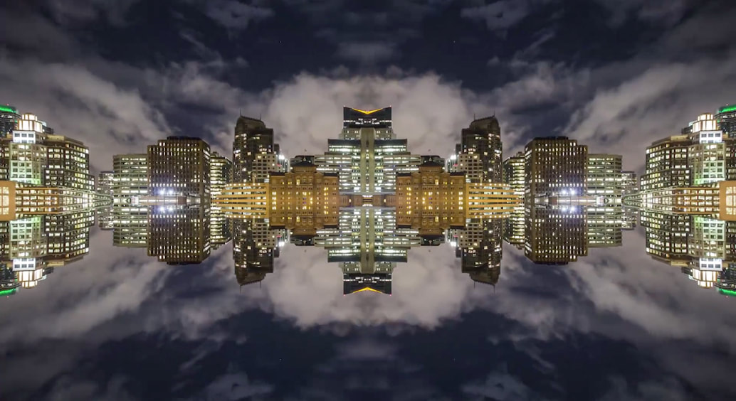
Yeung utilizes the worm's eye view to make his buildings seem taller and draws the viewers eye up to the sky and ironically consequently make them "look up" in the photo.
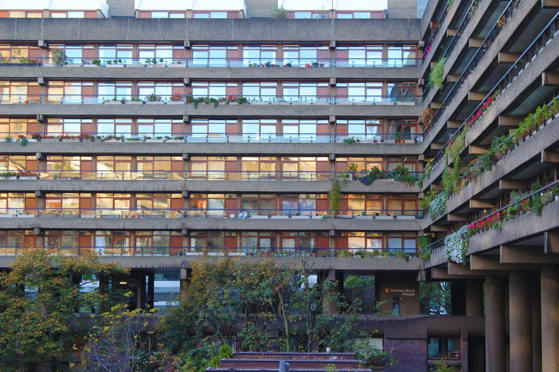
Looking Up:
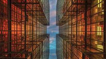
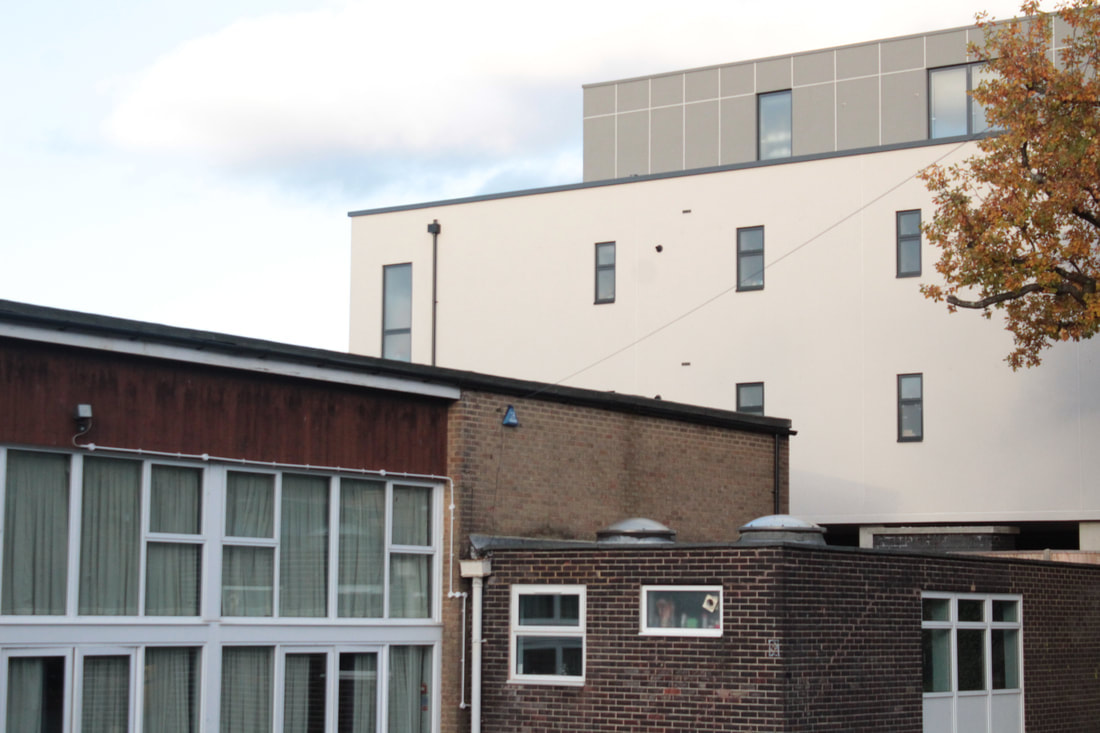
Using the work of Andy Yeung as inspiration I created a series of images of buildings in Canary Wharf, London and I photographed them from a worm’s eye view, which makes the building draw the viewers eye up to the sky. For this project I experimented with different angles, and for some of my pictures I tried to use buildings other than sky scrapers as my subjects.
WWW: I like how clear my pictures are, as well as the lighting because it created a dim London setting on the buildings, this makes the picture have a nice and potent contrast between the white cloudy sky and the dark buildings. I also like how I was able to get up close to the buildings a get a good worm's eye view angle in the photo.
EBI: I would have preferred for my pictures to involve more of the buildings as some of my photography is somewhat overpowered by the tumult in the sky and cloud movement.
EBI: I would have preferred for my pictures to involve more of the buildings as some of my photography is somewhat overpowered by the tumult in the sky and cloud movement.
Composition:
|
Rule of Third:


|
Triangles:


|
Layers:


|
Balance:

|
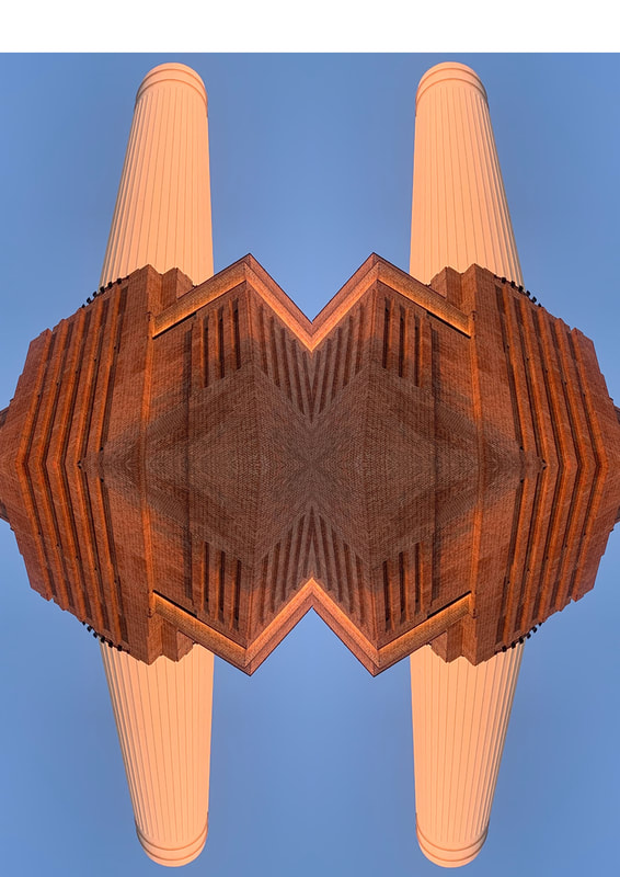
Reflection:
|

|
On the photo on the left I made a mistake by not reflecting the images perfectly next to each other so I was left with a feint white line between the two reflected images.

So I fixed it by nudging the two reflections together, clicking ctrl t and then clicking the arrow buttons..
WWW: I like how the reflections made interesting patterns and I like that I was able to make each picture perfect.
EBI: It would have been good to have explored reflecting the pictures on different axis.
EBI: It would have been good to have explored reflecting the pictures on different axis.
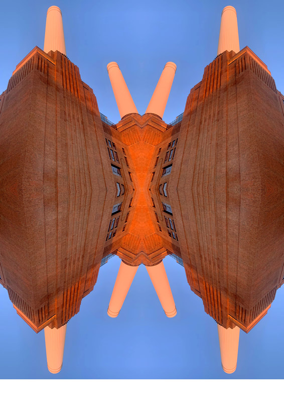
How to:
WWW: I enjoy how the buildings in the middle act as the focus and creates the illusion that its an unknown object floating in the sky. I also like how the buildings on the side of the picture act as a frame for the reflected buildings in the middle of the picture. This makes the viewer focus on the reflected middle.
EBI: However It could have been improved if the pictures were more vibrant with less clouds.
EBI: However It could have been improved if the pictures were more vibrant with less clouds.
I like how neat the outcome is as there aren't any lines in between the images. As well, I appreciate how the buildings frame the sky. If I were to repeat this project I would add an object in the middle of the sky, for example airplane or a helicopter.
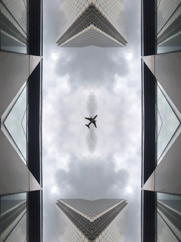
WWW: I like how the building creates a frame around the airplane. I also like how one of the buildings is also reflected by the other building because it distorts the image more and makes it seem like a never ending reality.
EBI: I think it could have been better if the picture had more vibrance and colour, for example where the sky blue instead of grey and cloudy. If I were to do this again I would try and take the pictures on a clearer day, however it could be argued that the grey clouds make it so the sky is less overpowering.
EBI: I think it could have been better if the picture had more vibrance and colour, for example where the sky blue instead of grey and cloudy. If I were to do this again I would try and take the pictures on a clearer day, however it could be argued that the grey clouds make it so the sky is less overpowering.
Gif:
WWW:I like how my gif goes forwards and then reverses the animation. I also think I used a good delay time between each photo 0.5 seconds.
EBI: The lower part of the picture had to be nudged to remove a reflection gap so the lower reflection is shorter than the top. I could fix this by resizing the bottom half by clicking ctrl t. As well, I dislike the composition (rule of third) as the metal pillars have been accidentally made into the focus of the gif. I could try rotating the original image reflected to create a different reflection.
EBI: The lower part of the picture had to be nudged to remove a reflection gap so the lower reflection is shorter than the top. I could fix this by resizing the bottom half by clicking ctrl t. As well, I dislike the composition (rule of third) as the metal pillars have been accidentally made into the focus of the gif. I could try rotating the original image reflected to create a different reflection.
I used the same picture as before but I rotated the pictures so the center of the reflection would be different so the metal beams may not overpower the picture as much.
How to:
Framing the Environment
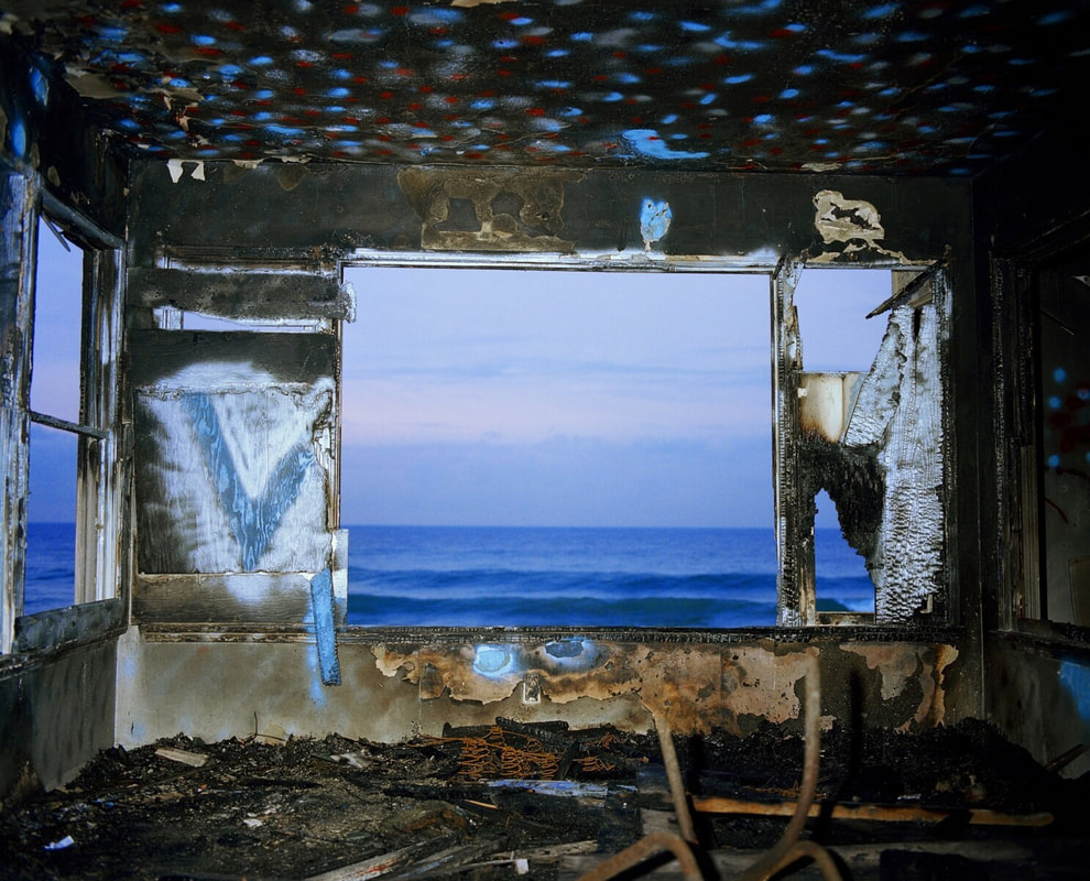
John Divola

|
|

|
In the 1970s, Los Angeles photographer John Divola began photographing in abandoned, often dilapidated, houses. With his series Vandalism (1973–75) and Zuma (1977–78), however, he didn’t just photograph houses. Here, Divola describes how he manipulated the environments with painting and other interventions as a way of “vandalizing the tradition of photography.”In the Zuma project, he Divola has described being interested in the relation between real artworks and representations of them, and the issues of the natural and the artificial. In his series of photographs from 1977, he used deserted houses on Zuma Beach and covered their walls in graffiti and photographed the ocean from the house's interior through windows and cracks. Divola states: "On initially arriving I would move through the house looking for areas or situations to photograph. If nothing seemed to interest me I would move things around or do some spray painting. The painting was done in much the same way that one might doodle on a piece of paper. At that point I would return to the camera and explore whatever new potentials existed"
First Response
Method: I explored the vicinity of my school and took pictures of various objects from far away and up close.however on my close up views I used a white cardboard frame to frame the near image around the objects I captured.
Widespread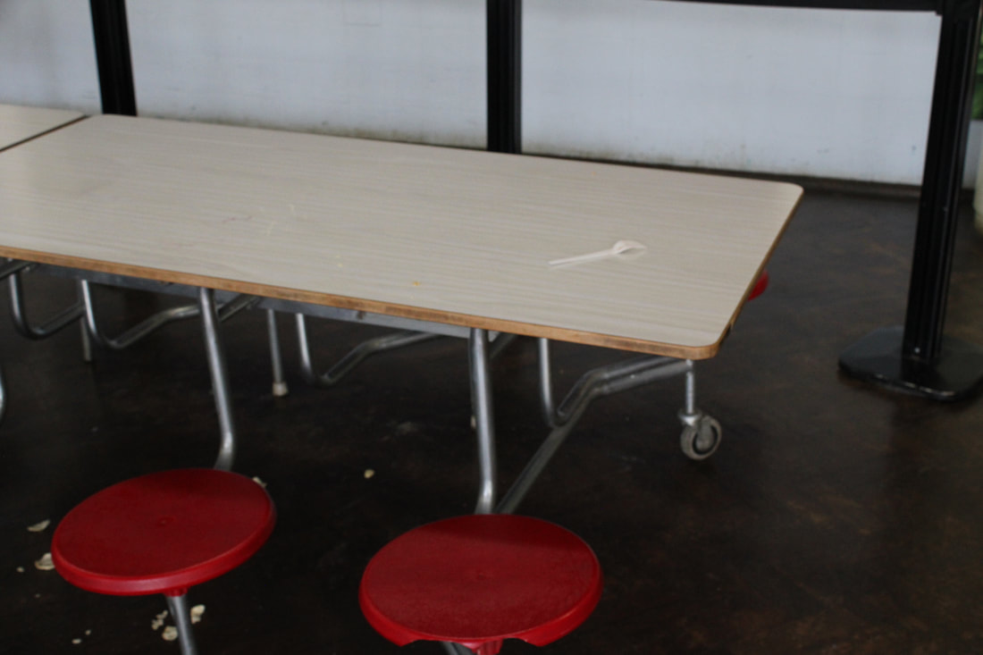
Widespread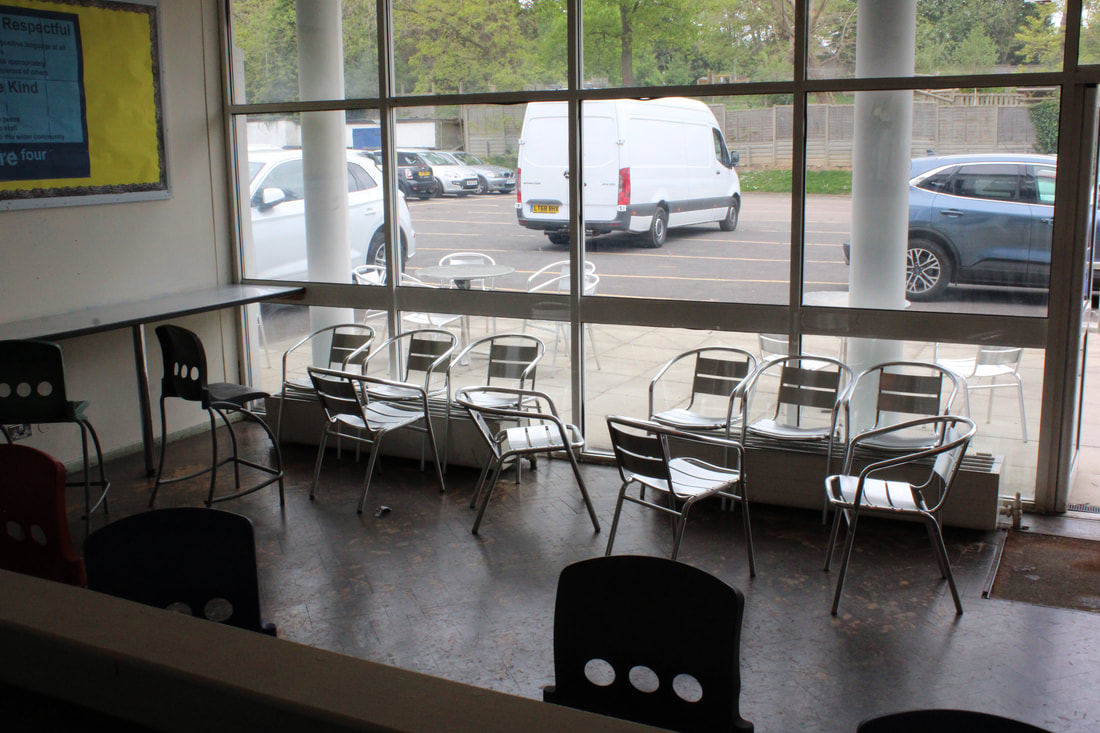
|
Close Up
Close Up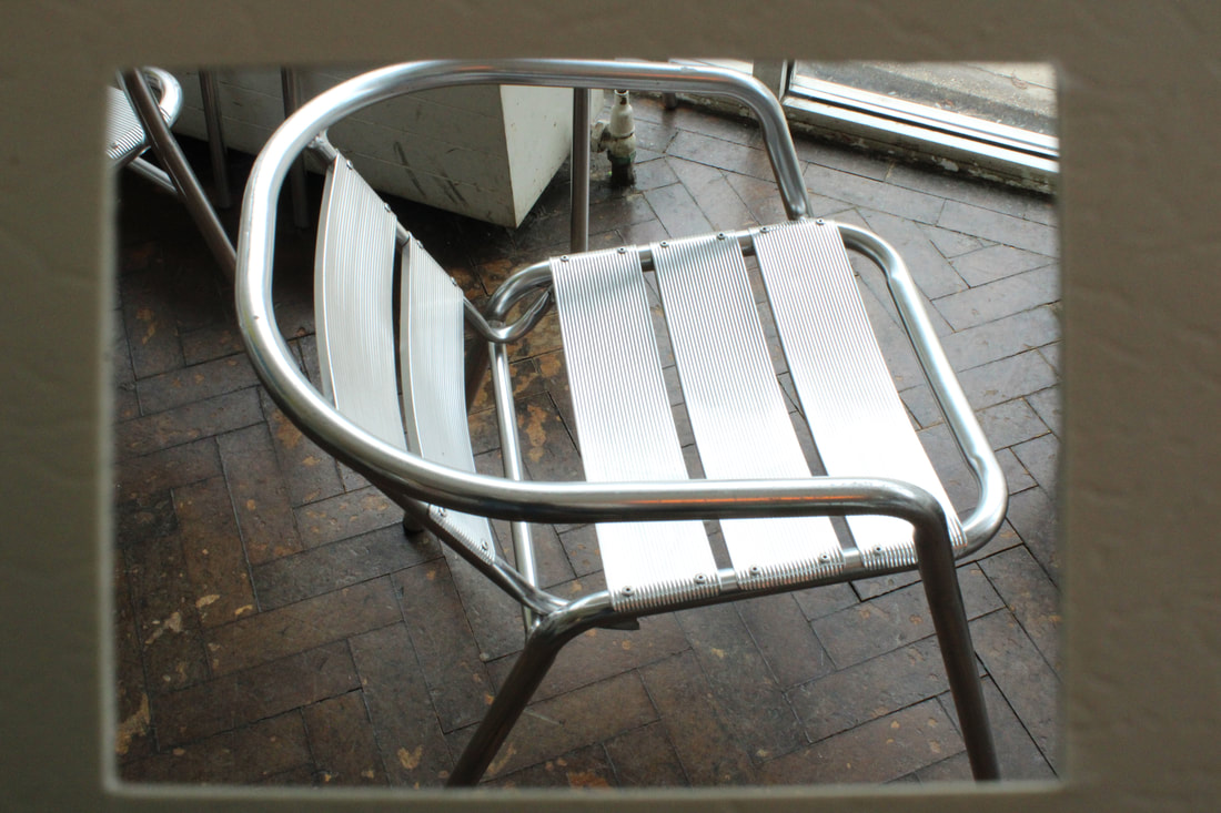
|
WWW: I appreciated the objects where I took close up pictures because they were noticeable in the widespread shots. I also think the composition on the picture of the fork made the fork stand out. I think I was successful in incorporating Divolas idea into environments and I think I succeeded in mimicking his technique.
EBI: However, some of the pictures were quite dark and out of focus, I could improve them by increasing the brightness and contrast.
EBI: However, some of the pictures were quite dark and out of focus, I could improve them by increasing the brightness and contrast.
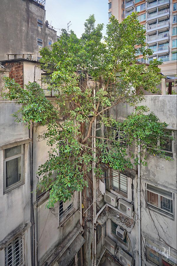
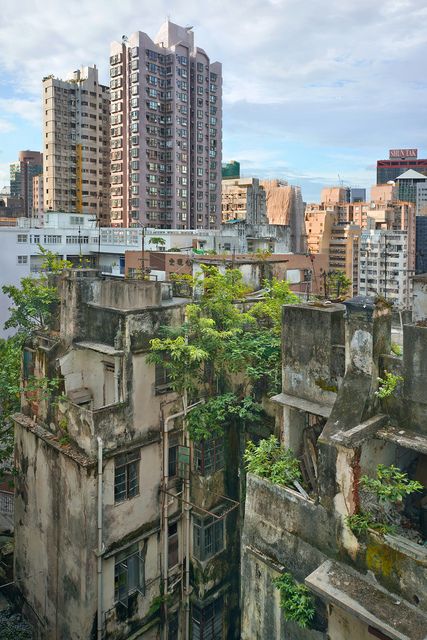
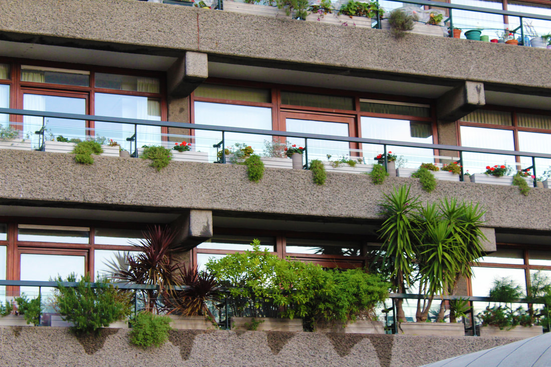
Wild Concrete
Romain Yacuet-lagreze
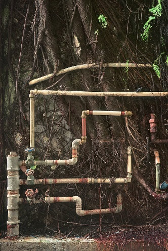
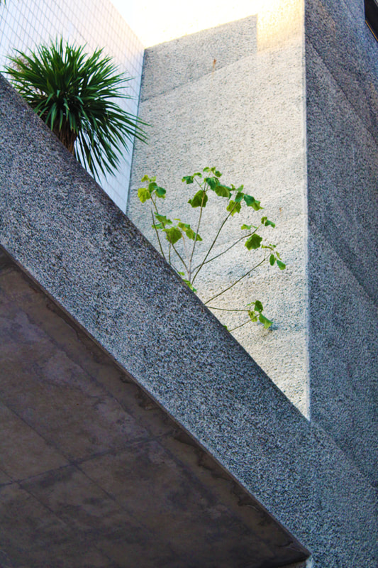
Romain is a French photographer who moved to Hong Kong in 2009. Romain Focuses on the idea of wild life growing around different buildings in Hong-Kong in 2014. Romain juxtaposes plants with man made buildings and structures in his series, Wild Concrete. I think Romain captures these scenes to juxtapose decay with life and make his surroundings seem more beautiful and interesting.
|

|
|
|
Romain utilizes the colour of nature to contrast with the bland concrete scenery around them to make the viewer focus on the plants he captures though sometimes he switches his focus to be on a man made objects in it's natural setting.
|
|
First Response:


WWW:I think the top 3 are the most successful due to the composition and because the colours of the flowers are vibrant and so stand out. Also, I used the rule of third to draw the eye to the colourful flowers. I also like the bottom right pictures as they have the triangular composition which draws the viewers eye to the side of the picture with the vines and draws them away from the negative space in the photo, the bottom left also has the triangular composition which draws the viewers eye to the leaves. I also tried ordering the photos to make the gallery look symmetrical to link all the pictures. I think I was successful at incorporating Romain's theme into my work as I made areas of my school seem far more interesting than on fleet viewing.
EBI: However, if I were to do this again I would try to get more distant shots instead of only close ups and I would also try to take pictures in a more varied range of angles. As well, I would not have included the grass in the top 3 pictures to limit nature from overpowering the concrete. I would also edit the pictures and increase the contrast to allow for the nature in my pictures to take more importance and stand out.
EBI: However, if I were to do this again I would try to get more distant shots instead of only close ups and I would also try to take pictures in a more varied range of angles. As well, I would not have included the grass in the top 3 pictures to limit nature from overpowering the concrete. I would also edit the pictures and increase the contrast to allow for the nature in my pictures to take more importance and stand out.
Second Response:
A lot of my pictures are quite dark because I had a low ISO setting so I'll have to increase the brightness in levels and increase the vibrance to make my pictures look good.
WWW: I like the vibrance of the images as well as the contrast between the colours. I also like how I've created a minimalistic response. I also like how I've experimented with different angles to portray all sides of nature. I think I was successful in capturing nature and contrasting it with the surroundings to make the environment in my pictures seem more interesting.
EBI:I lost some of the quality in the pictures because I had to increase their vibrance and brightness to make up for them being taken with a low ISO.
EBI:I lost some of the quality in the pictures because I had to increase their vibrance and brightness to make up for them being taken with a low ISO.
Homework Task:
For this task I visited the Barbican because of its overpowering amount of concrete. I thought it would be a good place to show large levels of contrast between nature and the man made environment. My aim was juxtapose nature and concrete to make the viewer focus on the plants in the pictures and create a new natural atmosphere for the scene. I also wanted to use a long shutter speed to take in a lot of detail and make the colour in the plants more vivid and stand out more.
Draft:
WWW:I like how I captured both large scales views as well as small scale views. I also like that I was able to capture lots of different looks of nature by using different angles. I also think I was successful at juxtaposing nature and concrete to create a new natural atmosphere to the environment I was capturing. The low shutter speed also worked well for taking in the green colours.
EBI: however some of my pictures were out of focus and I accidentally had the aperture setting turned on meaning the outsides of my pictures were prone to blurring.
EBI: however some of my pictures were out of focus and I accidentally had the aperture setting turned on meaning the outsides of my pictures were prone to blurring.
Best edits:
My favorites:
|
|
WWW: I like how my pictures convey a nice contrast with nature and concrete without either side being too overpowering over the other. I like how I was able to capture a large scale and a small scale picture of nature and concrete. I also like how vibrant my images are and I think I was successful in capturing the same environment that Romain captures in Hong Kong, as my scene conveyed an urban feel. I love how one of my photos is very minimalist and I like how the plant really stands out against the surrounding concrete.I think I was successful at juxtaposing nature and concrete to create a new natural surrounding to the environment I was capturing
EBI: I think my pictures could have been better quality if they weren't taken with the aperture setting turned on. I think it would've been good to of explored capturing nature in a different urban environment and if I was able to focus on a man made object in a natural surrounding.
EBI: I think my pictures could have been better quality if they weren't taken with the aperture setting turned on. I think it would've been good to of explored capturing nature in a different urban environment and if I was able to focus on a man made object in a natural surrounding.
Sun Ji: Layered Landscape
Sun Ji is a 29 year old artist whose photo collages portray a view of the city's past and present by layering pictures, this is called layered landscape. He began in 2005 where he photographed pictures of houses and rubble. He recreated impressions from his childhood.
|

|
|
The resulting compositions become like layered mountains of neighborhoods stacked on top of other as if waiting to be leveled. He loved using the urban landscapes in shanghai and photography partially torn down in residential areas. He used black and white color scheme to reduce clashing between the different colors of all the buildings.
Physical Response:

WWW:I like the Triangular composition as the picture slopes upwards from the right hand side to the left hand side, this makes the image more fluent and makes the viewer travel from the old to the new. I also like how the background goes well with the picture cut outs as the grey clouds and stars match the grey cut outs. Overall, I like the narrative of a developing urban world that's portrayed in this work.
EBI: I think my cut outs could've been neater as well I would've liked to of stuck down more buildings on a larger piece of work to have a much larger response.
EBI: I think my cut outs could've been neater as well I would've liked to of stuck down more buildings on a larger piece of work to have a much larger response.
Half-Term Work:
For this assignment I was asked to capture a unique, an old and a modern building.
Method: I went into London during the half term and explored different areas within the city that contain the specific types of buildings we were meant to capture. My aim was to use the surroundings to draw the viewers eye to the subjects I wanted to focus on, as well I wanted to experiment with different angles and see what viewpoints would emphasis on the structures description (i.e modern, unique, old).
Unique:
WWW: I like how clear and vibrant the picture is. I also like the contrast between the sky and the structure because it draws the viewers eye to the unique parts of the buildings structure and makes its uniqueness stand out.
EBI: I think I should've used a higher exposure (slow shutter speed) to pick up more details as my picture is a little grainy due to increasing the contrast and brightness.
EBI: I think I should've used a higher exposure (slow shutter speed) to pick up more details as my picture is a little grainy due to increasing the contrast and brightness.
Old:
WWW: I love how the juxtaposition between the old bridge and the modern buildings makes the bridge stand out. The high level of darkness around the bridge acts as a frame for the subject and beautifully draws the viewers eye onto the intended focus.
EBI: This photo is a little grainy because my shutter speed wasn't slow enough to capture an adequate level of detail to make up for the amount of editing I'd do to the image (increasing vibrance and saturation).
EBI: This photo is a little grainy because my shutter speed wasn't slow enough to capture an adequate level of detail to make up for the amount of editing I'd do to the image (increasing vibrance and saturation).
Modern:
WWW: I like how I was able to include a lot of the structure in the photo. I also like the angle I took the picture from because it highlights the buildings size whilst also emphasizing on its figure.
EBI: The building and the sky are similier colours so the building doesn't stand out as much as I would've liked.
EBI: The building and the sky are similier colours so the building doesn't stand out as much as I would've liked.
Development: Nature Vs Concrete:
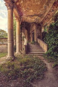
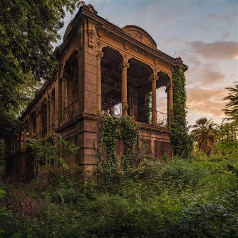
Gina Soden:
|

|
|
Soden's approach brings a sense of life into the scenes she captures, hinting at a decaying narrative with studied compositions. Each image has a distinctly painterly aesthetic.Her photography has the tendency to explore observational and distanced looking viewpoints.
Soden’s approach directs the viewer to explore the concepts of time and memory. The compositions feature derelict asylums, long since closed schools, ex-military compounds and famous city power stations in various stages of decay. The results are striking and edgy in their contemporary aesthetic and beauty.
The work is potentially controversial in gaining unlicensed access to the out of bounds areas. Every image is a product of a journey, referring both to the physical demands of gaining entry and to the passing of time which is evident in the abandoned locations.
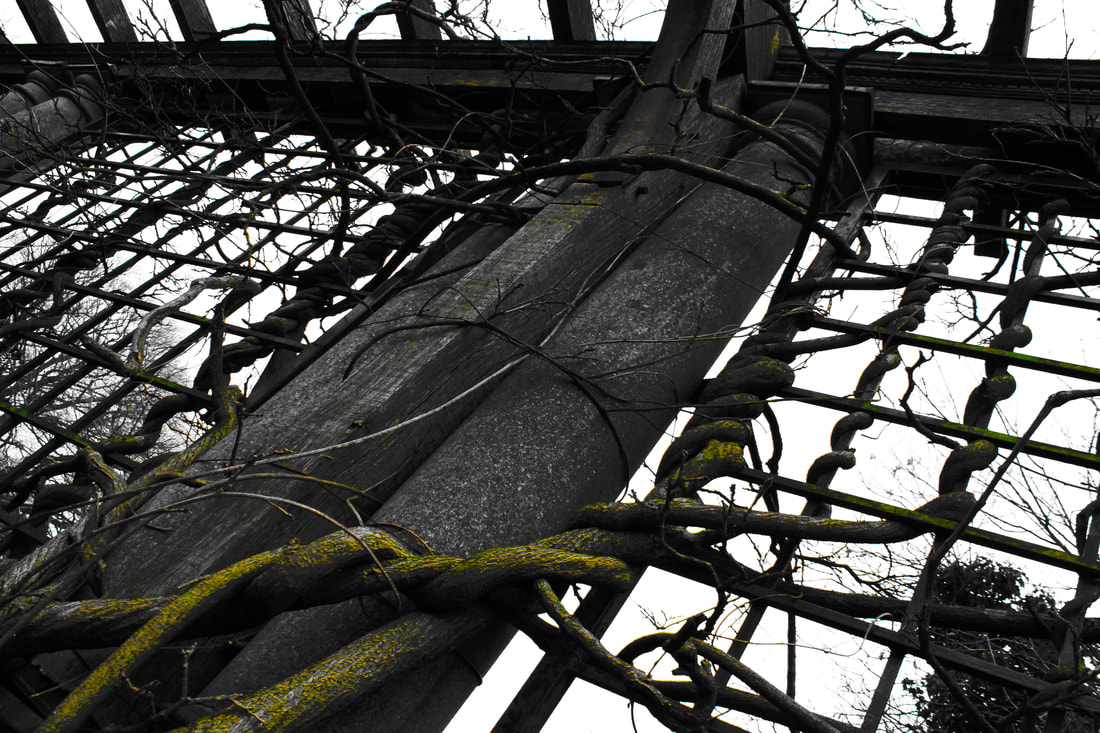
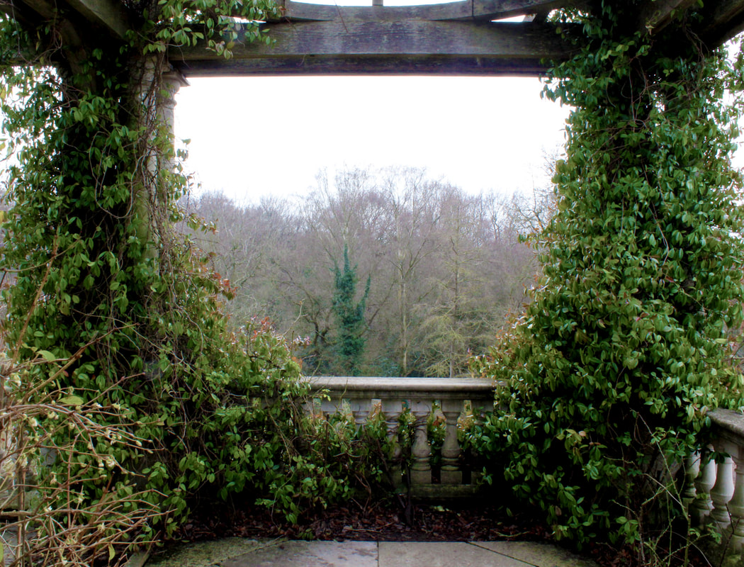
Method: I wanted to create a scene of nature overpowering concrete and make a narrative of it reclaiming its territory. I also wanted to portray the decay of structures and use nature to signify the change in time. I went to the Pergola in Hampstead becuase it has a very old Victorian structure that's been overgrown with varius plants. I wanted to also eperiment with different angles and viewpoints - like Soden- to make nature seem ominous and overpowering.
Draft:
WWW: I liked the pictures I took as they were very clear and had good compositions. I liked the angles that I used and I like that I was able to experiment with different viewpoints.
EBI: I struggled with finding pictures that included a lot of nature because I took these pictures around winter time so most of the plants were dead. So I tried using this to my advantage and create a more sinister scene.
EBI: I struggled with finding pictures that included a lot of nature because I took these pictures around winter time so most of the plants were dead. So I tried using this to my advantage and create a more sinister scene.
Final Edits:
WWW: I was happy with the pictures as they created a sense of chaos in an organised structure. I like how the nature overpowered the photos as it portrayed the narrative I was trying to go for (nature overtaking concrete). I liked the interesting viewpoints I took as they evoked a sublime feeling in the branches. I reduced the vibrance to make the concrete structures more lifeless and dark and increased the saturation to make the green and the nature surround the structures stand out. This created a nice contrast that allowed the branches and moss to remain vibrant ,and contrast well with the dark colorless concrete. I think I was successful at conveying the theme and narrative I was going for.
EBI: It would've been nice to of captured more nature and maybe created a more balanced photo between the two opposing subjects. As well, a lot of my pictures are too heavily contrasted and overworked, making the nature seem too overpowering. However I feel confident as these photos beautifully portrayed the theme and narrative I was trying to execute.
EBI: It would've been nice to of captured more nature and maybe created a more balanced photo between the two opposing subjects. As well, a lot of my pictures are too heavily contrasted and overworked, making the nature seem too overpowering. However I feel confident as these photos beautifully portrayed the theme and narrative I was trying to execute.
My Favorites:
WWW: I like how decayed the concrete looks and how the picture looks like it been taken in a zone of timeless destruction. I love how the moss in the picture stands out and kindles a sense of decay by contrasting with the environment. The swirling of the branches around the structure evokes a sense of life into life into death- eliciting a gothic feel. The vibrance of the moss also overpowers the colourless surroundings in the picture illustrating the narrative of nature overtaking concrete- whilst also attracting the viewer towards the subject (nature). I'm happy with the angle I took the picture because it makes the scene look larger than it is so it seems more impactful.
EBI: I think the photo could involve a higher amount of nature to further portray the natural environment.
EBI: I think the photo could involve a higher amount of nature to further portray the natural environment.
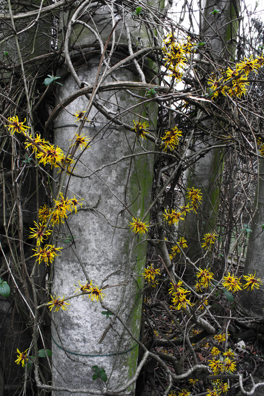
WWW: I like the contrast between the yellow flowers and the decaying surroundings as it creates the sense that nature has won and reclaimed its territory. The colourless concrete also evokes a decaying atmosphere that portrays its destruction in the narrative. I love how clear the picture is and the amount of detail visible on the concrete pillar. The contrast between the vibrant flowers and dark concrete almost enact the contrast between life and death. The picture is also very clear and shows define contrasts between the subjects.
EBI: I think that the dark concrete overpowers the photo a little.
EBI: I think that the dark concrete overpowers the photo a little.
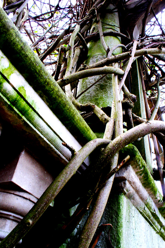
WWW: I love how sublime and sinister this picture is as the low angle makes the branches look huge and overpowering adding to the narrative of Nature overtaking concrete. This is one of the images where I think making the concrete overpowered by nature worked, as it beautifully shows how nature has consumed the decaying structure with the green moss completely covering it.The the picture also has a good level of detail.
EBI: the green moss is too saturated and looks a little unatural.
EBI: the green moss is too saturated and looks a little unatural.
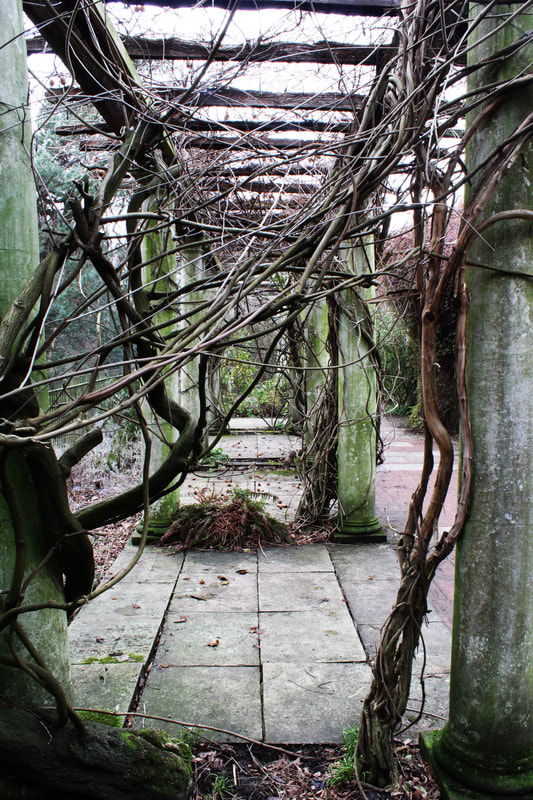
WWW: I like how the balanced composition pulls in the viewer and makes them feel impacted by the overpowering sense of nature. The picture also has a sense of timelessness to it- Linking it to Gina's theme. The picture also has a good level of detail due to the low shutter speed used and the high contrast edited onto the image.The scene contains a level of chaos in the organized structure emphasizing on the force of nature.
EBI: The picture could be more symmetrical as the right pillar is shown more than the left one.
EBI: The picture could be more symmetrical as the right pillar is shown more than the left one.
WWW: The softness and beauty of nature evoked in this picture has an intimate sense, this effectively romanticizes the concrete and nicely ends the narrative between the two subjects, and harmonizes the relationship. I like how neither subject feels overpowering as there is no increased contrast or saturation involved in the image.
EBI: It would have been better if the wood wasn't so detailed an vibrant as it distracts the viewer.
EBI: It would have been better if the wood wasn't so detailed an vibrant as it distracts the viewer.
Overall, I think this development was successful of portraying different narratives and perspectives on nature though the use of different angles and contrasting between nature and concrete. I also love the way I presented this development as it allowed me to create an interesting narrative around the collection of photos.
Development: Mirrored Perspective
Failed Reponse:
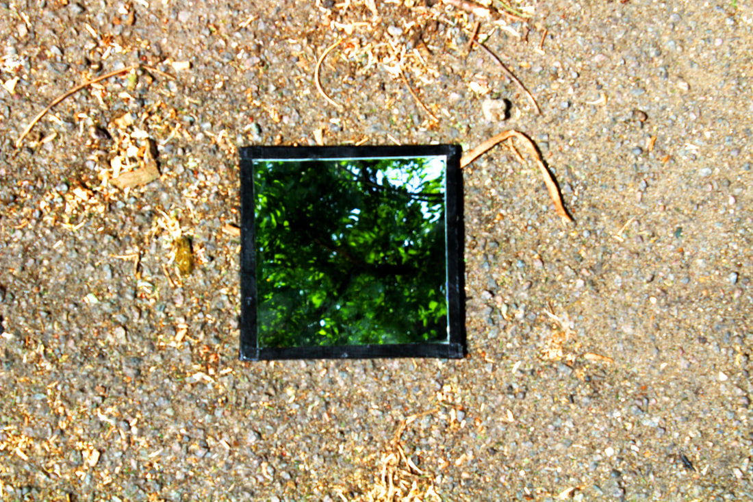
I took pictures with a mirror so I could reflect different perspectives into one photo. I tried creating contrast between what was shown in the reflection to what was shown around the reflection, by making the mirror reflect nature with its surrounding being concrete and the man made frame around itself.
It was hard to get both the reflection and the ground in focus and the mirror was also murky which made the reflection seem more blury. When I was editing my chosen best pictures I increased the contrast to decrease the level of blurriness and to also make the nature and concrete stand out next to each other more.
In the picture above, I like how both the nature and concrete both contrast with the man-made frame around the mirror. This is because the level of contrast and brightness made the ground look vibrant compared with the black frame, almost as if the ground was trying to reflect the vibrant colours within nature.

In this photo I like how there's less contrast between the concrete and the frame, due to both of them being dark, because it make the reflection stand out more due to it being bright and vibrant which opposes the lighting and colour scheme of the surroundings. However, the reflection isn't as clear as wanted it to be, though the blurriness does vaguely match the texture of the concrete floor.
Overall, I like the concept and theme of this response, however I don't think it been technically executed well and I think I can take much better photos.
Inspiration: Sebastian Magnani
Sebastian Magnani is Switzerland based photographer known for his intimate portraits masterfully utilizing light and color to create emotional scenes. I liked how he combined two perspectives of nature through reflections with the use of mirrors. I like the contrast between the man made floor and the nature in the reflection. His works on the left and right were the pieces that I mainly drew inspiration form.

|

|

|
I like how Sebastian uses light and colour to add emotion to his scenes. In his reflection collection Sebastian conveys two perspectives of beauty with the use of mirrors. He usually contrasts what he shows in the mirror with the mirror's surrounding, by showing a different environmental texture in each viewpoint, or by showing a completely different scene- like an up close shot of a geological landscape and including the clouds in the sky in the mirror's reflection.
Second Response:
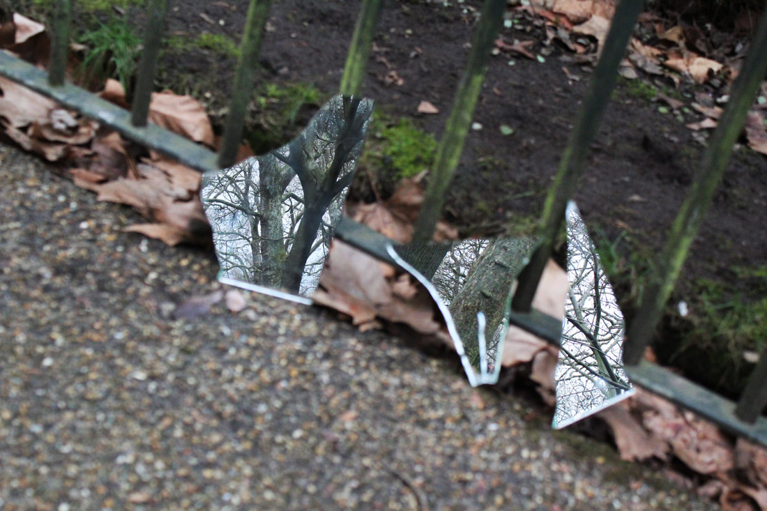
Method: I went to Hyde park to convey different scenes in nature by showing different perspectives through reflections.I want to create a similier contextual contrasts to the one's Magnini creates and also explore contrasting nature with the man made pathways and gates at the park. I thought Hyde park would be a good place to do this because of its large amount of green space.
Draft:
WWW: I like how my pictures had a clear focus on the reflection. I also like my idea of having multiple mirrors in a fractured state to make my reflections look like holes in reality.
EBI: the mirror's surroundings are quite blurred becuase it was hard to maker the camera focus on both reflection and background.
EBI: the mirror's surroundings are quite blurred becuase it was hard to maker the camera focus on both reflection and background.
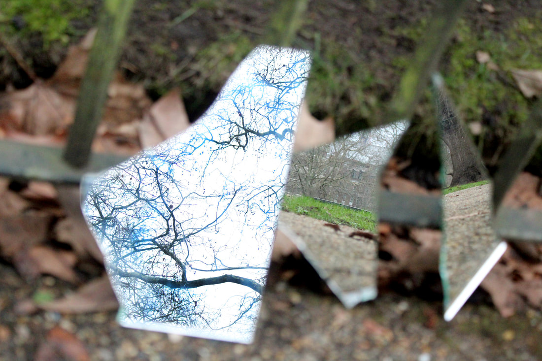
Final Edits:
WWW: I like how my reflections looked like holes in reality due to their shape. I'm also happy that I included more than one mirror because it meant I could convey multiple perspectives. I think the editing turned out well as the pictures didn't loose any visible quality after I increased their contrast,saturation and vibrance. I'm also happy that I was able to contrast the environment within the reflection to the environment of the surroundings. I also experimented with the angles I took my pictures to make sure I got the best images within my reflections. I also like how the outlines of the mirrors blur in with the background making the reflections stand out more.
EBI: It would of been better if everything in my picture was clear and not just my reflections.
EBI: It would of been better if everything in my picture was clear and not just my reflections.
My Favorites:
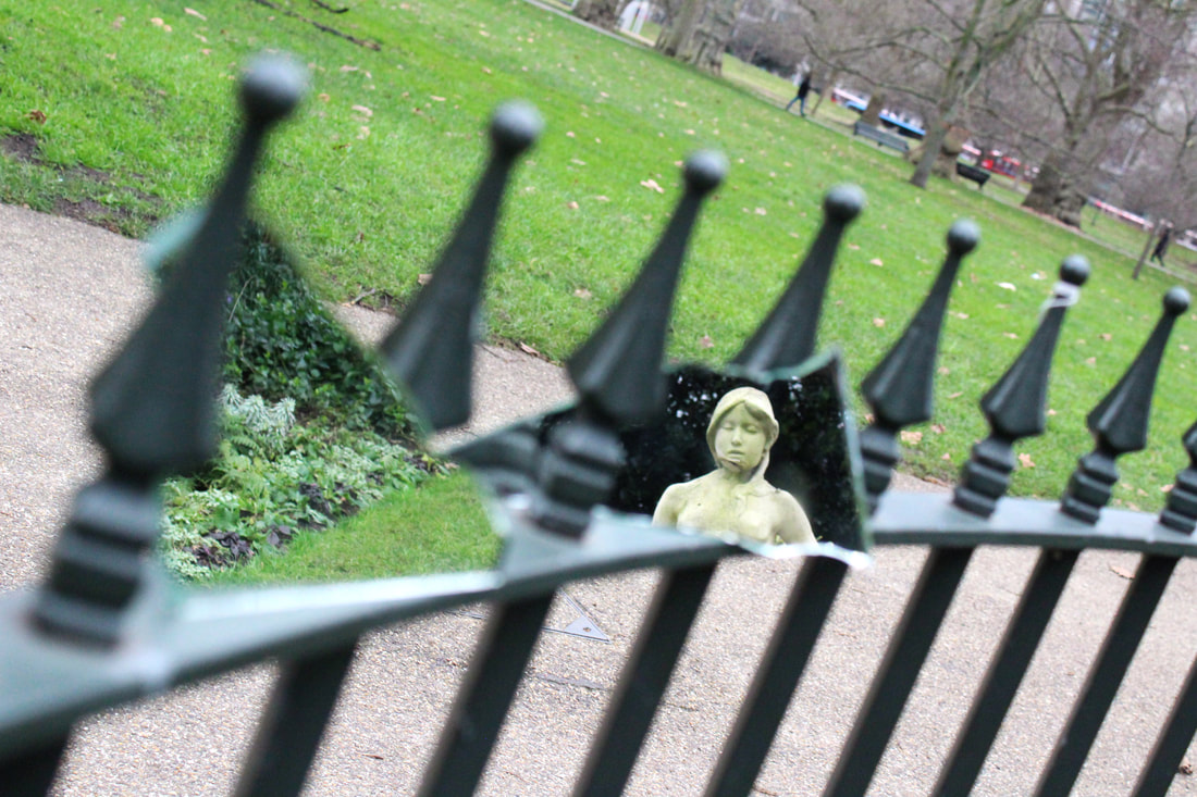
WWW: I specifically like this picture because the reflection of the statue directly grabs the viewers attention and creates a narrative of it looking through reality. I also like the contrast in viewpoints between the up close reflection of the grass and the wide spread view of the grass background. I think this photo also contrasts the man made with nature as the mirrors show reflections of nature when they're being held up by a metal gate. I also like how the mirror with the grass reflection looks like its apart of the drain cover on the ground and almost creates a type of optical illusion for the viewer.
EBI: It would've of been better if the metal gate wasn't out of focus and if there were more colours included to make the picture more vibrant.
EBI: It would've of been better if the metal gate wasn't out of focus and if there were more colours included to make the picture more vibrant.
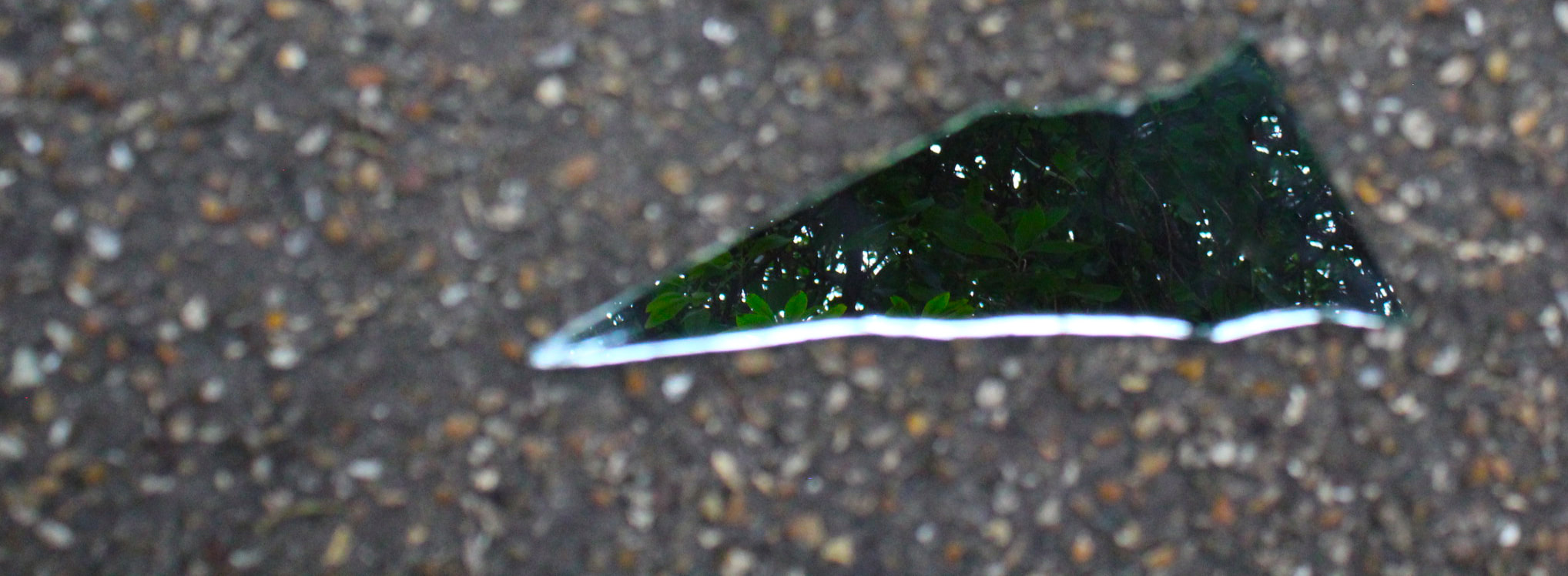
WWW: I like the simplicity of the photo and how there is a direct contrast between the nature and the man made floor. I also like how the reflection and background share the same up close viewpoint as it makes the photo contrast in a more cohesive manner. Furthermore, the reflection contains a lot of detail and the picture is great at capturing my theme of contrasting perspectives.
EBI: it would of been better if the floor wasn't blurry and if the outline of the mirror wasn't as bright, because it removed the narrative of the reflection being holes in reality.
EBI: it would of been better if the floor wasn't blurry and if the outline of the mirror wasn't as bright, because it removed the narrative of the reflection being holes in reality.
WWW: I like how the reflections seem suspended mid air because it further represents my narrative. I also like the contrast in viewpoints and angles as the reflection were captured from an angle looking down but the reflections show an angle looking up.
EBI: the surrounding is blurry and the mirrors are a little dirty, as well I would've liked to of contrasted the environments shown more.
EBI: the surrounding is blurry and the mirrors are a little dirty, as well I would've liked to of contrasted the environments shown more.
WWW: I like how pretty the reflection on the left is and I like how it attracts the viewers eye to its beauty due to its level of brightness. I like how the branches are quite defined because I used the burn tool over them to darken their figure and make them stand through their contrast with the bright sky. I also like the contrast in perspectives between all the reflections as well as with the surroundings.
EBI: the surrounding is blurry and becuase of the left reflection's brightness the focus is kept off of the other reflections.
EBI: the surrounding is blurry and becuase of the left reflection's brightness the focus is kept off of the other reflections.
Overall, I like how I was able to show different perspectives of the natural environment and I think I was successful in creating contrast between the scene and the reflections. However I had the common problem of the background blurring- to fix this I could've sharpened the photo in Photoshop or used a long exposure camera with a tri-pod. Though I think that burn tool and the spot heal brush were successful in removing blurs on the mirror that were caused by markings.
Development: Reflection
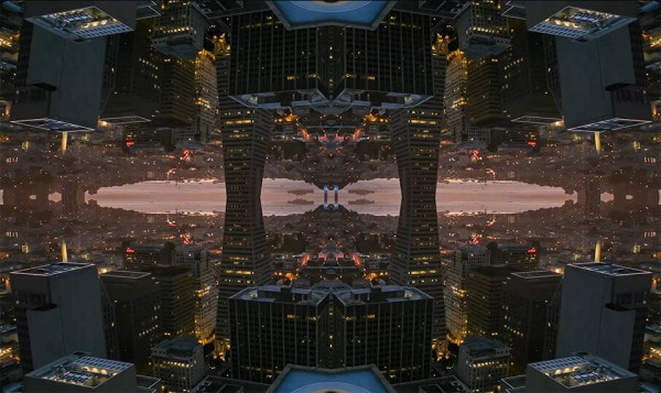
Inspiration:Michael Shainblum
Michael Shainblum is a landscape, timelapse and aerial photographer based in San Francisco, California. He has been working professionally as a photographer and filmmaker for 11 years. Michael first made a name for himself through his unique creativity and the ability to capture scenes and moments in his distinct style of surreal visual story telling. He challenged the boundaries of creativity, as well he had a flair for coming up with unique ideas, this dynamic visual artist is now commissioned by large clients including Nike, Samsung, Facebook, LG, Apple and Google. Michael's work is also published widely by media outlets such as National Geographic, Wired Magazine and The Weather Channel.
|
|
|
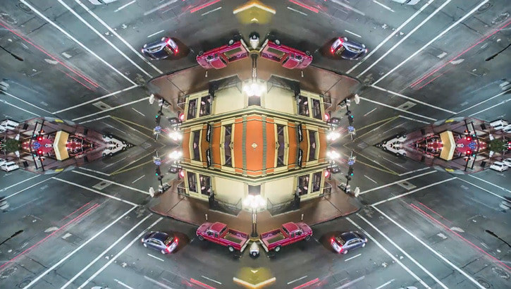
Michael Shainblum has allot of experience in making short films and astro photography. I drew inspiration from a project he did called mirror city. He created new distorted perspectives of scenes by creating digital 4 way reflections. He adapts his pictures to make them release a new futuristic atmosphere. His pictures emphasis on urban environments and makes urban features like skyscrapers and city lights stand out. I want to use his reflection technique to make similier tall structures stand out and emphasis on their features.
Method:My aim for this development was to go to Battersea power station and reflect the industrial, man-made building. I thought Battersea power station would be a good place to complete this development because of its unique chimneys, which I wanted to make the subject of my photos and emphasis on. I also thought that reflecting its chimneys would create interesting shapes when reflected. I thought of the idea of using Shainblum's 4 way reflections to make the chimneys stand out after I saw how shainblum made skyscrapers stand out. Because when Shainblum did a 4 way reflection with tall building he creates a rule of third composition that made the tall structures stand out. I would try to replicate this for the iconic power station chimneys.
WWW:The photoshoot went well because the lighting was great because I was taking my pictures at sunset so the sun was shining directly on the side of the building, whilst the lights were also turned on meaning I could capture a timeless scene with good lighting. I think the chimneys are in the right place for making a good composition when reflected.
EBI: However, if I used a better camera my pictures would've had a lot more detail and also would've been clearer and sharper .
EBI: However, if I used a better camera my pictures would've had a lot more detail and also would've been clearer and sharper .
WWW: my reflection were clean and I increased the contrast and saturation on the pictures to make the building stand out. I like how the change in contrast and saturation made certain parts of the structure stand out to. For example, in the first photo I contrasted the the light blue sky with the brick center and the white chimneys to emphasis on each component by making them stand out.
EBI: However, the fifth picture I took wasn't straight,meaning the reflection couldn't be completely symmetrical. I also think it would've been good to of taken pictures of different buildings and landscapes as well.
EBI: However, the fifth picture I took wasn't straight,meaning the reflection couldn't be completely symmetrical. I also think it would've been good to of taken pictures of different buildings and landscapes as well.
My Favorites:
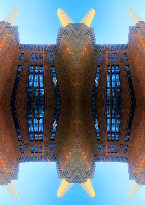
WWW:I like the pictures above because they are perfectly reflected; clear pictures. I loved the unique shaped that the reflection created, which distorted the buildings form and made it look like a different object that was warped in reality. I also like how the sky in the pictures is quite light even though I took the pictures in the evening. Due to me taking the pictures in the evening, the building had its lights turned on. This helped make the image more vibrant and gave the picture a more pleasing color scheme.I also like how the composition (rule of third) makes the chimneys stand out and draws the viewer towards the intended subject. I think I was successful at emphasizing on the structures features and adapting the image to a new atmosphere- like Shainblum.
EBI: However the pictures would be even better if I took them with a better camera to get more detail, and because I used a bad camera I had to spend allot of my time editing- by increasing the vibrance,saturation and brightness- to make the pictures better.
EBI: However the pictures would be even better if I took them with a better camera to get more detail, and because I used a bad camera I had to spend allot of my time editing- by increasing the vibrance,saturation and brightness- to make the pictures better.
How to:
I also adjusted my images: Image>adjustments then changed the contrast, saturation and vibrance.
Development: Double Exposure
Inspiration: Idris Khan
|
|
|
Idris Khan is a British photographer based in London, this photographer does allot of work on double exposure. I drew inspiration from his double exposure work on architecture because I liked how he merged pictures of famous buildings to create a new image that releases an abandoned and scary aesthetic. Furthermore, I liked how he showed different perspectives of the same building and made famous buildings seem chaotic and surreal (almost dreamlike) .
Khan's work draws from a diverse range of cultural settings to create densely layered images that are both abstract and figurative and address narratives of history, experience. He creates a metaphysical collapse in time by making the historical forms of the buildings present in a single moment.Whilst Khan’s mindset is more painterly than photographic, he often employs the tools of photo mechanical reproduction to create his work. He scans from secondary source materials and then builds up the layers of scans digitally, which allows him to meticulously control minute variances in contrast, brightness and opacity. The resultant images have a remarkable optical intensity.
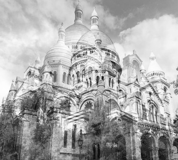
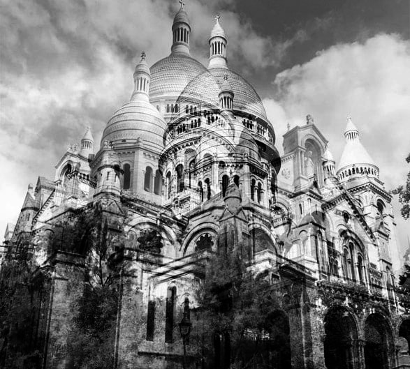
Method: For this development I went to Paris and take pictures of the Sacra Coeur- because of the buildings history and iconic nature. My idea was to Photoshop and layer opaque photos to portray different perspectives of the structure and to create a new atmosphere for the scene. I wanted to make the new atmosphere more gothic to create a historical narrative around the building.
Draft:
WWW: The photos I took are clear and have a nice level of brightness. They also show very different viewpoints and angles of the building.
EBI: It would've been good to of gotten a larger variety of perspectives and pictures. To combat this issue, I want to try and crop some of my pictures to enhance the view on different parts of the structure to increase the amount of perspectives I have in order to combat this issue.
EBI: It would've been good to of gotten a larger variety of perspectives and pictures. To combat this issue, I want to try and crop some of my pictures to enhance the view on different parts of the structure to increase the amount of perspectives I have in order to combat this issue.
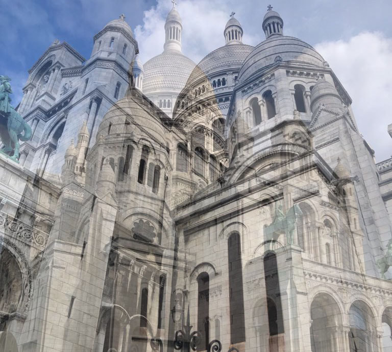
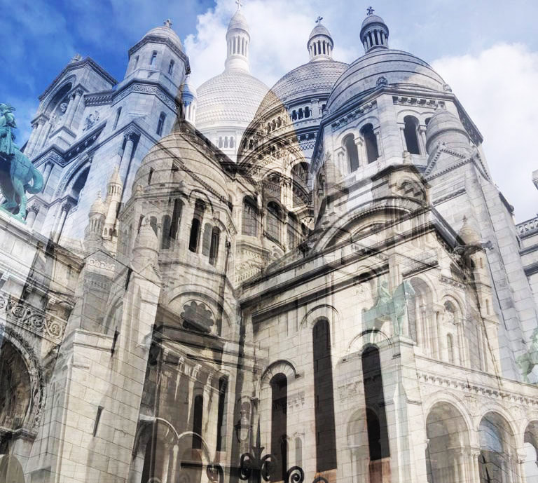
WWW:I really liked how the picture turned out because it showed two opposing sides of the building which makes it look somewhat chaotic. The different viewpoints also convey opposite perspectives which distorts the structures form. I like how both the top and bottom of the building are shown, because it emphasizes on both the domes and the large arches - the key parts of the structure I wanted to focus on. I also like the angle of the pictures because it makes the building look ominous and adds to the gothic narrative. Furthermore, the high level of contrast in black and white makes the building seem empty hinting towards a deserted nature to the viewer and adding to the gothic atmosphere I was trying to create.
EBI:This picture could be better if I edited the black gates at the bottom out because the darkness of them could draw the viewers eye away from the intended focus.
EBI:This picture could be better if I edited the black gates at the bottom out because the darkness of them could draw the viewers eye away from the intended focus.
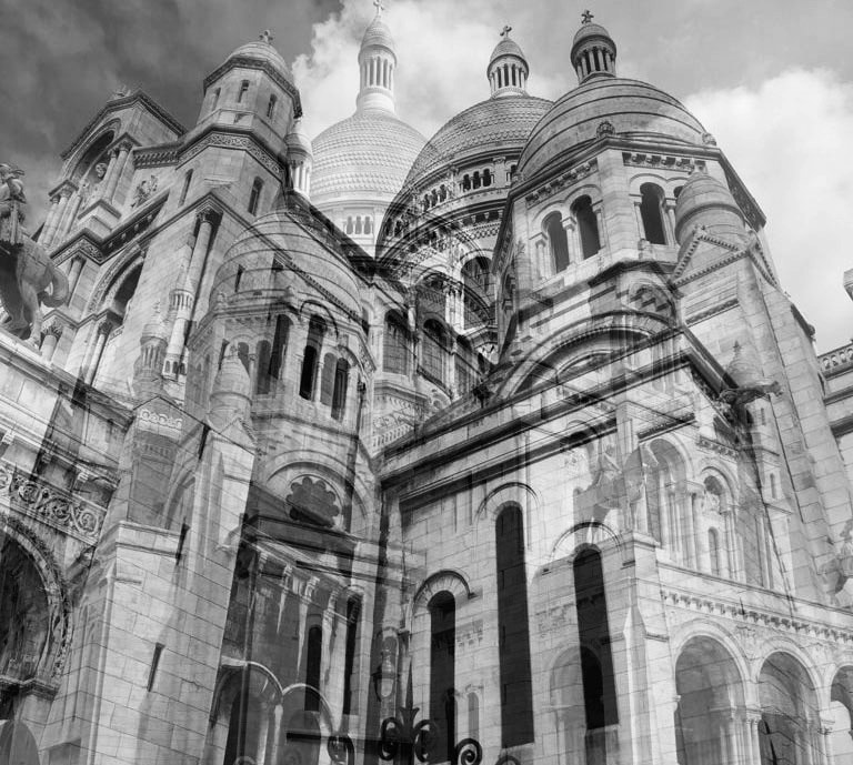
WWW:I like how the photos sink in well together as the nature around the bottom layer goes well with the arches at the bottom of the second layer and mimics a scene from a gothic courtyard. I like how the building still looks like its placed on a mountain because it makes the building seem isolated and ominous. The black and white colour scheme devoids the image of any emotion and releases an unknown and abandonned atmosphere that captures the mood I was trying to convey.
EBI: I think it might've been better to of focused more on the structural features rather than the whole structure itself. As well I would've liked to of layered more images to make the picture look more chaotic and surreal.
EBI: I think it might've been better to of focused more on the structural features rather than the whole structure itself. As well I would've liked to of layered more images to make the picture look more chaotic and surreal.
Overall, I think I was successful at layering different perspectives to create a new historical atmosphere.
Second Response:
Method: for my second response I wanted to emphasis and focus more on specific details and parts of a structure. I thought that Tower Bridge would be a good place to do this development because of its history- which nicely links to Khans work. I also liked its architectural detailing. I wanted to prioritize getting different viewpoints of the buildings, specifically up close and far away views, to show as many different perspectives as possible which specifically emphasis on the key parts of the structures: the towers, the brick structure and the blue metal works.


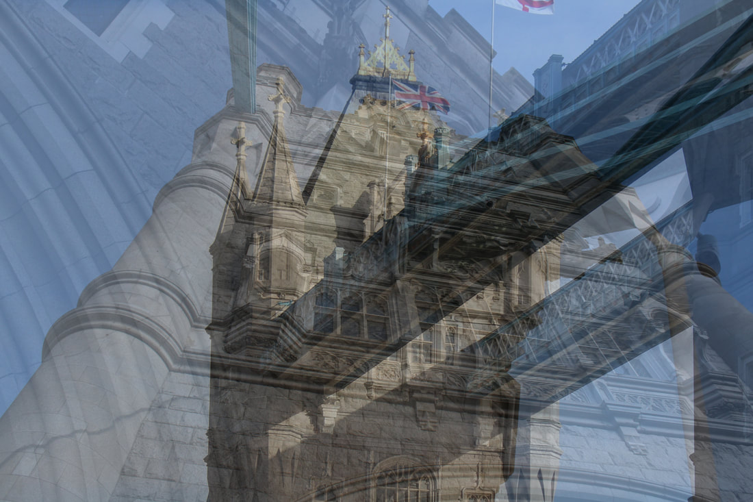
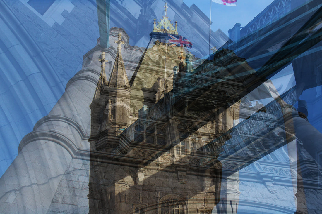
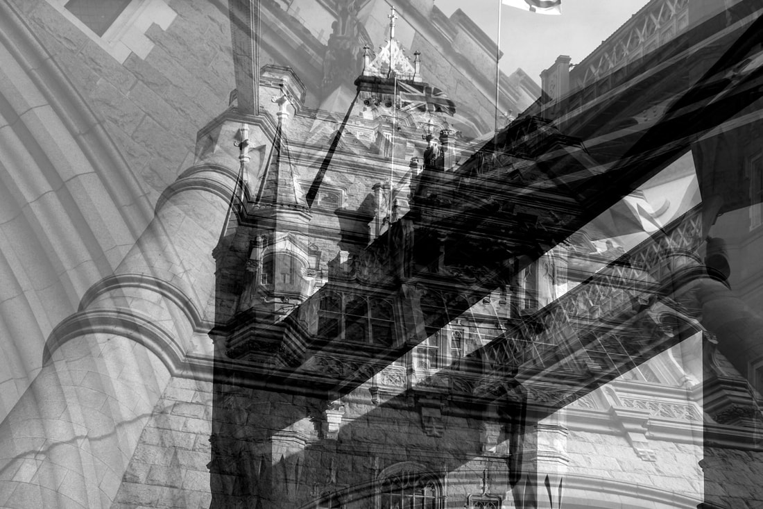
WWW: I like how this picture conveys all the specific parts I wanted to emphasis on. I also like how the viewer can separate the layers easily so they can focus on each part I want them too.I also like that each piece of the structure stand out due to the levels of contrast. I'm also happy that the image isn't too distorted.
EBI: I would've liked to of added to the atmosphere of the photos more and linked more to the historical nature of the building.
EBI: I would've liked to of added to the atmosphere of the photos more and linked more to the historical nature of the building.


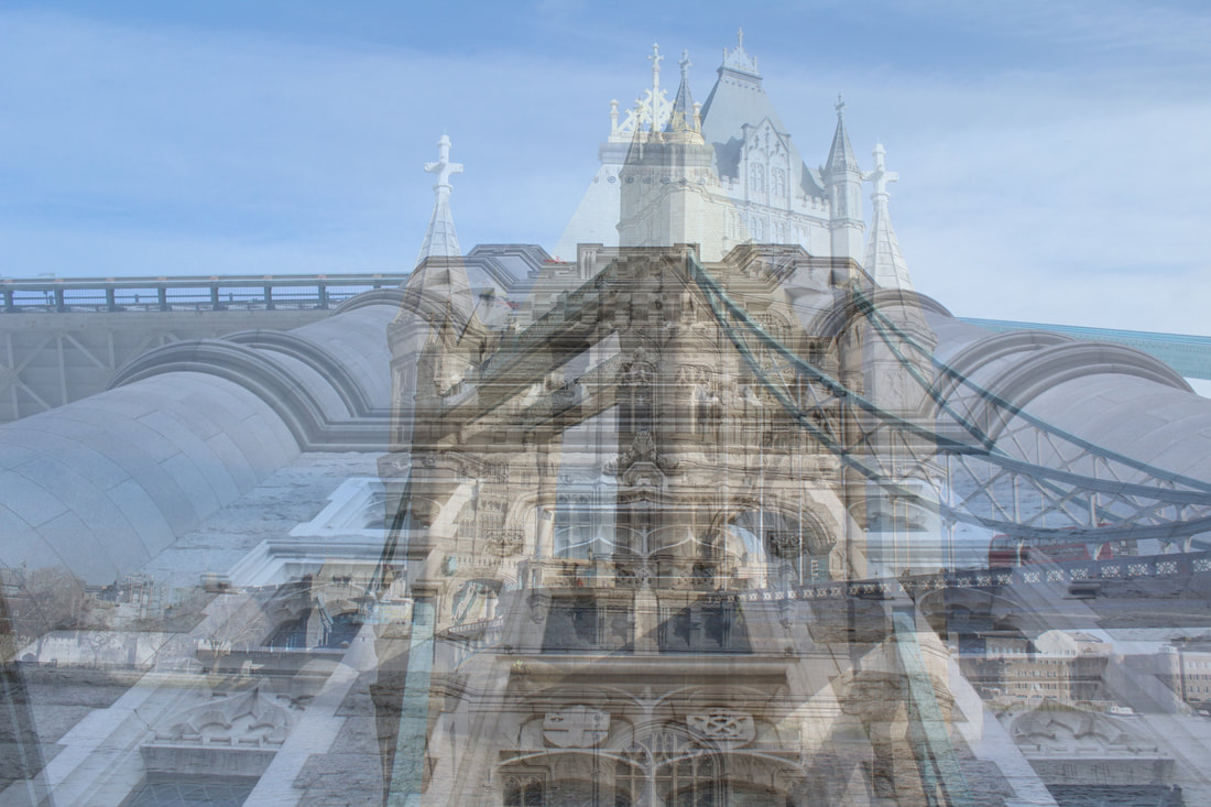
WWW: I like I was able to show multiple angles as well as viewpoints. I also think that the distortion of the building works for this photo because it leaves out the distractions from the key parts of the structure I was trying to focus on.
EBI: However, I dislike the amount of free space at the top of the picture because its quite eye drawing.
EBI: However, I dislike the amount of free space at the top of the picture because its quite eye drawing.


WWW: I like how I used composition to make the towers stand out as much as possible to make them focus of the picture. I also like how I focused on one specific part rather then different parts because it made the picture less hectic and more clearly portrayed the subject.
EBI: I think the picture could be more contrasted to make each layer stand out more.
EBI: I think the picture could be more contrasted to make each layer stand out more.
Overall, I like how this response has turned out because I was able to re focus on showing different perspectives to emphasis on certain parts of a structure. I also like how the colored contrasted pictures could also be there own pieces of work as they deliver the same point, as the colour highlights the different parts of the bridge. I think that this development has been successful in developing my theme of manipulation perspectives to make the audience focus on a structural feature.
How to:
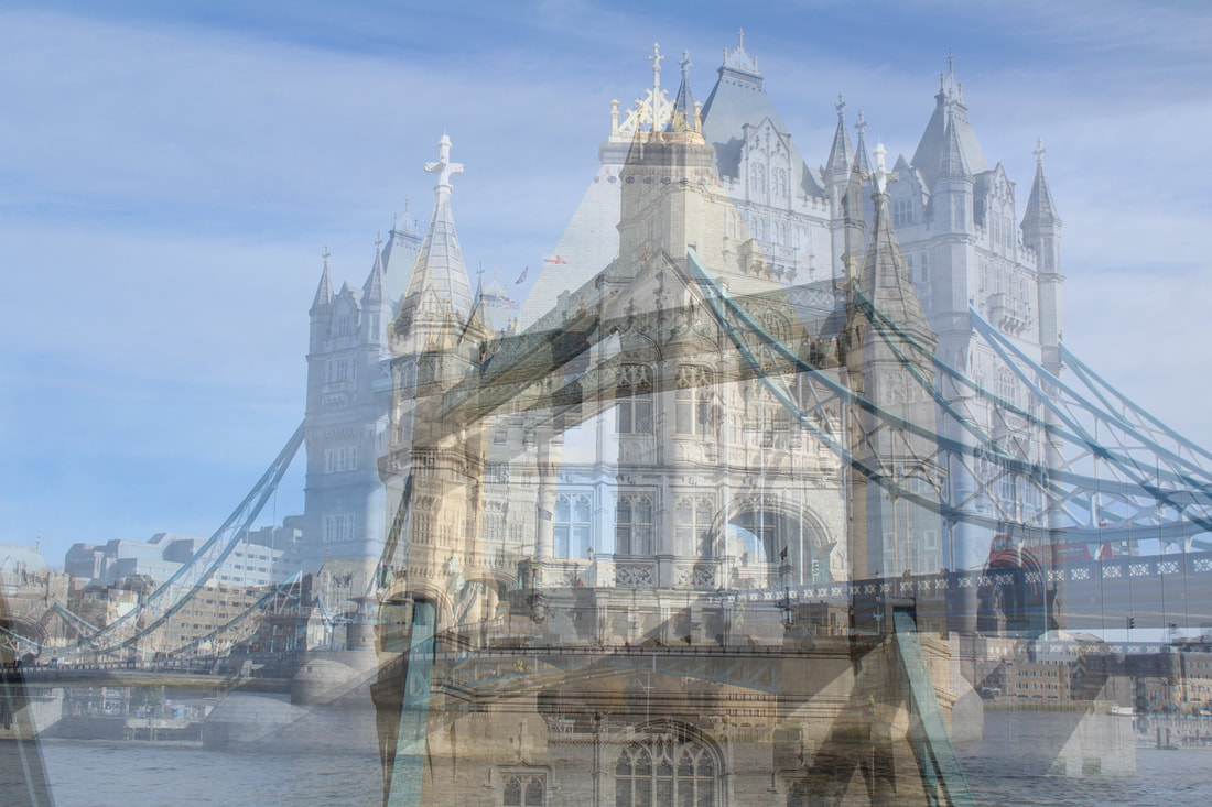
Development: X-Rays of a Structure
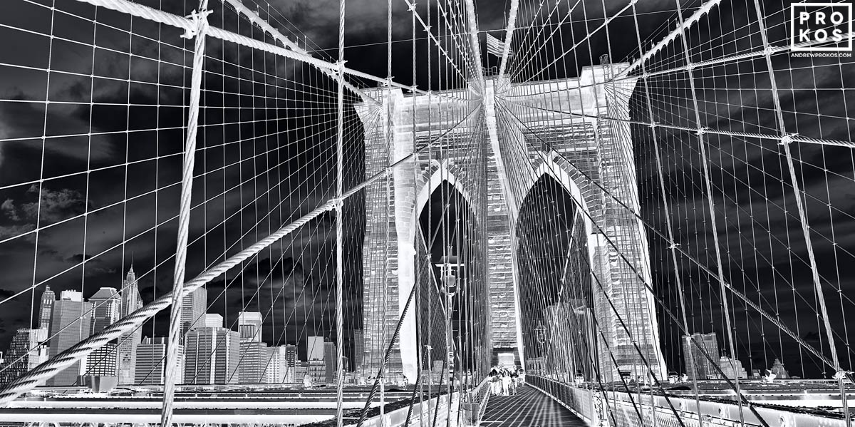
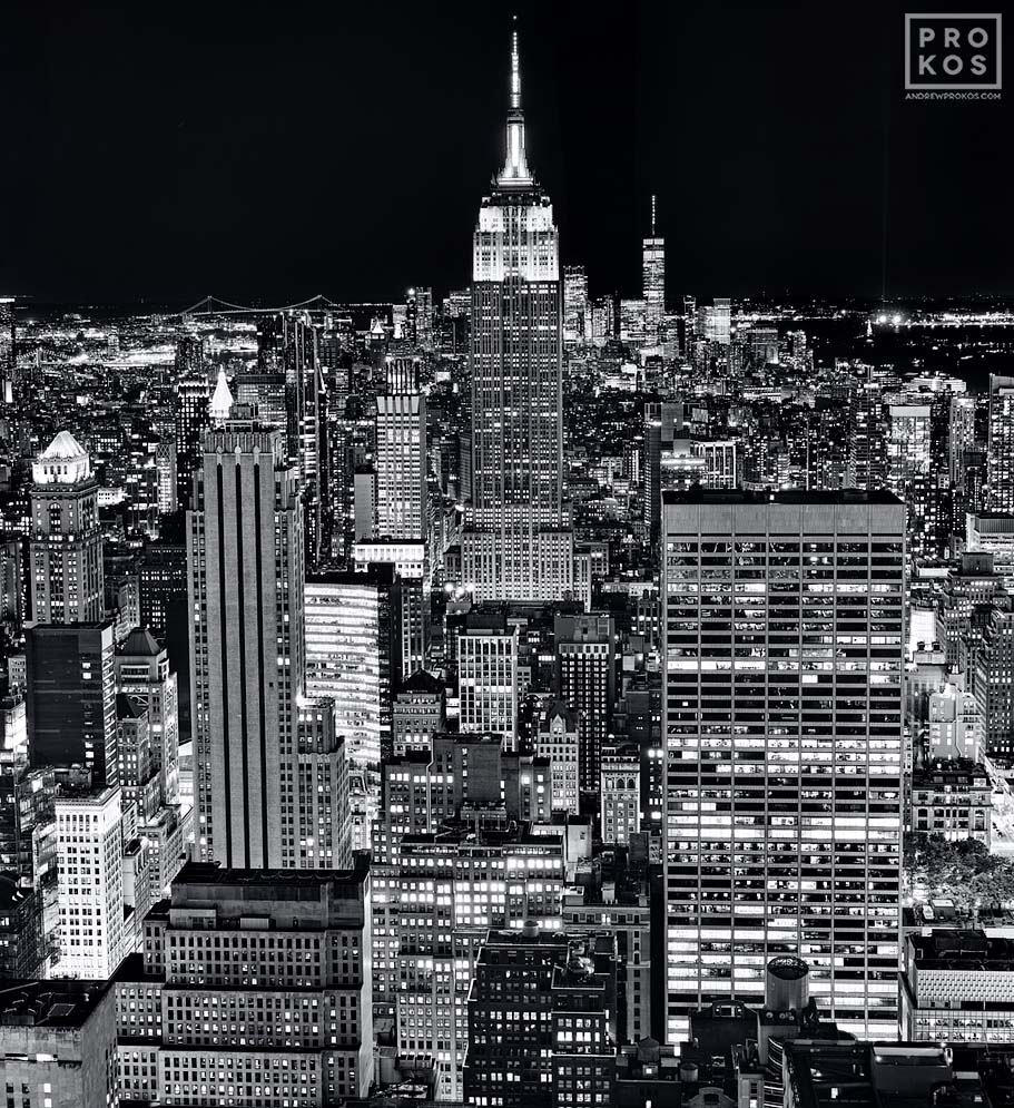
Andrew Prokos:
|
|
|
Originally, Prokos was born to Greek parents who immigrated to the United States after World War II and settled in Chicago.At an early age Prokos's family moved to Florida, where he grew up and attended the University of Florida, where he graduated with a degree in Political Science.He first started taking photographs after moving to New York City at the age of 20.
Andrew Prokos is now based in New York City and works as an artist and architectural photographer. His fine art photographs incorporate architectural elements and urban views of the city. Andrew captures the city-scapes throughout New York with a high level of exposure to capture a mass amount of detail on large prints. He then creates different levels of contrast and brightness to portray the detail in each picture he captures. This evokes a level of organised busyness which perfectly illustrates the city's architecture. |
|
I like how the artist uses contrast and different levels of brightness to emphasis on the city's architecture, which is what I'm currently basing my developments off. I want to use the artists technique of changing the light curves and levels of the pictures brightness to emphasis on parts of structures, however I'll carry on experiment with layering pictures.
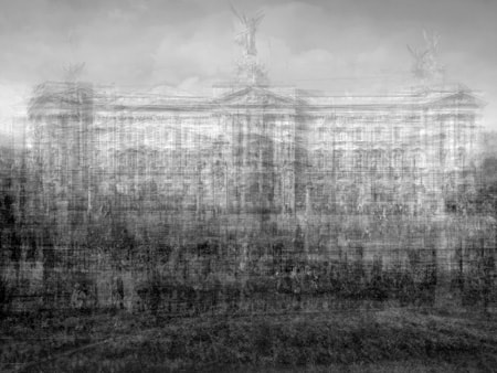
Method: I want to go into London and take pictures of the houses of parliaments to create a new perspective on London's cityscapes as I want to illustrate more of London's gothic, industrial origins by using the artists' technique of hyper contrasting -and by also layering- one of London's oldest structures. I wanted to prioritize using a low shutter speed to make sure I get as much detail as possible so my pictures look clear and sharp after editing them. However I do want to include a little graininess to add to the Gothic and historical narrative I'm going for.
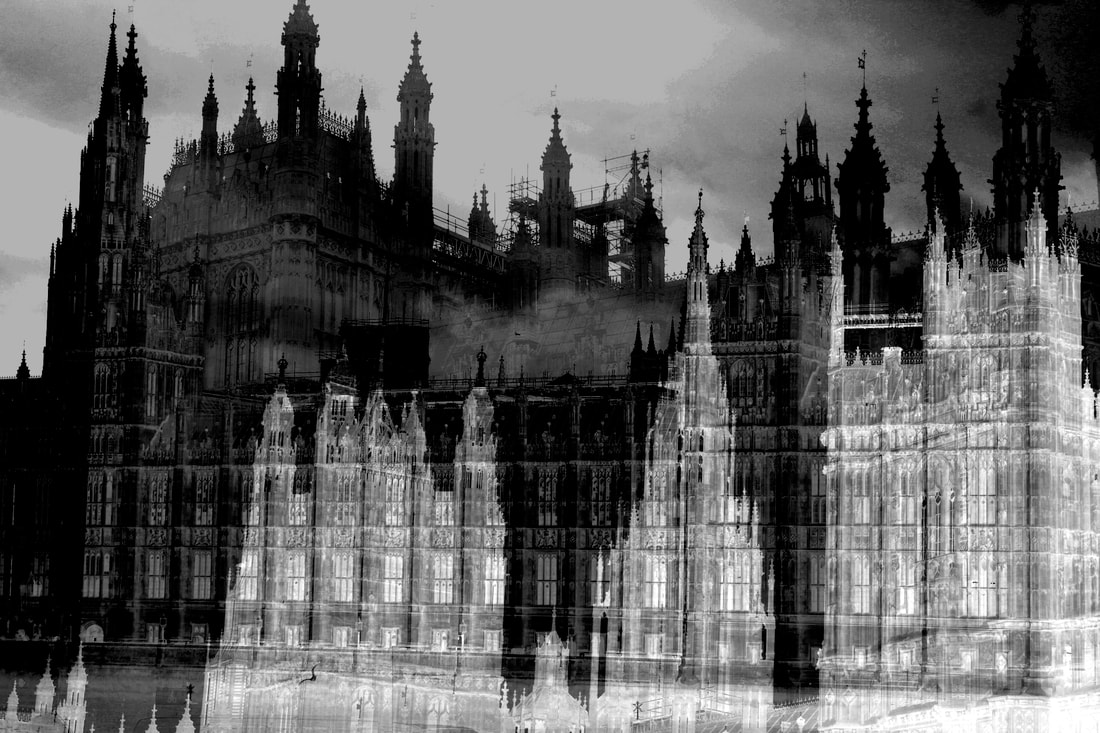
WWW: I like how each layer stand out and creates a gothic-industrial like shadow. I also like that the clouds in the first layer act as fog for the top layers because it creates a Victorian London atmosphere. I love how the buildings details stand out because of the vigorous differences in contrast and I love how the viewer can vividly see the detailing in the rooves because of the contrast between the layers. I think this picture is very successful at conveying the details in the building and I like how the multiple perspectives emphasis on the details by showing multiple copies of them.
EBI: The scaffolding disrupts the shadow in the sky and also causes a dark block to form near the middle of the picture which partly distracts the audience.
EBI: The scaffolding disrupts the shadow in the sky and also causes a dark block to form near the middle of the picture which partly distracts the audience.
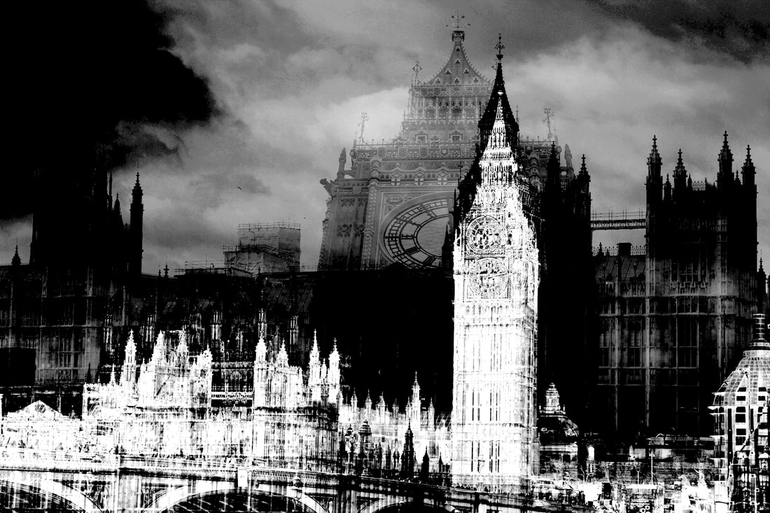
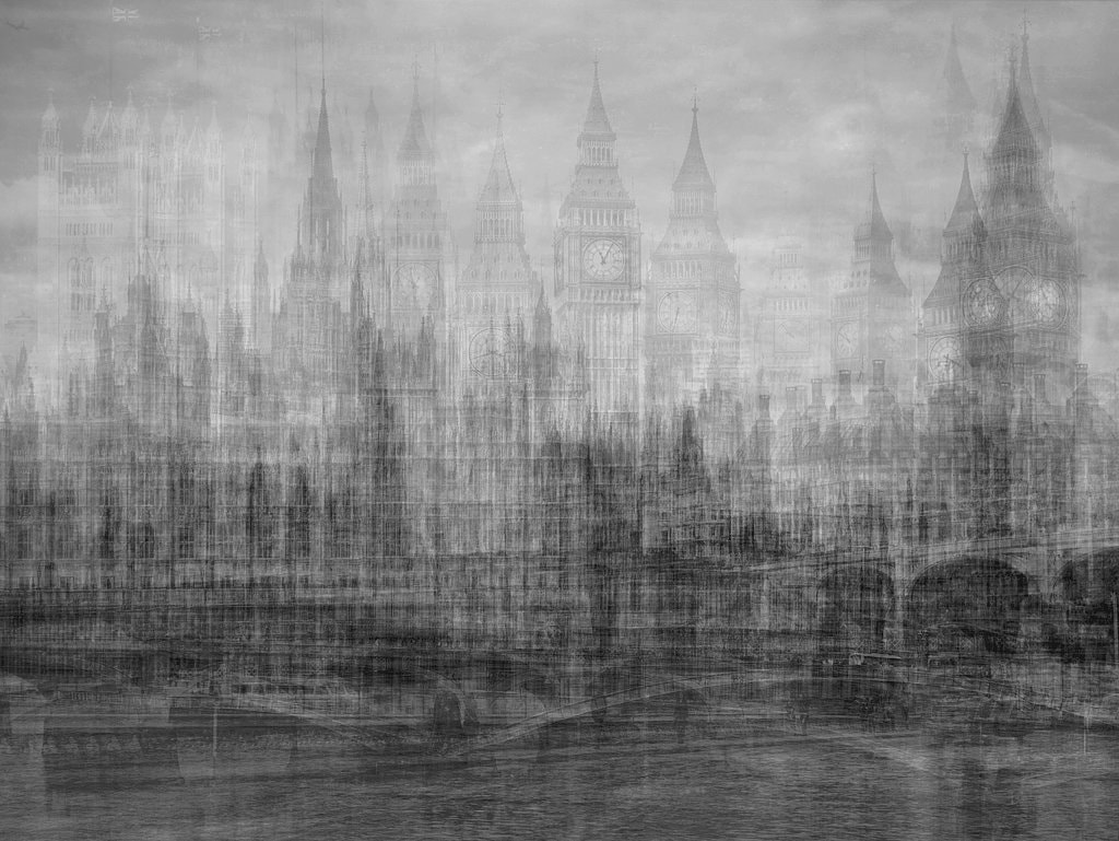
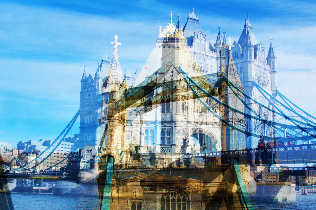
sWWW: I like how each layer contrasts impactfuly and makes the details of each layer stand out. The picture holds a stark nature which conveys the building's historical past. I also like the contrast between the modern art style with the gothic atmosphere released by the image portraying multiple perspectives of time to the viewer. I love how the gray tones of the black layer also highlight details in the main building and emphasis on the historical architecture. I also love the imposing layer of the clock a it distorts the reality of the image and adds an ominous atmosphere to the scene, whilst also showing a lot of details due to the increased size of the object.
EBI: It would be better if there was less cloud cover on the top left corner because the darkness distracts the viewer. I also dislike the scaffolding as it removes some of the historical atmosphere created by the image.
EBI: It would be better if there was less cloud cover on the top left corner because the darkness distracts the viewer. I also dislike the scaffolding as it removes some of the historical atmosphere created by the image.
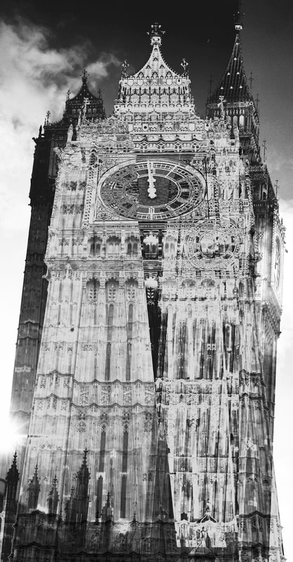
WWW: I like how the overlayed parts of the image create unique contrasts that emphasis on the structures details. I also like how there are multiple copies of the same building because it multiplies the perspective which adds more focus to the features. Furthermore the angle of the main layer (in the middle) creates an imposing viewpoint of the clock tower and evokes an ominous atmosphere which develops the gothic scene I was trying to create. I love how the buildings exemplify the industrial architecture from the industrial revolution because it makes the audience focus more on its historical routes. I also like how the image isn't too distorted as the physical form of the building is left unchanged.
EBI: I dislike the bright light of the sun at the bottom left of the picture because it distracts the viewer.
EBI: I dislike the bright light of the sun at the bottom left of the picture because it distracts the viewer.
Overall, I think this has been my strongest development as it has been very successful at using different perspectives. This is because the pictures multiplied-contrasted perspectives show different physical viewpoints as well as perspectives in time and history, which help emphasis on the structure's features and beautifully links to my themes.
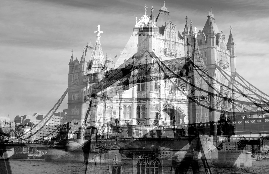
How to: I layered the images then flattened them. After I gray scaled them by clicking Image>Mode>gray scale then I adjusted the curves by going into Image>adjustments>curves.
Final Development: High Contrast
Inspiration: Keld Helmer-Peterson
Keld Helmer-Peterson was a Danish photographer that I drew inspiration from when doing this development. This photographer was originally inspired by Albert Renger-Patzsch who was a german photographer that focused on the New Objectivity Movement. Keld gained fame through coloured photographs but also released several books of black and white images that explore dramatic contrasts of tone. Keld Isolated the details in his pictures and gave them a new meaning, Petersen's aim was to catch the essence of modern life by sublimating color and form and deleting the depth of field thanks to the constant use of small apertures: the world therefore appears as a flat surface full of interesting geometrical patterns. I drew inspiration from the pictures in his black and white books which were of metal structures that gave off an industrial aesthetic that I tried to recreate.

|

|

|
Method: I went into central London, specifically coal drop yard, and took pictures of metal structures with the intent of contrasting the images to make the subject (gas holders) stand out by making it contrast with the surrounding environment. For this development my aim was to emphasis on parts of the industrial structure to create a perspective that focused on their interesting features. For this development I decided to revert back to focusing on industrial objects, but this time I tried to use a high contrast on the photos to emphasis on their structural features, instead of reflecting them.


WWW:I like how the pictures above all make the structure stand out and maintain the industrial style of architecture I was trying to convey. I also like how some of the pictures present different structures because it creates a more varied gallery. I like how the different perspectives and angles all emphasis on different features of the structure.
EBI:However, some of the structures on the photos don't have smooth edges and are quite pixelated. I tried to fix some of the pictures by using the polygonal lasso tool.
EBI:However, some of the structures on the photos don't have smooth edges and are quite pixelated. I tried to fix some of the pictures by using the polygonal lasso tool.
My Favorites:


WWW:The 4 photos above are my favorites because the structures stand out most because the lines around the structure are smooth because I used the polygonal lasso tool to straighten them. As well, I like how I've made the structural feature stand out by contrasting it with the surrounding nature/ or by isolating it (like Keld). Therefore, I think I've been successful with contrasting a perspective to emphasis on the features of a structure.
EBI: However, Some of the lines are still rough and pixelated, which could be fixed with further editing. As well, if I were to redo some of the photos I would try to get rid of the leaves that float above the bush to create a neater piece of work and further isolate the structure from the surroundings.
EBI: However, Some of the lines are still rough and pixelated, which could be fixed with further editing. As well, if I were to redo some of the photos I would try to get rid of the leaves that float above the bush to create a neater piece of work and further isolate the structure from the surroundings.
WWW:Overall I like how the development turned out because I got some really good photos that were clear and sharp. As well I feel like my work links to the artist well because I made the features on my pictures the focus and on some of my pieces I isolated them and gave a different perspective. Moreover I feel like I captured modern life (which was what Keld also did) by taking my pictures in a regenerated area that has both old industrial structures and newly mad buildings with overgrown (eco aesthetic) nature.
EBI:However, 3 of my pictures(specifically the last 2 in the slideshow above) weren't as sharp as my favorite ones due to the fin metal components making up the structure being half contrasted, making them look quite grainy. I also would've like to of taken more pictures on different types of industrial structures to make a more varied development as the most successful images were of the same type of structure.
EBI:However, 3 of my pictures(specifically the last 2 in the slideshow above) weren't as sharp as my favorite ones due to the fin metal components making up the structure being half contrasted, making them look quite grainy. I also would've like to of taken more pictures on different types of industrial structures to make a more varied development as the most successful images were of the same type of structure.
Final Piece:

WWW: I like how there is contrast between nature and the industrial structure as well as hyper contrast between the scene and the sky. I also Like how clear the details on the gas tower are. I like how the picture has a lot of clarity and the structure is very impactful. The image mimics a chiaroscuro effect, effecting the whole composition and imposing the details of the environment on the viewer, achieving a sense of volume on a 3 dimensional object. I also like how the low angle makes the size of the gas holder more imposing and eyedrawring.
EBI: the picture is a little overwhelmed by the nature and it would of been better to have focused a little more on the structure-though the contrast between the structure and nature did make the photo stand out more.
EBI: the picture is a little overwhelmed by the nature and it would of been better to have focused a little more on the structure-though the contrast between the structure and nature did make the photo stand out more.
How to: I used the filter-stamp in filter>filter gallery>sketch>stamp
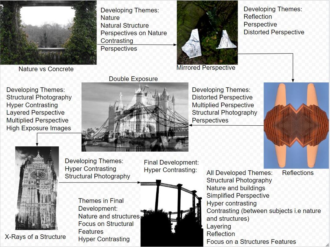
Development Chart:
Concluding Environment:
Overall, the environments topic in GCSE Photography was really enjoyable a this topic allowed me to explore a lot of different areas in photography. I feel that my Photoshop skills have really improved in this section. I also, think my photography skills have improved a lot, and I've taken pictures of many interesting things that you can find in our natural world whether this is man-made or natural. I think that environments has been lots of fun when it comes to my ability in photography and Photoshop. Furthermore, I liked the the themes I developed because it allowed me to interpret the way I wanted the viewer to see my work . I think I have proven well what my different capabilities are as a learning photographer and will use the skill set I've learnt from this unit in the future.
