Pinterest Board:
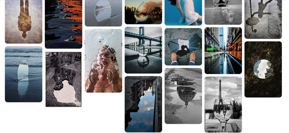
https://www.pinterest.co.uk/wilep3y1566/reflection/
Opening Tasks: My 3 Strands
First Task: Reflections in Water
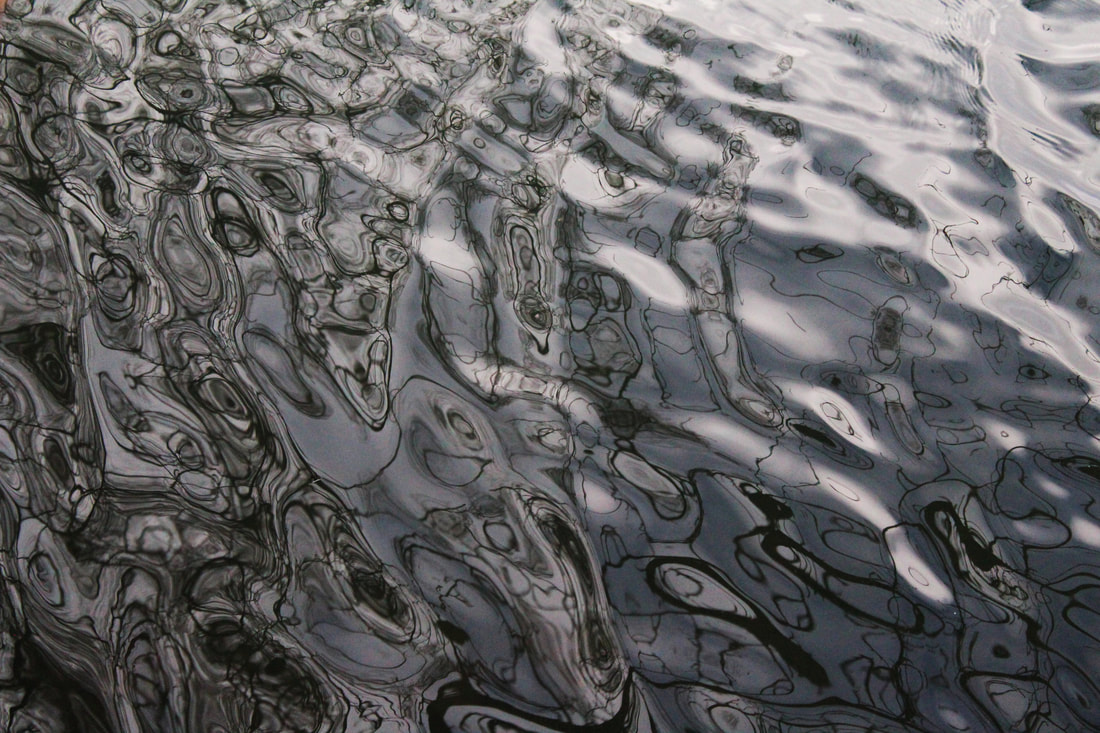
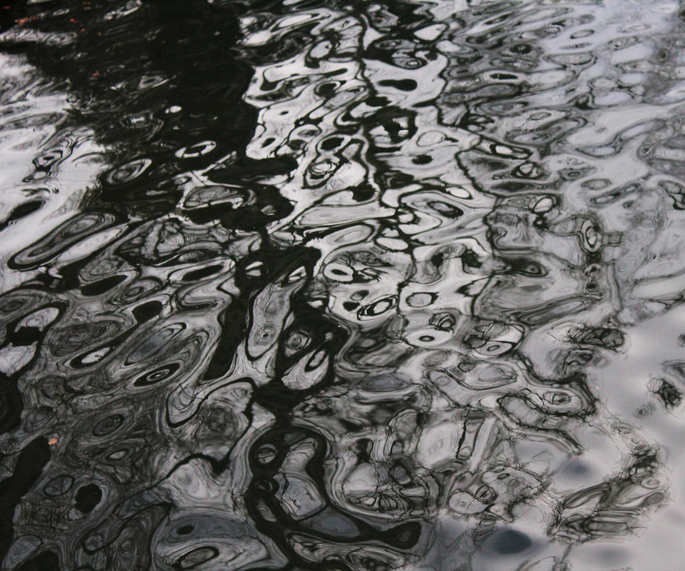
Andrew Hewett:
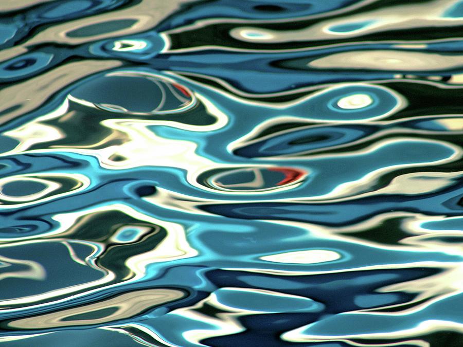
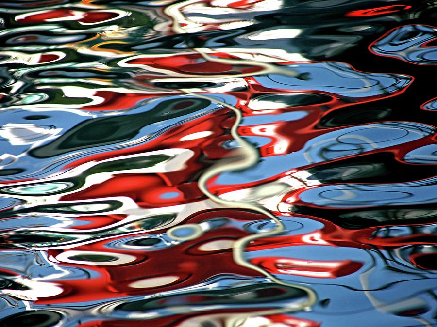
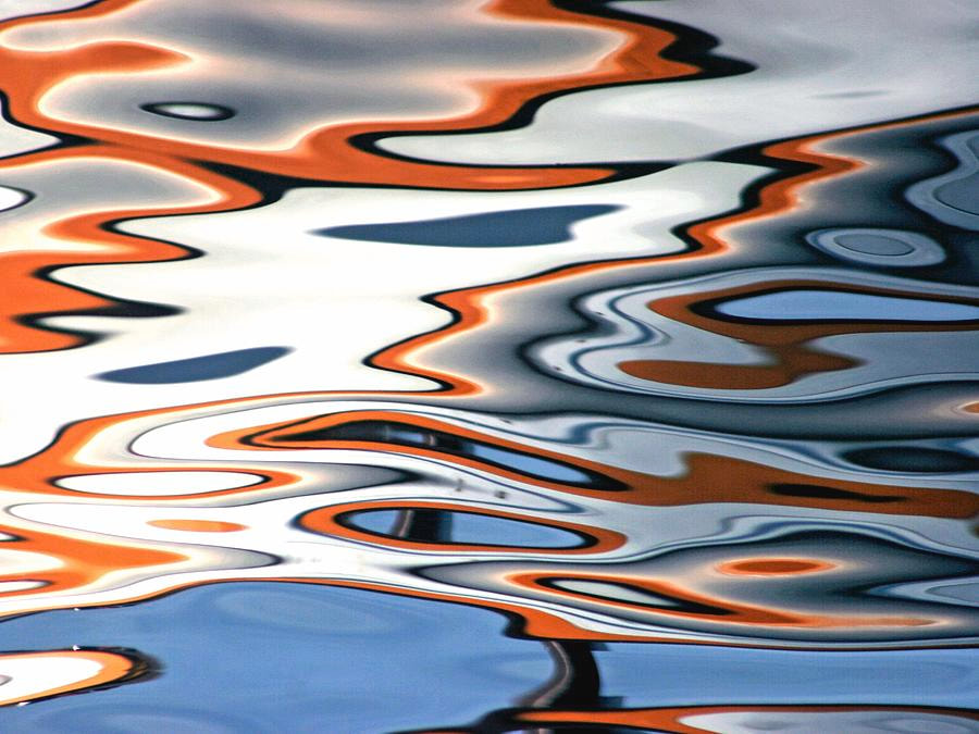
8 years ago, Hewettt became enthralled by the Abstract nature of the Boat Reflections in the Oily Sea Water by the place he was shooting for "my Lovely Kalk Bay Harbour Calendar publication". He became dedicated to building the best collection he could around these distorted reflections he could see in the oily water. Hewett tirelessly photographed during as many weather conditions, tide levels, oil levels and times of day to capture all the possible colours, reflections and movement as possible. All of his images occurred during a split second in time. This type of photography remains his passion to this day.
Hewett was Matriculated at Muizenberg High, went to the Navy and did Electronic Warfare. He originally wanted to get into photography but couldn't afford to study, so he became a Photographic Salesman and a little later Managed One Hour Photo Labs for about 10 years. He then studied the New York Photographic course of literature and then made the jump to freelance photography and has been a Fine Art Photographer for the past 12 years.
Hewett was Matriculated at Muizenberg High, went to the Navy and did Electronic Warfare. He originally wanted to get into photography but couldn't afford to study, so he became a Photographic Salesman and a little later Managed One Hour Photo Labs for about 10 years. He then studied the New York Photographic course of literature and then made the jump to freelance photography and has been a Fine Art Photographer for the past 12 years.
|
|
|
I liked how the artist captured unique and colourful patterns in somthing as common and looked past as water. I loved the movement and texture in the water as the highlights of colour outline every wave and ripple that takes place. The vibrance is also gripping and creates a vivid atmosphere that draws the viewer into each vigerously outlined wave.
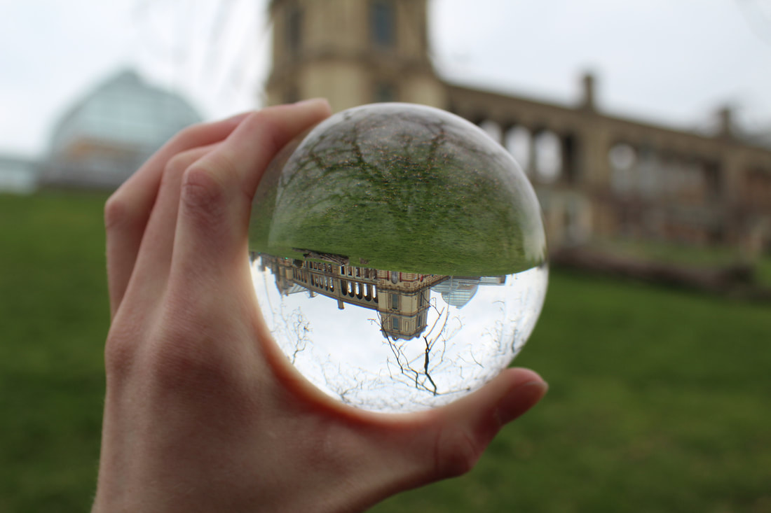
Method: I want to go to the lake in alexandra palace and take pictures of the sorrounding trees being reflected in the water. This is because its winter so the trees will be bare so the branches will be good at outlining the ripples in the water.
The Photoshoot:
WWW: I'm happy with the pictures I captured because they show the distinct reflection of the trees above it very well. I like how the reflection of the branches are distorted by the movement in the water because it shows the details of the waters surface, creating a really interesting effect. I also like how vibrant some of my pictures are and the amount of contrast there is between the water and the reflections.
EBI: I dislike some of the photos because they don't show any reflections of the surrounding nature. As well, my ISO was too high on some of the images- resulting in them being too bright and white- reducing the pictures vibrancy and colours.
Also, it was hard to combat the debris of leaves that was floating in the water, so some of the pictures have branches and leaves floating on the surface of the water which is very distracting. When I start editing these photos Ill try to get rid of some of the debris.
Edits:
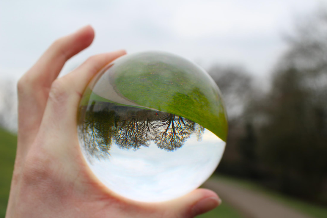
WWW: I like the contrast in the pictures because it makes the reflection stand out, which emphasizes more on the movement of the water and the details on the surface. I also love the details of the branches in the water and that there are loads of different outlines that make the water look like a topographic map with contour outlines. I also love the large black areas on the water as it mimicks the physical properties of oil and links to the artist's style a little.
EBI: I dont like how there is still some debree in the photos as it was hard to edit out with the spot healing brush because it was too large ,so the spot heal brush kept creating blurs.
EBI: I dont like how there is still some debree in the photos as it was hard to edit out with the spot healing brush because it was too large ,so the spot heal brush kept creating blurs.
My favorites:
This is one of my favorite photos because of how clear the outline of the branches are on the water. I also like how many "contour line" their are in the top left corner as they show many different ripples in the water. I also love how the branches mimick how oil looks like when its poured in water and creates an unidentifiable setting. I think that the patterns made really make the picture stand out and the contrast between the two sides- as the left side has may more ripples than the right so the viewer is immediately drawn towards the patterns.
However I wanted to increase the contrast to make the outlines darker, by changing the levels and contrast on the photo, but the quality was reduced each time I tried to do this too much.
However I wanted to increase the contrast to make the outlines darker, by changing the levels and contrast on the photo, but the quality was reduced each time I tried to do this too much.

This photo is one of my favorites becuase the outline are extremely clear beacuse the darkness of them stand out vigouresly against the grey background of the water. I'm happy that it was so cloudy that day becuase it made a very plain envireoment for the reflections to stand out in.
However, the picture is a little grainy in areas as I increased the contrast and changed the levels too much.
However, the picture is a little grainy in areas as I increased the contrast and changed the levels too much.
This image is one of my favorites because of the variation in the patterns on the surface, as in the top left corner is very dark and looks like a dark oil spilled into the water. Furthermore, I like how the picture has a cold nature and also radiates a sense of timelessness; like all the motion has been permanently paused.
Sadly some red leaves made their way into the picture and create a little distraction and also contrast heavenly with the black and white feel of the image.
Sadly some red leaves made their way into the picture and create a little distraction and also contrast heavenly with the black and white feel of the image.
Overall, I really liked this response as I was able to create pictures that suspended water in time and showed a lot of motion. Furthermore, I like the patterns the reflections made as it made the water seem like a completely different form of matter. I also loved how the reflection sometimes mimicked oil patterns- allowing the pictures to link to the artists work.
It was annoying that the quality of the photos wasn't perfect however if I were to do this response again I would try to have a lower shutter speed or use a camera that has a higher max ISO setting than the camera I was using.
It was annoying that the quality of the photos wasn't perfect however if I were to do this response again I would try to have a lower shutter speed or use a camera that has a higher max ISO setting than the camera I was using.
I liked this task a lot, however I want to be able to explore themes in my work and I think it would be quite hard to incorporate a lot of themes into works that only involve real reflections.
Processes:
|
To make my pictures very contrasted and dark I changed the contrast and the levels.
Image>adjustments>contrast/brightness Image>adjustments>levels I also used the spot heal brush to remove some of the leaves that were distracting in the photo. |

spot healing brush
|
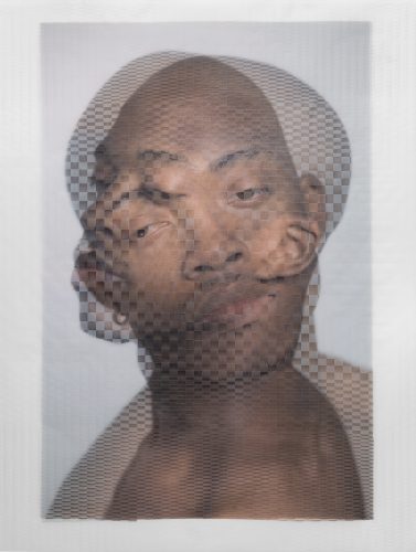
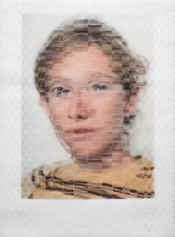
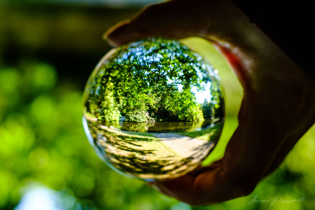
Second Task: Reflection in People
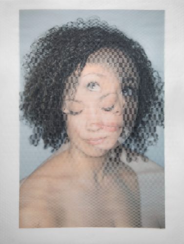
David Samuel Stern:
David Samuel Stern is a photographer, artist and teacher who is based in NYC.Stern was born in 1982, in Highland Park, now living in Brooklyn: New York and he graduated from Washington University. His work revolves around translating his photographs and portraits into tangible objects, which attract many viewers from around the world. As a child, he drew constantly, he remembers visiting art museums with his mother when he was young, but he only became passionate about photography when he did a darkroom-photography course at a local college during a high-school summer break. "I had enjoyed photography in a casual way before that, but when I learned how the medium actually worked, and got to know its weird machinery and chemicals and their smells, it seemed special and I began to take art as a whole seriously".
|
|
|
I loved how the artist was not only able to show reflections in an unconventional way but also reflect different emotions and personality's of someone in one photo. I also liked how some of his woven photos contained more than 1 woven picture ( as the picture on the far left above has 4 faces woven into each other). Moreover, I found it interesting that the photos distorted the persons face yet the persons countenance and expression still remained clear to the viewer.
Method: For this response I wanted to reflect a person's background in an street style urban environment using the surroundings and the subject style to instill a feeling of raw, stripped back expression. I went to different areas such as east finchely and Alexandra palace to take these pictures as I know there are places within those areas that contain the scenery I wanted to capture my model in. The main theme in this task was distortion and expression (of someones background and upbringing).
The Photoshoot:
WWW: The lighting was easy to work with as it was a bright day which made the quality of my pictures better and allowed my ISo and shutter speed levels to be very flexible. I'm happy that I was able to keep the focus on the subject whilst also incorporating the desired element of the scenery into the picture. I am happy with the settings chosen because the graffiti and tunnel fitted well with my aim for this response. I also appreciated the opportunity to juxtapose the natural field used and the model's style and expression. The images I captured link to my theme of background and expression as the model showcases her street style and portrays an urban working class upbringing.
EBI:I believe a wider range of expressions could have been encouraged, to vary the images and it could have been more interesting to layer images of different people. Furthermore, I think I could of explored using different compositions to make my model stand out in a larger variety of ways. Due to the high level of brightness from the weather, a few of my pictures are a little over exposed which I tried fixing by reducing the brightness.
EBI:I believe a wider range of expressions could have been encouraged, to vary the images and it could have been more interesting to layer images of different people. Furthermore, I think I could of explored using different compositions to make my model stand out in a larger variety of ways. Due to the high level of brightness from the weather, a few of my pictures are a little over exposed which I tried fixing by reducing the brightness.
Finished product:
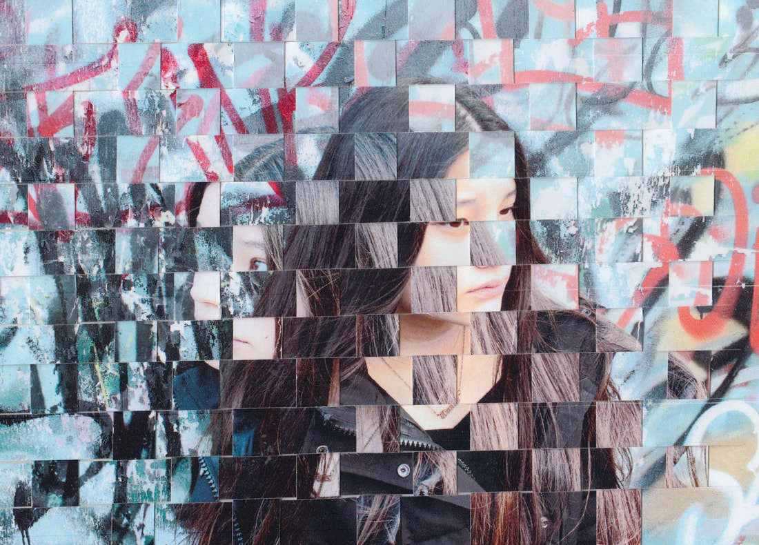
WWW:I like how the distortion doesn't distract form the core purpose of the image and I like how I was able to get the model looking in opposing directions as it capitalizes on the theme of expression. This is because the face looking to the right portrays a scared emotion whilst the face looking to the right has a hint of attitude- like its masking the models true emotions. The weaves are neat and there are no gaps between the slips. With both images having similar backgrounds it allows the model to be the main focus. The graffiti is nicely distorted when woven as the two images increases the representation of the red, which draws your eye into the picture.
EBI: I would have preferred the models hair to have not been on the models face when the two images were woven over each other, as I think this disguises some of the model expression and removes some of the audiences focus away from her face. The image is a little over exposed as well which could've been fixed with a lower ISO.
EBI: I would have preferred the models hair to have not been on the models face when the two images were woven over each other, as I think this disguises some of the model expression and removes some of the audiences focus away from her face. The image is a little over exposed as well which could've been fixed with a lower ISO.
Processes:
I varied the brightness and contrast of the images.
Image>adjustments>contrast/brightness
Image>adjustments>levels
Image>adjustments>contrast/brightness
Image>adjustments>levels
Overall, I think this strand was nice to explore, however I want my work to be more digitally focused and involve more of the environment.
Third Task: Distorting Reflections
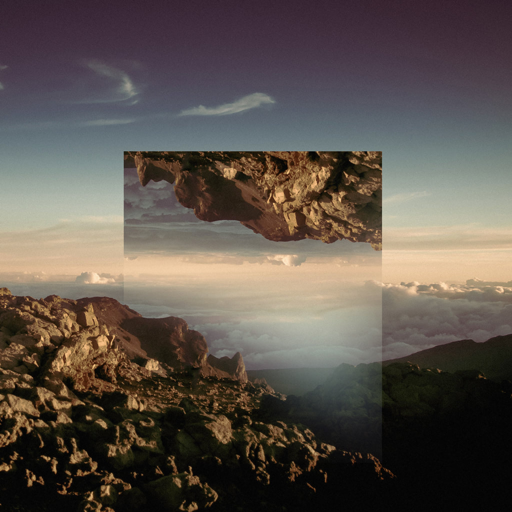
Victoria Siemer:
Victoria Siemer is a Brooklyn-based American graphic artist who focuses mainly on photo manipulation using Photoshop.she graduated from SUNY buffalo with a BFA in communication design.Victoria says that "Digital manipulation has given me the ability to create my own alternate realities where anything is possible. Sometimes it feels like magic".
Siemer's work mainly revolves around geometric reflections (digitally-altered landscapes), in which the artist digitally overlays a landscape with copied area of itself .These geometric reflections have been manipulated and turned which makes the viewer focus on certain features within the landscape.
Siemer's work mainly revolves around geometric reflections (digitally-altered landscapes), in which the artist digitally overlays a landscape with copied area of itself .These geometric reflections have been manipulated and turned which makes the viewer focus on certain features within the landscape.
|
|
|
I love how the artist distorts physics and experiment with different perspectives of the environment and draws the viewers eyes onto detailed parts of the scenery. I also like how the layered images blend in a little with the background images so they don't seem too out of place but still have the ability to draw immediate attention.
Method: I wanted to take pictures of different of setting or angles of the same setting and layer the pictures over each other in circles to create a sense that the viewer is looking through wormholes into different realities. For this I wanted to focus on natural setting so I went around Alexandra palace park and high gate woods. The theme I was aiming to convey was a breakdown/hole in dimensions to link back to the artists theme of perspectives and distorted physics.
Draft:
WWW: I'm happy that I was able to capture a variety of natural settings around my local area- as well as a photo from central London that I thought would be good for this response. I think it was also good that I captured different angles and viewpoints of the same subject as I think layering those pictures over each other will create a good distorted image and show a nice level of contrast and also similarity. It was also nice that the different trees I captured were at different stages of their seasoned life cycle as many trees still didn't have any leaves on them from the past winter, however their were still some early blooming flowers and trees, meaning I could capture pictures of nature that have opposing subjects- helping me contrast the layers that I use.
EBI: I think that the pictures I took aren't as interesting as they could've been if I went to other places like kew Gardens.The lighting on the day I took these photos wasn't great as it was quite cloudy and grey. This diddnt help me when trying to make my photos as clear as possible as it meant I had to use a lower shutter speed to get s much light as possible, which made my photos a little blurry. As well, the lighting makes the natural settings captured seem less vibrant and colourful. If I were to retake these photos again I would plan to do it on a much sunnier date and also go to an area that has a higher abundance of blooming flowers and nature.
EBI: I think that the pictures I took aren't as interesting as they could've been if I went to other places like kew Gardens.The lighting on the day I took these photos wasn't great as it was quite cloudy and grey. This diddnt help me when trying to make my photos as clear as possible as it meant I had to use a lower shutter speed to get s much light as possible, which made my photos a little blurry. As well, the lighting makes the natural settings captured seem less vibrant and colourful. If I were to retake these photos again I would plan to do it on a much sunnier date and also go to an area that has a higher abundance of blooming flowers and nature.
Final Edits:
WWW: I'm happy with how bluntly my layers stand out in their respective images as it helps vigorously convey my idea of different perspectives being shown by dimensional holes. I'm happy that I was able to explore using different angles in my backgrounds and layers as the contrast between the angles in my background and layers to draw the viewer in. I also love that I was able to capture plants that were at different stages of their life cycle, as the trees in high gate woods were still bare and looked like they were in the middle of winter, whilst the trees in Alexandra park has nice pink flowers on them- like they were in spring(this would later influence the way I presented my images). I'm also happy that I was also able to include a picture from the city as this helped vary the scenery in my images a little more.
EBI: I think I could've made the images I layered more different to each other ,like maybe cross different environments over to each other (like a man made background with a natural layer). I also think that the images could be a little more interesting as the trees at this time of year don't have much colour to attract people to the images.If I were to do this response again I would go to an area with more colourful plants and also explore a more urban environment too.
EBI: I think I could've made the images I layered more different to each other ,like maybe cross different environments over to each other (like a man made background with a natural layer). I also think that the images could be a little more interesting as the trees at this time of year don't have much colour to attract people to the images.If I were to do this response again I would go to an area with more colourful plants and also explore a more urban environment too.
Presentation:
WWW: I like how the tree in the first picture is fully bloomed as it releases a spring feel, and evokes an atmosphere of rebirth. I like how the picture maintains its prettiness as the angles on the layer and background don't contrast, allowing the picture to have a fluid nature that doesn't look off putting. I actually quite like how the layer blends a little into the background as it links to the artists work- by attracting the viewer to focus on it without being too out of place.
EBI: I think it would've been nicer if the lighting was better as the grey sky takes away from the spring atmosphere. I also think that this picture could link to the theme of distorted dimensional holes more as the pictures are both very similier. I also think my picture could've been a little clearer as my shutter speed was quite low- but I could've used a longer shutter speed to get more light and stop blurring by using a tripod.
EBI: I think it would've been nicer if the lighting was better as the grey sky takes away from the spring atmosphere. I also think that this picture could link to the theme of distorted dimensional holes more as the pictures are both very similier. I also think my picture could've been a little clearer as my shutter speed was quite low- but I could've used a longer shutter speed to get more light and stop blurring by using a tripod.
WWW: I like how I was able to explore different perspectives more with this photo as well as different angles. I like how there's contrast between these two photos even though they show very similier settings. I think I achieved this as the lighting different as well as the angle and perspective. This also helps it link to the artists work as it again nicely mimics the artist's technique as the layer stands out well but also doesn't look out of place. I think this picture also links to the theme of dimensional holes ( or wormholes) as the perspectives and lighting are so different. I'm also happy that rubbing out the bottom left corner of the layer helps it blend a little more with the background so it doesn't look too out of place. Both photos as well are quite clear due to the weather being better, so I could afford to have a quicker shutter speed and prevent the exposure being too high. The lighting also helps the image convey a summer atmosphere.
EBI: I think the images could involve more colour to make it more interesting as the green and brown aren't very eye catching to the audience. Furthermore, the images do look a little too similier which works with what I was trying to go for, however it does make it a little less interesting.
EBI: I think the images could involve more colour to make it more interesting as the green and brown aren't very eye catching to the audience. Furthermore, the images do look a little too similier which works with what I was trying to go for, however it does make it a little less interesting.
WWW: I love how the layer stands out so well due to the change in lighting but it also holds a similarity with the background as the subjects in both layers are the barron branches. The layers show a change in time which helps evoke the theme around dimensional holes and physics breaking down.The bare trees also create a winter atmosphere that compliments the presentation of the 3 pictures I've chosen as my favorites. I also think that I mimicked the artists style quite well in this photo. I like how the branches release an eerie atmosphere that makes the scene look like a winding haunted forest, giving the picture emotions of fear.
EBI: I think that the image could be a little more clear and detailed. I also think that the top-middle part of the image could be made darker by using the burn tool, as I think the sun rays attract attention and remove part of the shadowy figure of the branches.
EBI: I think that the image could be a little more clear and detailed. I also think that the top-middle part of the image could be made darker by using the burn tool, as I think the sun rays attract attention and remove part of the shadowy figure of the branches.
I decided to present the pictures above this way because I thought it show a narrative of transitions between spring summer winter as the nature shown in the images were all at different stages of their life cycle. The first picture includes a fully bloomed pink tree which releases a spring feel, the second picture has a nice yellow lighting from the sun- releasing a summer feel and the last picture includes a lot of Barron and bare trees which makes it look like the pictures were captured in winter. I thought that this transition between seasons in the pictures made the presentation of them more interesting.
Overall, I liked the concept of this response and I want to continue doing work around the themes I tried exploring. I'm happy that I was able to focus On how I wanted to present these photos and I liked thinking about contrasting perspectives of similier environments. However, I think that this response could've specifically explored the themes I was trying to convey more. Although, I feel like I linked my work more to the artist well and was successful at using her technique and I could've tried experimenting with using different shapes for my layers.
Process:
The Plan for My Developments:
My plan for my developments is to explore different distortions that revolve around themes of perspectives and also link to the overall theme of reflections. I also want to involve thinking about different atmospheres and juxtaposing environments to vary my responses to this unit and make my developments more interesting. I might also look into exploring breaking physical laws in my images the make them seem perculiar and attract attention.
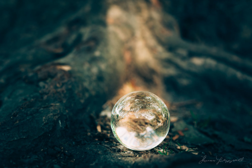
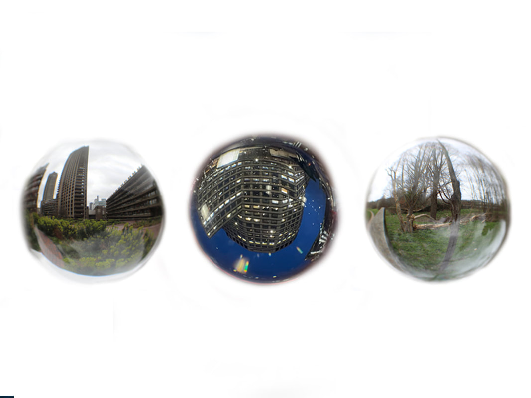
First Development: Distorted Reflections of Nature
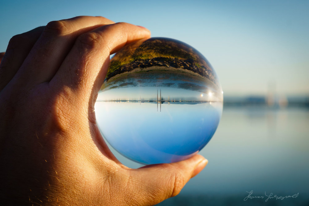
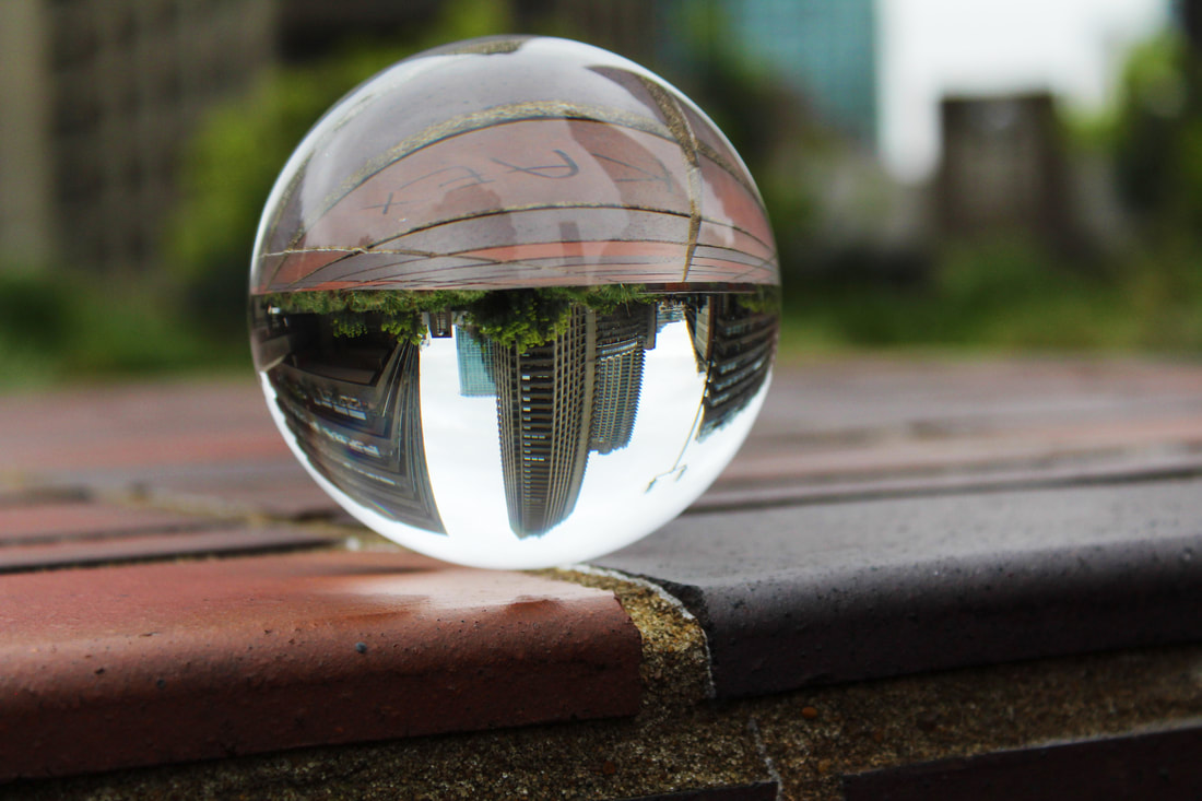
Thomas Fitzgerald:
Thomas is a fine art photographer and writer: specialising in photography related content as well as travel writing and street photography.He shoots street and travel photography as well as maintaining a portfolio of landscape and nature and abstract photography. He was previously a designer, animator and visual effects artist working in television and film.His love of all things visual though has always pushed him towards photography. The ability to capture a moment in time and freeze it for all to see became his main passion and so his skills as a designer and artist was merged into his love of photography. Combining the two disciplines, Thomas uses photography as a tool for artistic expression.He has an eye for seeing hidden details in the world around us and likes focusing on the little things that most people don't notice.
|
|
|
I like how the artist uses the lensball to distort different environments in nature and focus the audience onto features in the scenes he captures (similier to siemer). I like how the lensball distorts the surroundings and turns the background upside down as it links to the themes I want to explore throughout my developments ( such as breaking down physics). The lensball also makes the picture seem quite interesting as the distortions made are quite unique and unusual (especially as there made in front of the camera and not digitally).
Method: I want to go to Alexandra Park to take take pictures of nature in the area, as well as the palace itself, to mainly explore distorting the environment. I want to make sure my camera is focused on the image inside my lensball- to help do this I will use a tripod to make sure my camera doesn't move about due to the large amounts of wind and also make it easier to take pictures as I'll have to hold the lensball. I also want to explore using different setting on aperture.
Draft:
WWW: I like how interesting some of the images look inside the lens ball as the flipped background creates nice horizon lines and attracts the viewers eye. Furthermore, I like the contrast between the green grass and the bare branched trees and although it was sometimes difficult, I'm happy with the clarity of the images. I'm also pleased with how many different trees and scenes I captured. I also think that my work links well to the artist, where I captured a moment in time and froze it.
EBI: The lighting wasn't good as it was very cloudy and grey day, This was disappointing as it reduced the vibrance of my images and in my view, rendered them slightly less interesting. I also dislike how my hand is in a lot of the images, to combat my hand being too distracting I want to make sure that the image inside the lens ball stands out as much as possible through blurring my hand and by making the image in the lens ball more vivid, contrasted and saturated. I also think I could have had a higher ISO on some of these pictures. If I were to do this again I would take my pictures on a more sunny day and experiment more with putting my lens ball in different positions.
EBI: The lighting wasn't good as it was very cloudy and grey day, This was disappointing as it reduced the vibrance of my images and in my view, rendered them slightly less interesting. I also dislike how my hand is in a lot of the images, to combat my hand being too distracting I want to make sure that the image inside the lens ball stands out as much as possible through blurring my hand and by making the image in the lens ball more vivid, contrasted and saturated. I also think I could have had a higher ISO on some of these pictures. If I were to do this again I would take my pictures on a more sunny day and experiment more with putting my lens ball in different positions.
Final Edits:
WWW: I like that I was able to make the images inside the lens ball stand out more as they looked better with a higher level of vividness and saturation. Moreover, I like the different looks of nature that I captured as the different trees convey different seasonal atmospheres. I also like how I left the lens ball images inverted as it links to my theme of breaking down physics. The distortions also link well to my themes on distorted perspectives too.
EBI: I think some parts of the photos are too bright and distracting which could be fixed by going over those areas with the burn tool. I also think the images could be a little more chaotic to link to my theme of breaking down physics more. I also don't like how my last 2 photos in the slideshow are overexposed, this was because the ISO was too high as I was trying to compensate for the lack of lighting.
EBI: I think some parts of the photos are too bright and distracting which could be fixed by going over those areas with the burn tool. I also think the images could be a little more chaotic to link to my theme of breaking down physics more. I also don't like how my last 2 photos in the slideshow are overexposed, this was because the ISO was too high as I was trying to compensate for the lack of lighting.
My Favorites:
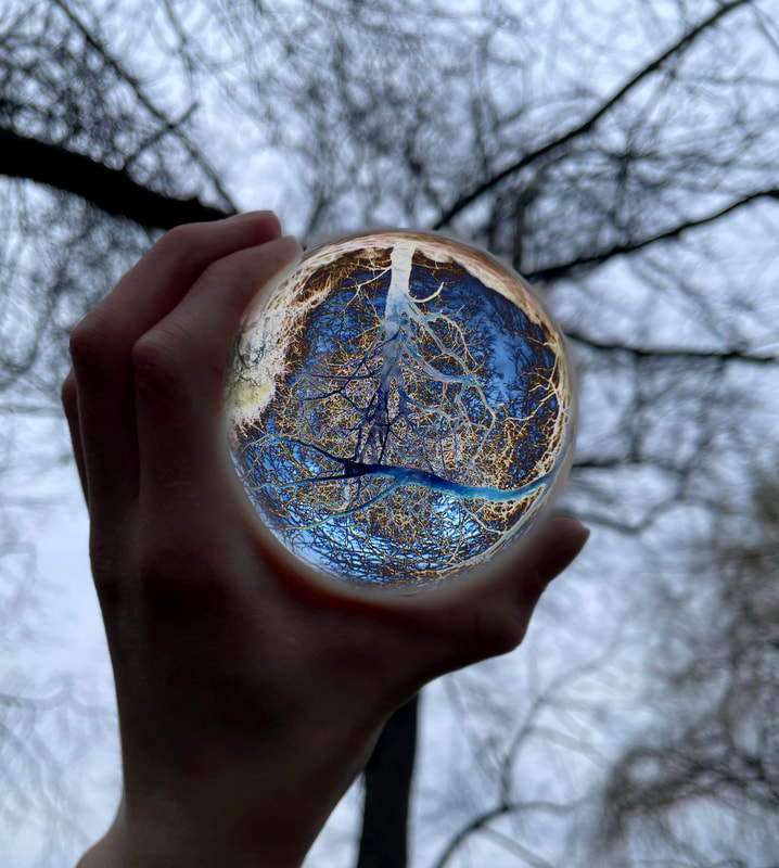
WWW: I love how eye drawing the shadowy figure inside the lens ball is as the strong dark colour of the branch contrasts heavily with the light grey sky. I like how the branches create an intricate pattern that almost looks like a system of blood vessels. I'm also very happy with the amount of refraction inside the lens ball as it links to my theme well.The picture in the lens ball is also clear, and not too overexposed. I feel like my use of aperture in this photo payed off as it helps make the subject the focus, whilst also keeping some of the background form, so the scenery is obvious to the viewer.
EBI: I feel like my hand is distracting and that the sky could have been whiter to increase the contrast ( I'd do this by adjusting the levels). Furthermore, my hand stopped me from adjusting the image flexibly because the adjustments were always too obvious - as when I increase the saturation too much my hand would become red.
EBI: I feel like my hand is distracting and that the sky could have been whiter to increase the contrast ( I'd do this by adjusting the levels). Furthermore, my hand stopped me from adjusting the image flexibly because the adjustments were always too obvious - as when I increase the saturation too much my hand would become red.
WWW: I love how this picture focuses the audience on Alexander Palace. I like how the lens ball is also clear and the picture has a little colour that makes it more interesting without being too distracting. I also think the inverted look of the image helps it look like a peep into another dimension which links to my themes very well. I was also successful as using my aperture to create a strong depth of field. I also love the reflection of the trees onto the lens ball- as it makes the trees look like a shadow on the grass.
EBI: It would have been nicer if it was more sunny as the picture would seem more vibrant and eye catching. Plus, my hand is still a little distracting but introduces a welcome human element.
EBI: It would have been nicer if it was more sunny as the picture would seem more vibrant and eye catching. Plus, my hand is still a little distracting but introduces a welcome human element.
WWW: I love the curved line of the horizon created in this photo as it makes it look very interesting and it draws the viewers sight to travel along it. I also think that the inverted background on top of the curved distorted horizon created links to my themes of distorted perspectives and the breakdown of physics well. The sun rays shining thought the trees also add a nice air of serenity to what could be a chaotic image. I think that the level of vibrance from the grass looks great too.
EBI: It would have been nicer if the background around the lens ball was a little clearer (I could have fixed this by lowering the aperture to lower the depth of field). I also feel like my hand takes up a little too much space in the photograph..
EBI: It would have been nicer if the background around the lens ball was a little clearer (I could have fixed this by lowering the aperture to lower the depth of field). I also feel like my hand takes up a little too much space in the photograph..
Overall, I really enjoyed this development, as I was able to learn how to work with the lens ball and also experiment using different setting on my camera , such as aperture. I'm happy with how the images are distorted and I think I was successful in linking my images to my theme of distorted perspectives. Although, I think I could have linked more to my theme around the breakdown of physics more. If I were to do this development again I would go out on sunnier days and try exploring different compositions.
Process:
Experimental Response: Experimenting with Colour
Method:I wanted to explore breaking down physics and making my pictures look peculiar so I could link them more to my themes that I'm trying to convey throughout my developments. I liked the idea of creating colourful chaotic images within the lens ball that contrasts with the surroundings- making more focus on the picture within the lens ball- whilst also making the lens ball seem magical as though you are peeping into another dimension.
Outcome:
WWW: I like how my editing went successful and I also like the colours chosen inside the lens ball itself as they make the image look a lot more interesting. The colours also conjure the image to look magical and mystical, as I used unconventional colours versus nature. I'm very happy with how clear the outlines of my lens ball are and that I was able to explore different adjustments such as colour balance, hue, curves and I also used the mode gray scale on one of my images. I think that by exploring with different colours I was more successful with creating a narrative of looking through dimensional holes.
EBI: I think the coloring on some of my photos is a little too bright and vigorous which can make the lens ball seem too out of place. I also think that some of the outlines are a little unclear (though I think these blurred outlines compliment the last two photos).
EBI: I think the coloring on some of my photos is a little too bright and vigorous which can make the lens ball seem too out of place. I also think that some of the outlines are a little unclear (though I think these blurred outlines compliment the last two photos).
Favorites:
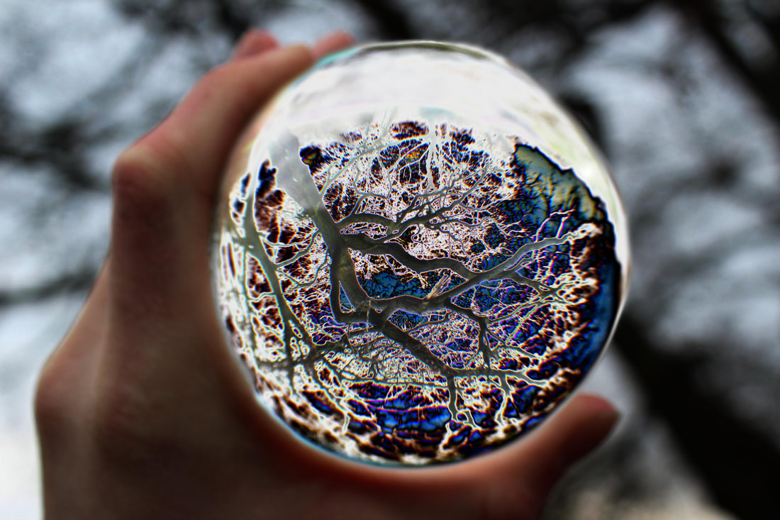
WWW: I love how chaotic the lens ball image is and how it makes the lens ball look mystical. The colour scheme is also very interesting and I like how the yellow outlines of the blue branches and highlights the trees' skeleton. I love how most of the detailing on the tree is not lost due to the intensity of the adjustments. I think this image was successful at creating peculiarity and I think I linked to my themes around physics well, as the lens ball looks like a magical x-ray ball. I also think the blurred cut out lines also compliment the picture as it makes the lens ball look like its illuminated- adding to the magical narrative.
EBI: I think if my hand wasn't in the picture and that that if the ball was just hovering over the background then it would link a lot more to my themes around physics.
EBI: I think if my hand wasn't in the picture and that that if the ball was just hovering over the background then it would link a lot more to my themes around physics.
WWW: I love the variety of colours as it makes the image very interesting and detailed. I also love how the white outlines around the branches makes the trees' figure stand out more and makes the lens ball look like it has a lot of depth to it. I think this picture successfully releases a magical aesthetic. The figure of the image inside the lens ball looks harrowing, but the colours make it seem more beautiful and interesting.
EBI: I think that the outline of the lens ball could have been more clear. Furthermore I think I could have lowered the aperture so that the background was not out of focus.
EBI: I think that the outline of the lens ball could have been more clear. Furthermore I think I could have lowered the aperture so that the background was not out of focus.
Overall, I'm happy that I was able to explore using different adjustments and colours on my pictures to create interest and link more to my themes around physics. I like how the theme around distortion wasn't completely lost in this response and I'm happy with how I successfully made the images look somewhat magical and like the viewer is peeping through a hole in reality. I think the most successful images were the ones with the hue and curves adjusted.
This is because the pictures with the change in colour balance looked too out of place and too fake o be looked into seriously.
This is because the pictures with the change in colour balance looked too out of place and too fake o be looked into seriously.
Process:
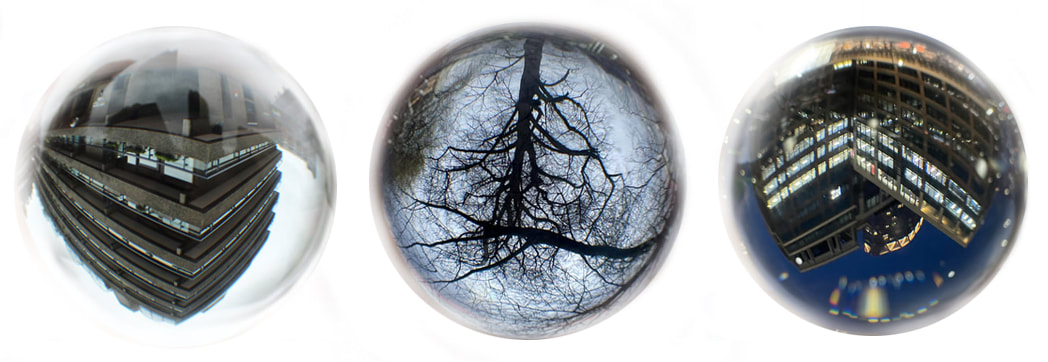
Second Development: Distorted Reflections of Concrete
Le Corbusier
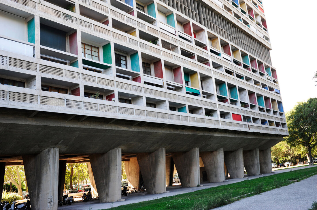
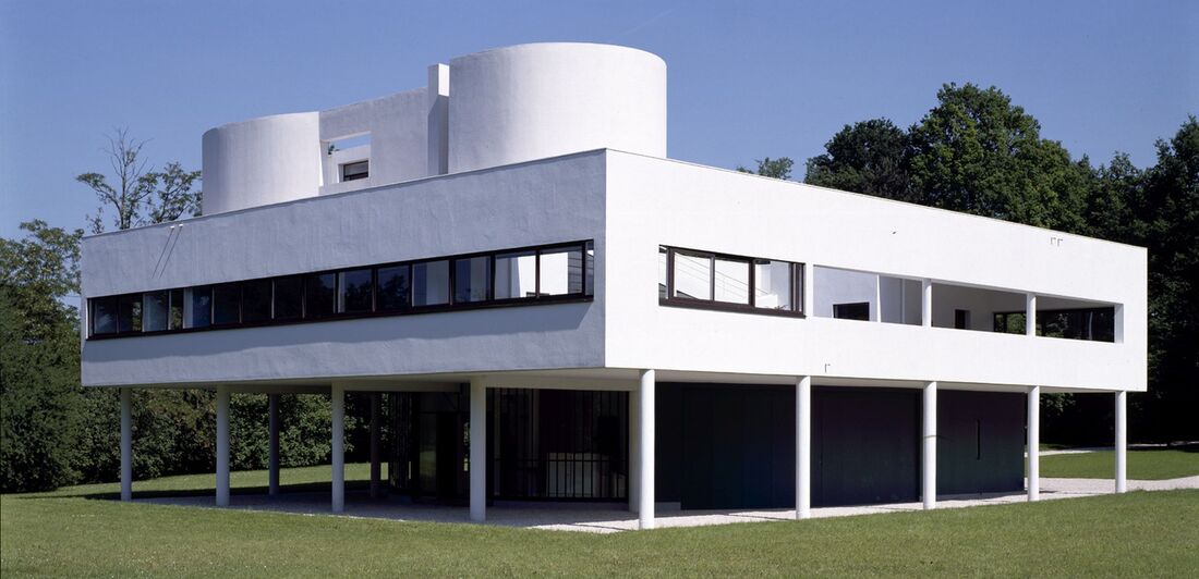
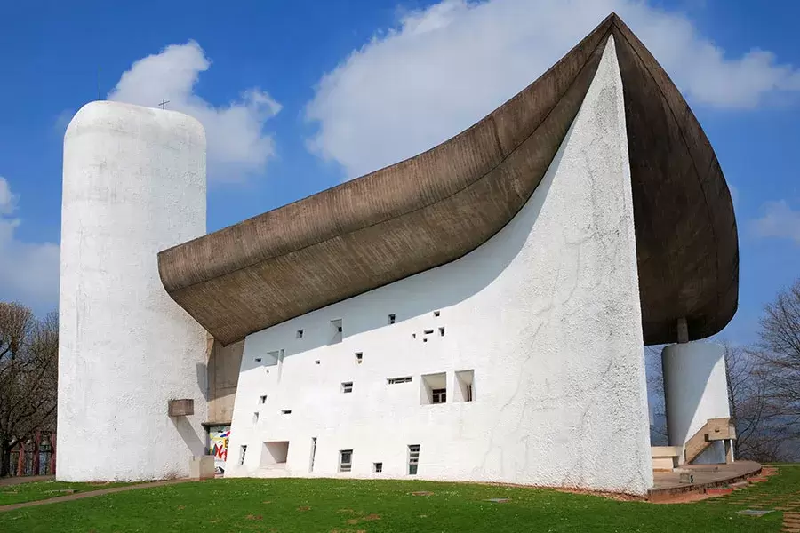
Charles-Édouard Jeanneret, known as Le Corbusier, was a Swiss-French: architect, designer, painter, urban planner, writer and one of the pioneers of what is now regarded as modern architecture. He was born in Switzerland and became a French citizen in 1930.Le Corbusier, is known as the great pioneer of Modernism in architecture, he has created impressive buildings all over the world – from France to Germany and across India to the United States and South America. The architectural work of Le Corbusier includes designs and buildings from the early 1920s to the mid-1960s.
|
|
|
My inspiration from Corbusier comes from his brutalist buildings and the environment he shows them in as their is always a strong contrast between the nature and grass with the white concrete structures. This contrast actually compliments his buildings and showed me that the natural environment and man-made environment can co exist. This made me want to explore the idea of looking into perspectives on the man made and natural envireoment.
Method: I want to go to the barbican as it includes many man-made, concrete and brutalist structures that will contrast well with the surrounding nature. However my aim is to make both environment contrast but still seem like they can co-exist. I also want to capture pictures that only show the man made environment as I think it will help me in a future development. I want to use a low shutter speed and a tripod to make sure I get as much detail as possible.
Draft:
WWW: I liker how I captured a lot of different perspectives and angles of the different structures. I'm happy that I was able to include nature into a lot of my pictures whilst also being able to put the main focus on the man made structure. I think I was successful at achieving my aim of combining two contrasting environments into 1 perspective. My pictures are clear and the viewpoints are quite varied which makes the overall response to my work more interesting. I like how some of the pictures have little areas of colour that can attract a lot of attention even though the main subjects in the photos are the plane concrete buildings. This works perfectly as it means the bright green colours of nature can stand out and grab attention even though the man made buildings are still the main focus. I'm also very pleased that I was able to include pictures that didn't have my hand on them as it stops the viewers from being distracted and it will make my editing easier for my future developments. It also nice that the lensball has warped and distorted some of the buildings a lot as it helps me convey my theme around the breaking down of natural physics. I also like that the pictures have a good depth of filed that stops the background from being to distracting from the lensball.
EBI: Some of my pictures are blurry as its hard to get the camera to focus on the lensball. The pictures are also a little overexposed by the sky which distracts the viewer from the intended subjects. I also think that my pictures would of looked better if the weather was more sunny as the yellow rays of light would've made the concrete buildings more cohesive with the natural elements I was trying to combine it with.
EBI: Some of my pictures are blurry as its hard to get the camera to focus on the lensball. The pictures are also a little overexposed by the sky which distracts the viewer from the intended subjects. I also think that my pictures would of looked better if the weather was more sunny as the yellow rays of light would've made the concrete buildings more cohesive with the natural elements I was trying to combine it with.
Final Edits:
WWW: I like that I was able to make the colours stand out a little more make the photos a little less overexposed. I'm also happy with the quality of these pictures and the amount of detail captured in them. The geometrical shapes of the buildings made inside the lensball make them seem more interesting which is useful.
EBI: My hand stand out a little too much due to the increased saturation and vibrance. Some of the adjustments also make my reflection stand out a little more which is also distracting.
EBI: My hand stand out a little too much due to the increased saturation and vibrance. Some of the adjustments also make my reflection stand out a little more which is also distracting.
Favorites:
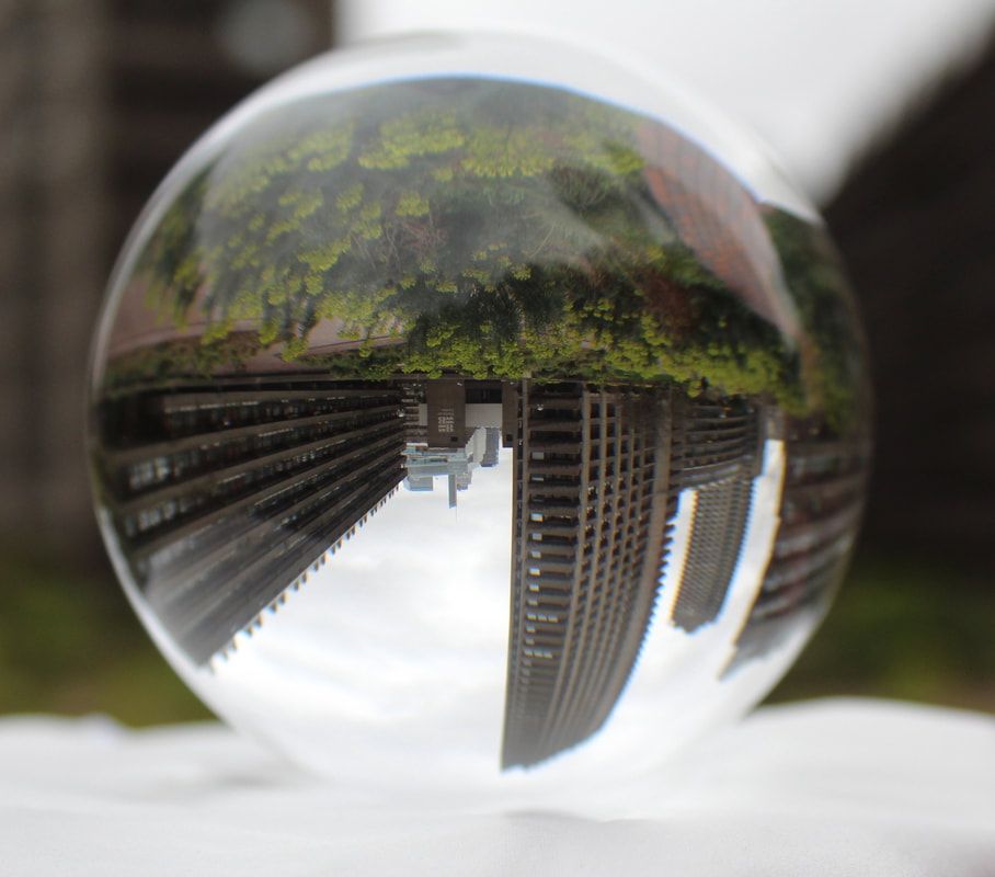
WWW: I love that I was able to achieve an upwards angle of a building without my hand being in the photo as it ables my picture to draw a lot of focus to the building. I'm happy with the framing of my picture as it takes up most of the picture so a lot of detail in the inverted lensball can be explored by the viewer. I'm happy with the amount of nature shown in the image and I overall think that the two environments look quite cohesive. Its good that the bottom of the lensball bends the building a little as it helps me reference my theme on physics. I'm also fond of the upwards perspective on the building that is shown to be pointing downwards by the lensball. I think I successfully used the burn tool in areas of the photo that were too overexposed. I'm happy with the composition if the building in the photo too.
EBI:I think that the white surface that the lensball was on removes some of the natural environment at the bottom of the background which would've been nice to include. I also think that the grey sky is still a little distracting even after reducing its white brightness in the levels adjustment.
EBI:I think that the white surface that the lensball was on removes some of the natural environment at the bottom of the background which would've been nice to include. I also think that the grey sky is still a little distracting even after reducing its white brightness in the levels adjustment.
WWW: I like the reflection of the white light from the lensball onto the surface its on as it makes the lensball seem iluminated. I'm very happy with the amount of detail in the picture and how vibrant it looks. I like how the background shows quite a lot of nature whilst the lensball mainly shows the man made environment because this contrast makes both scenes look more pleasing.
EBI:I dislike how my adjustments made my shadow at the top of the lensball stand out more as its distracting and takes away from the beauty of the scene.
EBI:I dislike how my adjustments made my shadow at the top of the lensball stand out more as its distracting and takes away from the beauty of the scene.
WWW: I like how in this photo I was able to spend more time looking into the man made environment. It was fun being able to convey and focus on one single perspective and I like the opposing dynamic between the direction of the building in the lensball and direction of the building in the background. I think the mirroring between the two perspectives makes the image look very interesting.
EBI: I dislike the high level of exposure by the sky and that my shadows reflected on to the lendball.
EBI: I dislike the high level of exposure by the sky and that my shadows reflected on to the lendball.
Overall, I enjoyed exploring the different perspectives and the combination of the natural and man made environment. I like the distortions my lensball created as some of the building look liker their being bent which nicely references my themes around the destruction of physics. However, I think I could've linked to the artist (architect more) by capturing at buildings that are more open plan like his. I now want to look into capturing a more urban scene to convey the different perspectives of the man made world.
Process:
Image>adjustments>contrast/brightness
Image>adjustments>levels
Image>adjustments>vibrance
Burn tool
Image>adjustments>levels
Image>adjustments>vibrance
Burn tool
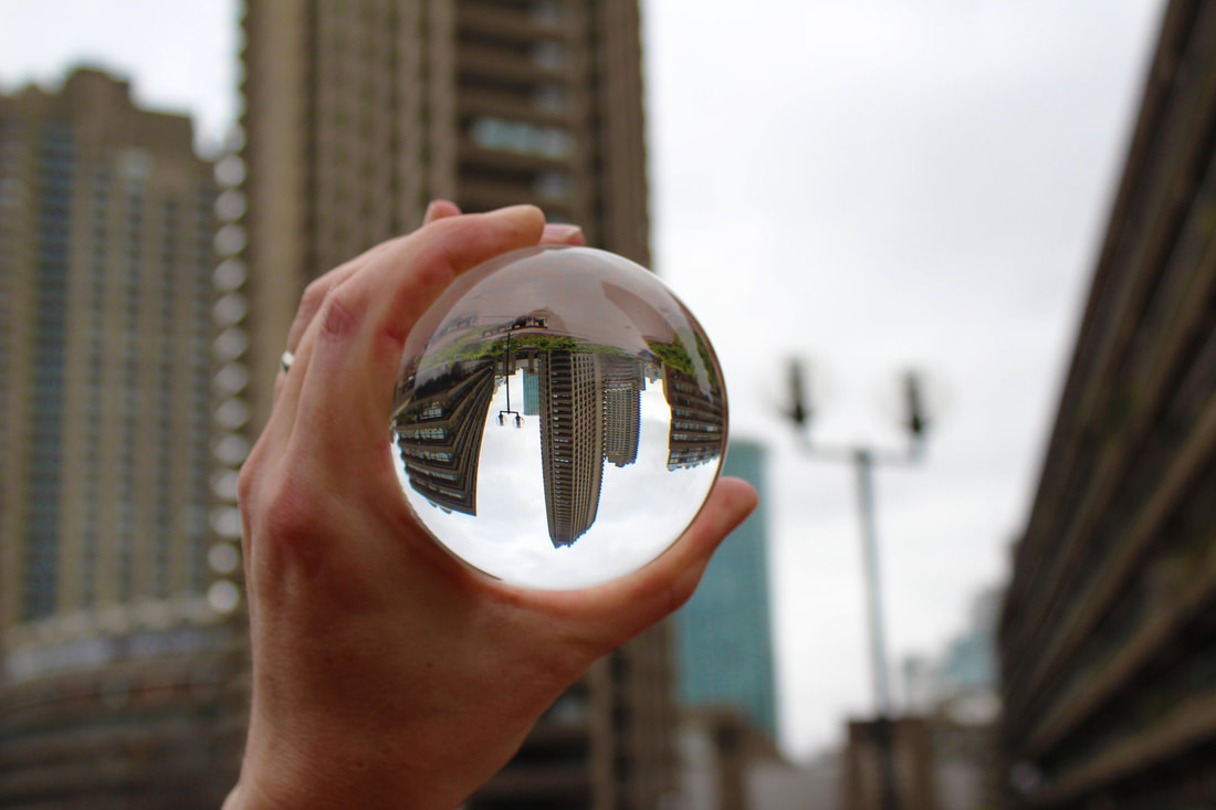
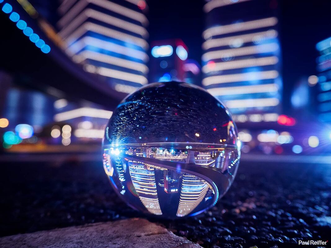
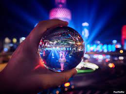
Third Development:Distorted Reflections of the city (at night)
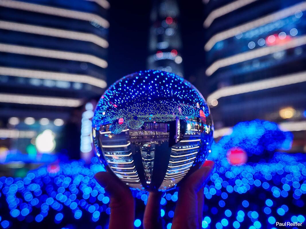
Paul Reiffer:
Pual Reiffer is a British commercial photographer. Born in May 1980 in Dorset, Reiffer focuses on the small details in his photos.He primarily captures the little details in the world that people don't pay enough attention to. "As photographers, we're taught to capture the most brilliant, stunning images. It's why you see so many of us pursuing the same, picture-postcard landscapes. But often, the most amazing photos happen when you turn your lens away from what everyone else is focused on and capture the world that lies behind."
|
|
|
I specifically like Reiffers work on lensball photography around citys as it has helped give my the idea of capturing details in an urban environment and then combining the pictures of the lensballs in the natural and man-made environment in a later development.
Method: I want to go to Canary Wharf to take pictures of the city scape environment. I will focus on using aperture to make the background blurry so that my lensball stands out in all the photos as all the lights from all the buildings can be overwhelming for the photo.
Draft:


WWW: I like the amount of pictures I was able to capture and I'm happy that I was able to explore capturing many different scenes in the urban environment. I like how the inverted perspective link well to my themes around physics and I think that some of the building I captured looked quite futuristic and so helped me create a narrative of the lensball showing a futuristic dimension. I also like how lit up the buildings were as it also contributed the futuristic narrative and made the image seem more illuminated and pretty. I'm happy that I was able to experiment with using different angles in my photos too.
EBI: Annoyingly a lot of my pictures are quite blurred, so I chose to present them how I did to hide their level of blurriness. I think my pictures could've been improved if I used the manual focus as its hard for the automatic focus to focus on the lensball.
EBI: Annoyingly a lot of my pictures are quite blurred, so I chose to present them how I did to hide their level of blurriness. I think my pictures could've been improved if I used the manual focus as its hard for the automatic focus to focus on the lensball.
Favorites:
WWW: I like how the backgrounds in the pictures match well with the distortions as the inverted images compliment each other. I like how the red structure I captured looks very futuristic and conveys a technological narrative. The red lights are also very eye catching. Additionally, I think my pictures successfully draw focus onto structures that most people would take for granted ,and not admire, which links to the artist.
EBI: I wasn't able to get a variety of good quality photos due to the bad focusing of the camera, which is very disappointing. I also dislike how there are people in my first photo as it distracts the viewer from the environment a little. Its also annoying that 2 of the photos above have light refractions that are distracting ( though this could be fixed with the clone stamp tool or the spot heal brush).
EBI: I wasn't able to get a variety of good quality photos due to the bad focusing of the camera, which is very disappointing. I also dislike how there are people in my first photo as it distracts the viewer from the environment a little. Its also annoying that 2 of the photos above have light refractions that are distracting ( though this could be fixed with the clone stamp tool or the spot heal brush).
Overall, I'm disappointed in this development as a whole because most of the pictures are blurred and are a bad quality. However, I'm happy with some of the pictures I captured as they can still be used in my later development where I want to combine different lensballs into 1 image. I'm also happy with the futuristic narrative created around these photos and that I was able to explore using different angles on each of my pictures. Although I'm annoyed that I wasn't able to reference the theme as much as I wanted to, but I think I did reference the artist's idea well.
Process:
I only changed the contrast and vibrance in my photos.
Image>adjustments>contrast/brightness
Image>adjustments>vibrance
Image>adjustments>contrast/brightness
Image>adjustments>vibrance
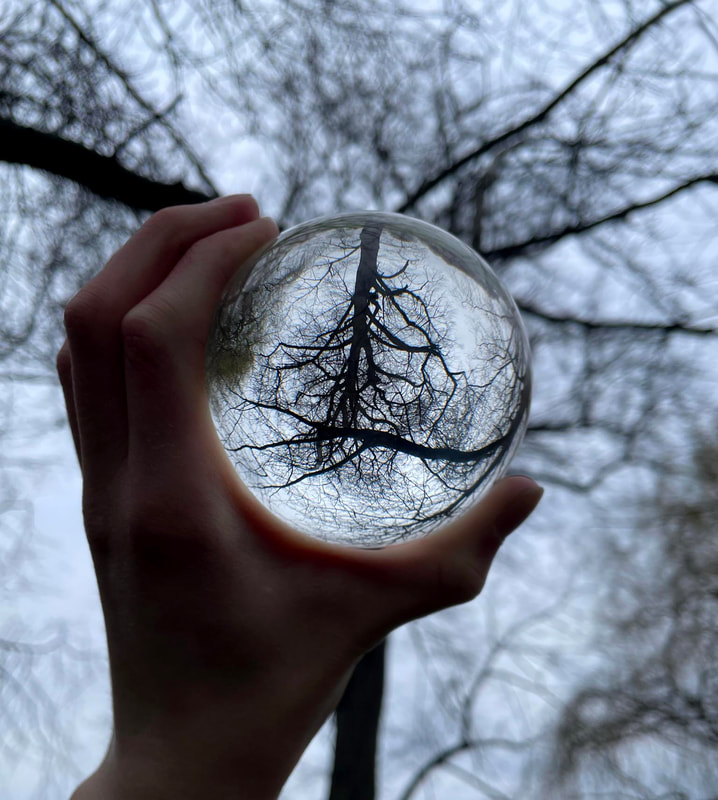
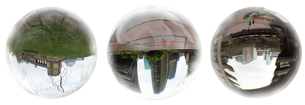
Fourth Development:
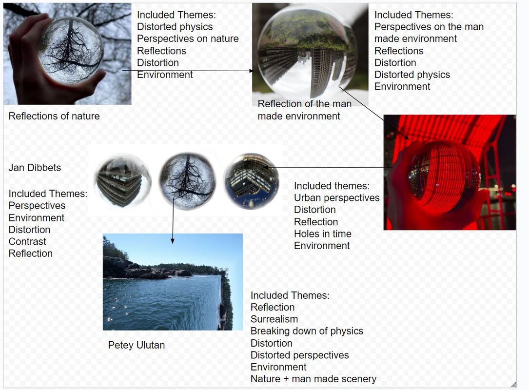
Jan Dibets:
Jan Dibets is a dutch artist who works mainly with photography. Dibets was borned in Weert and trained as an art teacher at the Tilburg academy he studied painting with Jan Gregoor in Eindhoven 1961-3. Taught art at a training college 1964-7. First one-man exhibition at Galerie 845, Amsterdam, 1965. Painted some abstract shaped canvasas, then gave up painting in 1967. Shortly afterwards visited London on a British Council scholarship and met Richard Long and other artists involved with Land Art. On return to Holland, settled in Amsterdam and began to make 'Plough Projects', 'Beach Projects' etc., followed by his first 'Perspective Corrections'. Started in 1967 to use photography to create a dialogue between nature and cool geometrical design by rotating the camera on its axis, taking series of photographs systematically increasing the shutter speed, etc. Also experimented with videos, films and conceptual works. His exhibition in the Dutch pavilion at the Venice Biennale in 1972 established his international reputation.
|
|
|
I like how Dibets combines different environments into 1 piece of work. I love how his pieces include contrasting scenery, however the pictures still link together through his use of horizen lines. I want to involve his ideas of combining different images, however I don't want my image to have a linear connection between them as I want to contrast the environments shown in them to portray my themes of perspectives well.
Method:To link to Dibets' work I want to combine my lensball pictures in all the different environments and contrast all 3 images- although I want the images to still link to each other through a common theme or technique. I want to try removing my hand from a few of the pictures to make it easier to cut out the outlines of the balls, although this will be hard as its hard to find something to rest the ball onto. I want to also take some more pictures in the city so I can have a larger variety of urban photos.
New Photos Taken:
WWW: I like how I was able to successfully take some pictures without my hand in them. I'm also happy that the pictures of nature are clear. The vibrance of the green grass also contrasts nicely with the gray sky which helps the nature within the image stand out more and be the main focus. I think that the contrast between the living vibrant grass and the dead barron trees also makes the photo more interesting. I'm happy that the image isn't too overexposed.
EBI: I wasn't able to get that many pictures as the day was very rainy and the water droplets blurred all my pictures, so the only acceptable photos were the ones above.
EBI: I wasn't able to get that many pictures as the day was very rainy and the water droplets blurred all my pictures, so the only acceptable photos were the ones above.
Final Products:
WWW: I like how I was successfully able to contrast the environments and bring together different pieces of work into 1 image. I think the images combined together compliment each other really well as they all allow each other to stand out equally. Furthermore, I like how I the images have different dimensions as the middle lensball is inverted which helps the images keep their individuality. I'm also happy that the images have kept their distortion (even though its a small amount) as it helps convey the theme of my developments and retains the viewers attention for longer. I think I was successful in conveying the different perspectives on the environment and I'm happy with the narrative I created of the nature and man coming in different forms ( as the first picture shows them together, whilst the other two completely show them as opposing scenes). I tried presenting the photos in this way as I thought the city lensball was the most unique out of the 3, so I put it in the middle of my presentation to help it stand out more and make the whole piece more eye catching. I also think the presentation increases the contrast between all 3 images as the lensballs on the left and right are a little too similier to be put next to each other.
EBI: I liked how the outlines are a little blurred as it made them sink in with the background a little bit so they didn't seem to out of place, however I think that they are a little too blurred and un-neat. I also dislike the distorted lights on the middle picture (especially at the bottom left of it) because it distracts away from the building and makes the picture too hectic and lowers the quality of it. I could try using the spot heal brush or the clone stamp tool to remove the unwanted lights.
EBI: I liked how the outlines are a little blurred as it made them sink in with the background a little bit so they didn't seem to out of place, however I think that they are a little too blurred and un-neat. I also dislike the distorted lights on the middle picture (especially at the bottom left of it) because it distracts away from the building and makes the picture too hectic and lowers the quality of it. I could try using the spot heal brush or the clone stamp tool to remove the unwanted lights.
WWW:I like how I was able to keep a link between the photos like Dibets did as the left and right balls have similier geometrical shapes. But I also like the separation and contrast between the 3 images as the natural tree in the middle maintains the contrast; because it has a very different pattern and form to the buildings. I think that the presentation of the 3 images is good and I think the cut outs are much neater than the ones I did before. I like that I was able to portray a perspective of death in nature as the lifeless tree shares a similier narrative to the lifeless brutalist building in the ball next to it. Furthermore, I like how the orbs blend in a little with the white background as it stops them from poking out and allows them to merge and be apart of the same image well. I'm also happy that the theme of broken physics is somewhat included as the lensball on the left curves the building a little and makes it seem surreal.
EBI: I dislike the little refraction of light in the orb on the right as its distracting ( I could try to remove some of these with the clone stamp tool but it would be very hard to make sure the background doesn't have an unnatural colour change). I also don't like how my shadow is reflected on the lensball by the left as that too distracts the viewer a little bit.
EBI: I dislike the little refraction of light in the orb on the right as its distracting ( I could try to remove some of these with the clone stamp tool but it would be very hard to make sure the background doesn't have an unnatural colour change). I also don't like how my shadow is reflected on the lensball by the left as that too distracts the viewer a little bit.
WWW: I like the presentation of the image as there is a transtion between nature in the first lensball onto a mixture of both natural and man made environment, and then into a man made environment. This transition and presentation helped me keep the photos somewhat linked- like dibets does. I also enjoy the gradual change in colours between the 3 images as it makes them a little more cohesive with one another and allows them to merge better together to create the whole piece. I also like how the natural lensball looks a lot more clean and peaceful than the man made lensball as it creates a narrative of nature being beautiful whilst the man made environment being an ugly evil that destroys the environment.
EBI: I dislike how my reflections i shown in the middle lensball. As well, i think the image on the right could be a little more vibrant and detailed so that it could math the other images more.
EBI: I dislike how my reflections i shown in the middle lensball. As well, i think the image on the right could be a little more vibrant and detailed so that it could math the other images more.
Overall, I liked how this development was successful in being able to combine the different perspectives of the environment well. I like how the lensballs also kept the distorted nature of the images and allowed me to link to my themes. However, I feel as though I've left out my theme around physics so for my next development I want to focus on it more.
Process:
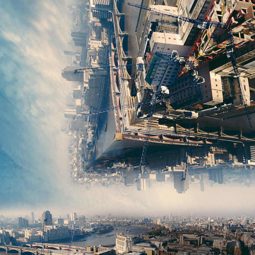
Final Development: Distorted Reflections
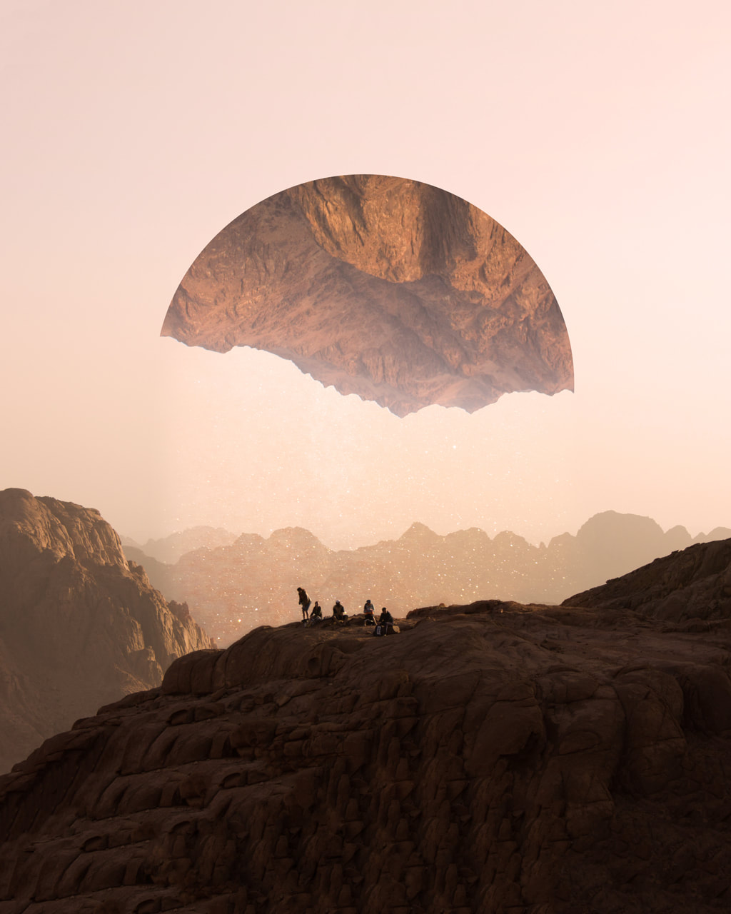
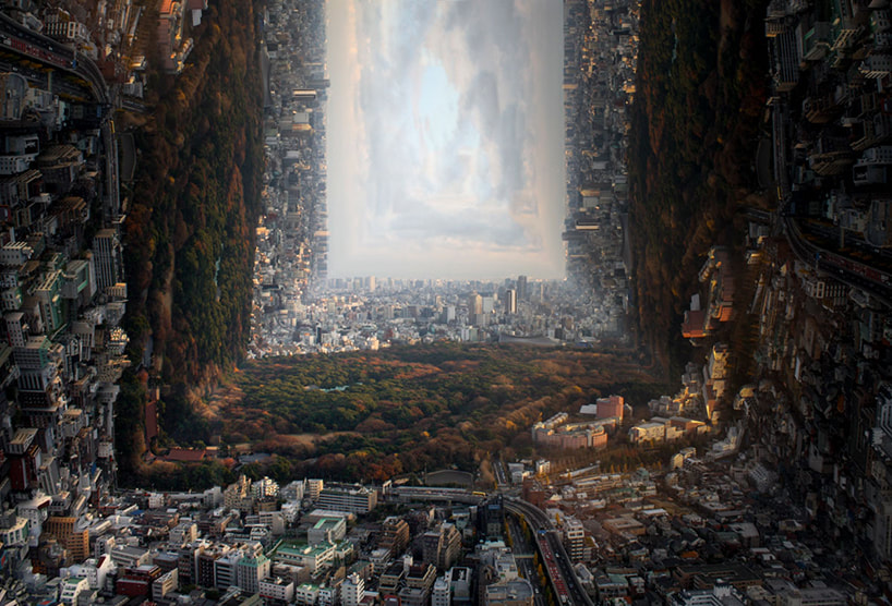
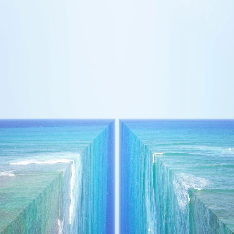
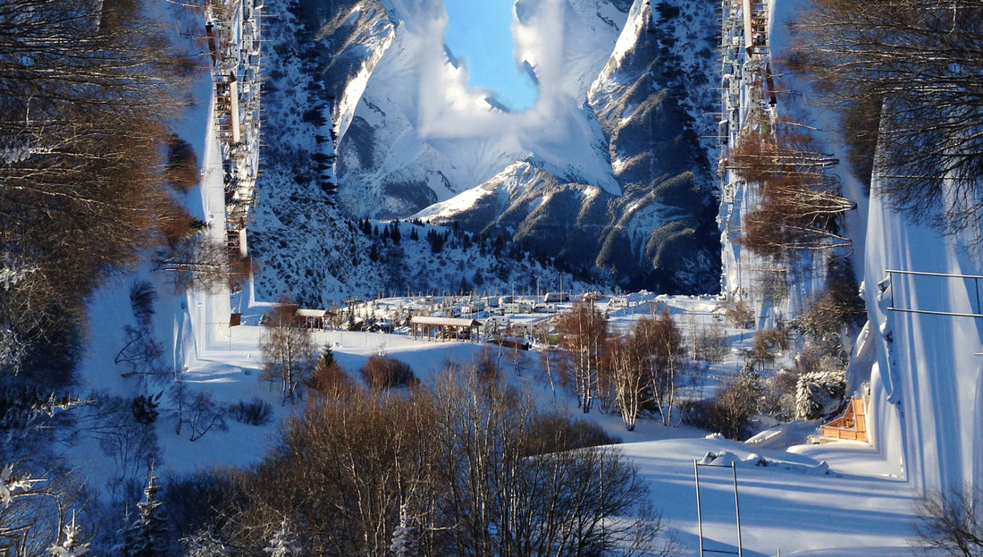
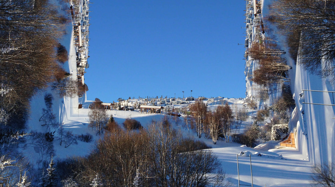
Petey Ulatan:
Petey Ulatan is a Honolulu based graphic designer, artist & photographer who’s is most well known for taking realism and creating mind bending destinations of an alternate world. Ulutan creates geometric landscapes that dramatically add angles to panoramic views. Oceans drop off into eternity, cities overlook cities, and mountain ranges are creased right down the middle. The Honolulu-based innovator has a special appreciation for the wonders of the natural world, twisting coastlines and other common sights into distorted dreams.
|
|
|
I love how Ulutan breaks the laws of physics and his work really relates to my themes around distortion and breaking down physics. I also like how his work includes many different environments.
Method: I want to try to mimic Ulutan's technique to create photos that distort the viewers perspective and create pictures that look like physics has been destroyed and a multidimensional landscape has been created. I want to start of by taking pictures of the thames in London as it seems that water is the easiest thing to reflect in Ulutan's style. I want to use a faster shutter speed when capturing water so that my pictures can show the detail of the surface well, which will make the picture more interesting and satisfying to induce motion into.
Draft:
WWW: I'm happy that I was bale to photograph a range of environments, however I think my pictures of the Thames will definitely be the easiest to edit. I took many of these photos on different days so the lighting on some of them is really nice. The pictures are also clear and have a lot of detail in them. Furthermore, I think the pictures have the right compositions to make my reflections effective.
EBI: On a lot of the days the weather was quite cloudy and gray which limited the vibrance in a lot of my photos (I could try fixing this by increasing the brightness and vibrance in Photoshop). As well I dislike how a lot of my photos include people in them which distracts the viewer. Using a higher ISO and a lower shutter speed with the use of a tripod would of helped make the photos a lot nicer and colourful.
EBI: On a lot of the days the weather was quite cloudy and gray which limited the vibrance in a lot of my photos (I could try fixing this by increasing the brightness and vibrance in Photoshop). As well I dislike how a lot of my photos include people in them which distracts the viewer. Using a higher ISO and a lower shutter speed with the use of a tripod would of helped make the photos a lot nicer and colourful.
First Response:
WWW: I like how I was able to explore reflecting the man made environment a lot in this response. I loved the interesting geometric shapes made in the first photo and Its nice how chaotic the photo is. I also love how the second photo includes the two ships being hooked onto each other as it creates the narrative that 1 of the ships is holding up the other and stopping it from falling into the endless water fall. I also like the contrast between the two man made environments I captures as it varies the response a little. I warped dimensional perspective on the photos also links well to my themes around physics and perspectives whilst also referencing the artist as I turned a common london site into a distorted dream. I like how the fast shutter speed was able to capture the water surface well as it made it easier to reflect. Plus it looks a lot nicer when the water starts travelling downwards as the water surface creates a calm motion in what should normally be seen as a hectic movement (waterfall)- helping me reference my theme of breaking down natural physics.
EBI: It would have been nicer if the lighting was better and if my pictures were more vibrant as the colours a quite uninteresting. Furthermore, I want my pictures to include more of the water so for my next response I want to focus on creating calm motion in still water to juxtapose the natural laws of physics (as water that travels downwards should be fast and chaotic-like a waterfall and not a calm and fluid motion like what my pictures will be).
EBI: It would have been nicer if the lighting was better and if my pictures were more vibrant as the colours a quite uninteresting. Furthermore, I want my pictures to include more of the water so for my next response I want to focus on creating calm motion in still water to juxtapose the natural laws of physics (as water that travels downwards should be fast and chaotic-like a waterfall and not a calm and fluid motion like what my pictures will be).
Experimental Response: Reflections in the Lensballs
Method: I wanted to see if I could create the same reflections as Ulutan inside the lensballs.
WWW: I like how the pictures turned out as they look quite chaotic and it combines my themes quite well. I like how I was able to enhance the distortions already inside the lensball by using Petey's technique.
EBI: Some of the reflections inside the lensball don't look very interesting or nice.
I think that reflected landscape images look more interesting than these pictures and also have a more surreal atmosphere so I think I will try to get more landscape photos for my final response, but I'm happy that I was able to experiment with different ideas.
Second Response: Final Piece
Method: For my final pieces I want to heavily develop and reference my themes on breaking down physics and distorting perspectives. I will re-use Ulutan's Technique because its perfect for conveying what I want to. I also want to use the photos I took during my ski trip in the winter holidays and I also want to use the photos that I will take this half term in Canada.
Draft:
WWW: I love the lighting on the photos as it makes each setting look vibrant and colourful. I love how I was able to capture lots of different natural environments involving water. I absolutely love the scenery in my pictures as they release a nice sunny; summer atmosphere that makes my pictures evoke happiness in the viewer. The nature that also present is very beautiful and contains strong natural green shades that are pleasing to look at. I love my ISO setting being high (6400) as it meant I could use a quick shutter speed to capture the detail in the water's surface. I also love some of the pictures include seafoam over the water as it adds more detail and makes the picture more pleasant.
EBI: Some of my photos are a little blurry due to my manual focus being a little off. I also feel like I could've have explored using different angles more to vary my perspectives and link to my perspective theme more.
EBI: Some of my photos are a little blurry due to my manual focus being a little off. I also feel like I could've have explored using different angles more to vary my perspectives and link to my perspective theme more.
Edits:
WWW: I love how clean my lines of reflection are as they don't look too unreal. I'm happy with the surreal atmosphere my pictures release as it retains the viewers attention. I love how some of the waters glistens with light as it adds to the artists description of being "a distorted dream" because the glistening light makes the picture seem like a happy memory. I love the variation in the different watery environments because it expands the amount of perspectives in my development. I'm also happy that I didn't go too over the top with my adjustments as the natural lighting and colours in the pictures make it seem more surreal with its reality breaking reflections, as the natural elements in the picture contrast with the unnatural motions. The sea foam also adds a nice level of detail to the images that include it. I'm also very happy that I was able to experiment with multiple amounts of reflection to completely change the horizon on some photos.
EBI: Some of my pictures are a little blurry and I dislike the reflection liners that include a lot of trees in them because it makes the image feel more fake the surreal.
EBI: Some of my pictures are a little blurry and I dislike the reflection liners that include a lot of trees in them because it makes the image feel more fake the surreal.
My Favorites:

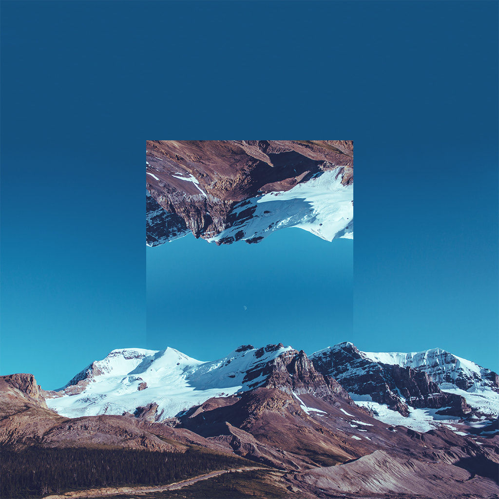
WWW: I like how I was able to experiment with a snowy lanscape rather than just doing different tropical environments. I like how I was also able to explore using two reflection lines. I'm happy with how the editing went to remove part of the background as I think by removing the extra mountains the image looks more surreal. I like how the surreal perspectives of the photo heavily link to my themes around perspectives and breaking the laws of physics. I like the amount of details in the picture as the trees and the snowy town creates the narrative that is just a picture of a normal town in another dimension- adding more surrealism. Plus the image has a lot of depth to it and I think its very successful at linking to the artist's ideas.
EBI: I think that the sky background could include a few clouds to make it seem a little more realistic. I also would've liked the lighting to be a bit better and for the frost on the snow to glisten with light to create a more beautiful atmosphere.
EBI: I think that the sky background could include a few clouds to make it seem a little more realistic. I also would've liked the lighting to be a bit better and for the frost on the snow to glisten with light to create a more beautiful atmosphere.

WWW: I love the vibrance and the colour and I think it's very pristine and clear in quality. I love how clean the reflection is and how the water remains in constant flow and motion. The natural environment is pleasing as the blue and green of nature with the plain blue sky supports the water being the main focus. The image radiates and evokes beauty and calm emotions with a holiday feeling. I like how the chaotic distortion of reality folding in on itself still allows a calming atmosphere due to the stillness of the water.The line of reflection has a good composition and I like how I managed my ISO well as the picture has the right level of brightness. I tried using a low shutter speed to stop any blurring and to make sure my picture was as clear as possible, this was easy as the brightness of the day allowed the shutter speed to be very flexible. I like how the green trees separate the blues in the water and the sky and allow each component to stand out more.
EBI: I dislike the reflection line by the trees as makes the image look more fake and reduces the level of cohesiveness between the two reflections.
EBI: I dislike the reflection line by the trees as makes the image look more fake and reduces the level of cohesiveness between the two reflections.

I thought adding a plane onto the picture would make it seem more sureal and the difference between the direction of travel between the water and the aeroplane draws more attention to the drop off of the water. Its as if the plane is flying off into empty space.

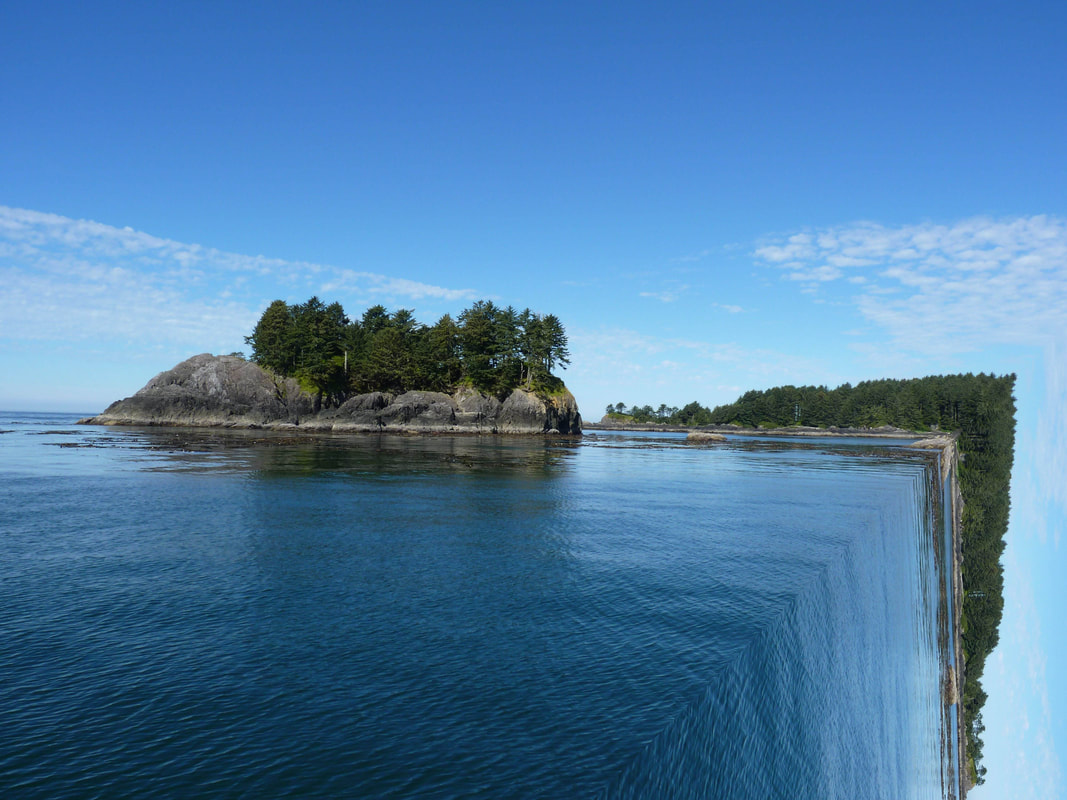
WWW: The green shades in the image really evoke a natural atmosphere throughout the photo and focuses the audiences perspective on nature. I like how clear the sky is as it ables the water and trees to attract most of the attention. The large rocks by the drop off in the water add more surrealism to the photo and conveys the theme of breaking down physics more vigorously. The reflection line almost makes it look like the earth had snapped- like the description of Ulutan's mountains being split. I like how much scenery there is in the picture but its good that is doesn't overwhelm the photo and distract from the physical absurdity of the reflection.
EBI: I think the line of reflection in the sky could have been fixed by using the clone stamp tool. I also think that It would have been nice to of captured some of the sunlight reflection off the water to make the atmosphere more pleasing.
EBI: I think the line of reflection in the sky could have been fixed by using the clone stamp tool. I also think that It would have been nice to of captured some of the sunlight reflection off the water to make the atmosphere more pleasing.
Overall, I am very happy with the development as I think the pictures include a surreal atmosphere that links to my overall themes very well. I like how my reflection break the laws of physics which has allowed me to reignite that theme into my work. Furthermore, I'm happy that I was able to continue my work on the different man mad and natural environments in the different responses within this development. Moreover, I'm happy that the reflection within the image distort the audiences view which also nicely links to my other major theme. So overall I'd say that my last development was very successful.
Process:
Development Flow Chart: