fragment -
noun
plural noun: fragments
/ˈfraɡm(ə)nt/
noun
plural noun: fragments
/ˈfraɡm(ə)nt/
- a small part broken off or separated from something.
"small fragments of pottery"
Pinterest Ideas:
In this Pinterest board I was firstly inspired by the idea of using mirrors to physically create a fragmented photo.
My first idea of fragments was fragments of glass and mirrors. So for my Pinterest board I tried exploring different ideas around glass and mirrored fragments. I like how these photographers have used shattered mirrors to portray different perspectives and capture time. For this unit I'll try capturing these same themes.
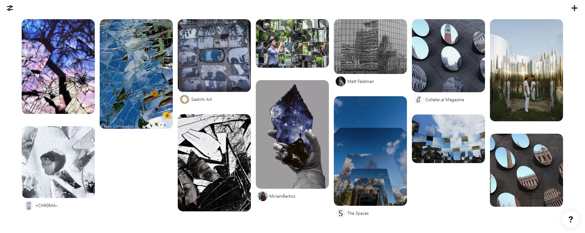
I tried looking more into mirrors portraying different perspectives as this theme in fragments stood out most to me.
Still Water:
Roni Horn:
|
|
|
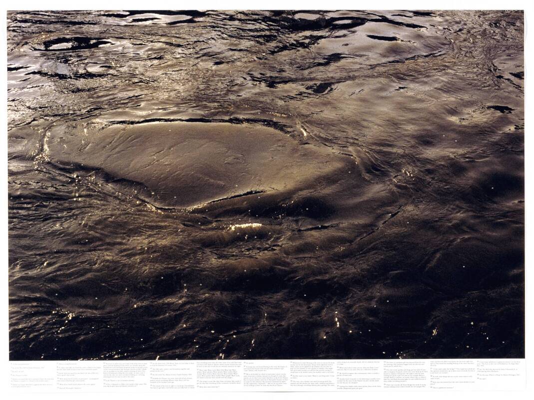
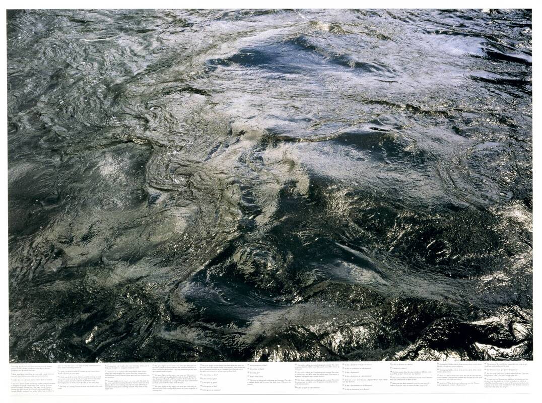
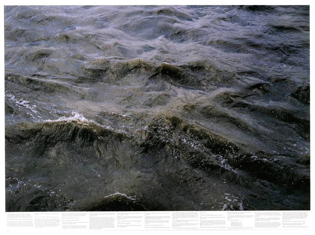
In 1999 Roni Horn published "Still Water (The River Thames for Example)", an examination of the water of the River Thames through extensively footnoted photographs. Horn uses a wide contrast between exposure and shadows to create an active effect on the water. It also creates the illusion that the water is alive and not frozen in a picture.
I think that he portrays water to be always changing and diverse as he says water is captured in all different shapes and sizes. I also think that fast shutter speed is very good for this work, because it allows the photographer to clearly capture the movement and flow of the water. The pictures that Roni creates have a varied atmosphere as some of his pictures are quite peaceful but others are quite busy with watery movement. I also thought that the artist captured one of the themes I was interested with for this unit (capturing movement).
I think that he portrays water to be always changing and diverse as he says water is captured in all different shapes and sizes. I also think that fast shutter speed is very good for this work, because it allows the photographer to clearly capture the movement and flow of the water. The pictures that Roni creates have a varied atmosphere as some of his pictures are quite peaceful but others are quite busy with watery movement. I also thought that the artist captured one of the themes I was interested with for this unit (capturing movement).
My Response:
WWW: I was able to capture water in different setting and at different times of the day. I was also able to capture different colours and patterns in the water too.
EBI: A lot of my pictures of the Thames are quite unfocused and dark. This is because my camera's manuel focus wasn't adjusted well enough.
EBI: A lot of my pictures of the Thames are quite unfocused and dark. This is because my camera's manuel focus wasn't adjusted well enough.
WWW: I like how I was able to explore different areas as I took pictures in a reservoir by Alexandra palace and I got more pictures by the river Thames. I did this because I wanted to capture different movements of water: as by the reservoir the water was very calm, but by the Thames the water was more active. I experimented with the pictures a lot by changing the saturation, vibrance and levels to create different effects on each picture. Through this I was able to create some vibrant photos as well as some black and white ones. I also think it was good that some of my pictures were blurry because it helped me make them look like grainy so they conveyed an older atmosphere. I'm happy that I was able to add vibrant effects to my images because the contrasts in the water create a nice level of motion.
EBI:I didn't capture a variety of movement in the Thames and a lot of my pictures for the Thames were blurry, to work with this, I tried making my Thames pictures look like old and grainy pictures from the past. Moreover, I would've liked to of captured more specific movement in the water.
EBI:I didn't capture a variety of movement in the Thames and a lot of my pictures for the Thames were blurry, to work with this, I tried making my Thames pictures look like old and grainy pictures from the past. Moreover, I would've liked to of captured more specific movement in the water.
Second Response:
For this response I focused more on my own ideas on capturing water.I came up with the idea of photographing reflections in the water because I was interested in this type of photography from my pinterest board..
Method: to do this I went to Trafalgar square and took pictures of the fountains where the national art gallery's lights were being reflected.
Method: to do this I went to Trafalgar square and took pictures of the fountains where the national art gallery's lights were being reflected.
WWW: I like the patterns that the light forms when it hits the water because it creates the effect that gold leaves are floating on the surface, it almost mimics phosphorescence. I also think that the editing (though simple), went really well. By changing the contrast, vibrance and saturation I was able to make the lights stand out. I also think that I got a good angle of the water because I was quite low, and on level with the water's surface, so I was able to capture a lot of ripples and convey movement. As well, I think the photos have a really good definition as you can see the rails of the fountain at the bottom of the water. I like how the light highlights the ripples in water and convey a define level of movement.
EBI: I would've like to have experimented more with different colored lights and I wasn't able to use that many pictures because it was hard to get my camera in focus with the water because my automatic focus didn't work. This meant I had to manually focus it which was hard to achieve given it was really dark at the time I took the pictures.
EBI: I would've like to have experimented more with different colored lights and I wasn't able to use that many pictures because it was hard to get my camera in focus with the water because my automatic focus didn't work. This meant I had to manually focus it which was hard to achieve given it was really dark at the time I took the pictures.
WWW: I tried to experiment more with colors by adjusting the hue and I like how the colors of the lights changed without drastically changing the natural colour of the water. I also like how clear the picture still is.
EBI: I think the pictures could look a bit more natural and I think that they might be a little overworked I could fix this by turning down the vibrance.
EBI: I think the pictures could look a bit more natural and I think that they might be a little overworked I could fix this by turning down the vibrance.
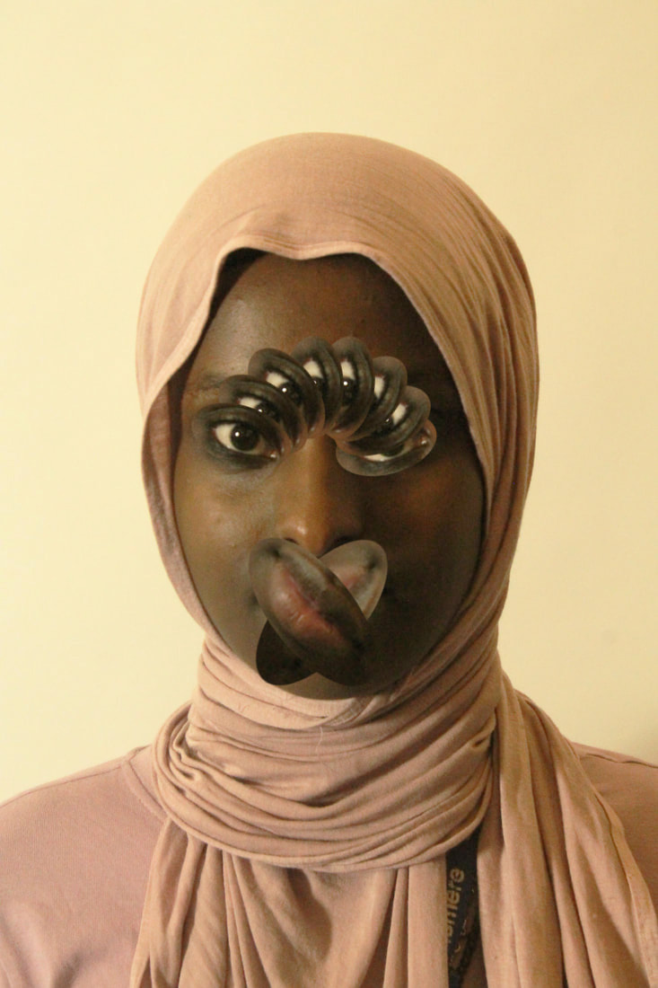
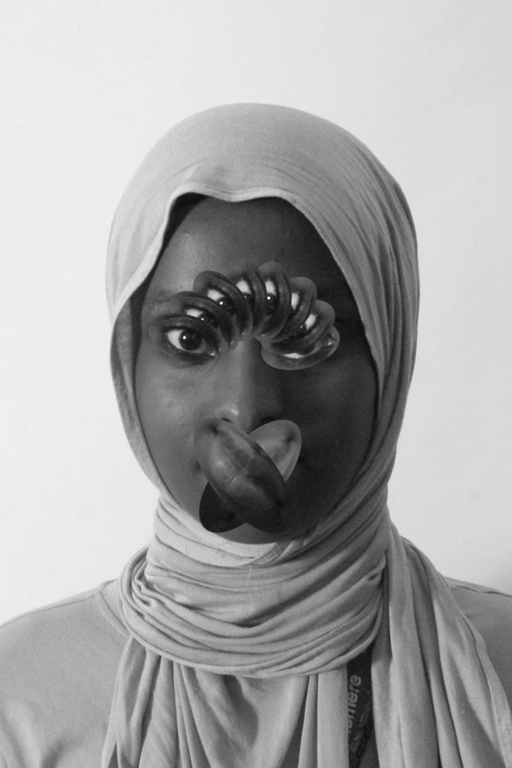
Silhouette Fragments:
Malick Kebe:
|
|
|
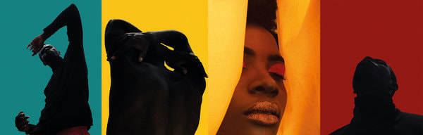
Malick Kebe is an African photographer who was who was born in 1991. With his iphone and his minimalistick vision, Kebe is able to create his own identity by building a universe that he perfectly masters, mixing modernity and his African origins. Kebe has a strong understanding of shape, colour and concept, producing evocative storytelling through minimal subjects and limited production. His use of bold colours and darker skinned models creates a silhouetted effect in his images, I aim to recreate this. As I am really interested in experimenting with concentrated colours and creating vibrant photos which I don't usually get the chance to do.
“The color is my flag, it is Africa. For me any object is above all a color before being a form. Color has a hold on me. I spend hours on my photos in post-production. My sublimated models embody a story through over saturated colors".
“Even if I had the means, I would still shoot on iPhone. It pushes me to go further than with a pro camera. I want to show people that it’s not enough to have a great device, but it is enough to have a creative eye.” Photoshop, Light room, VSCO and Snap seed are the only other tools used to build “a universe that mixes modernity and African origins.”
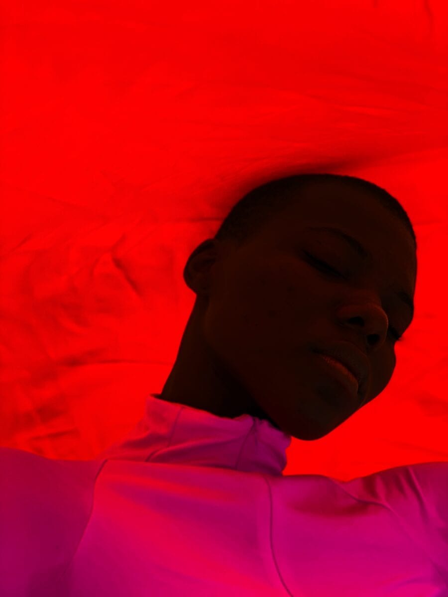
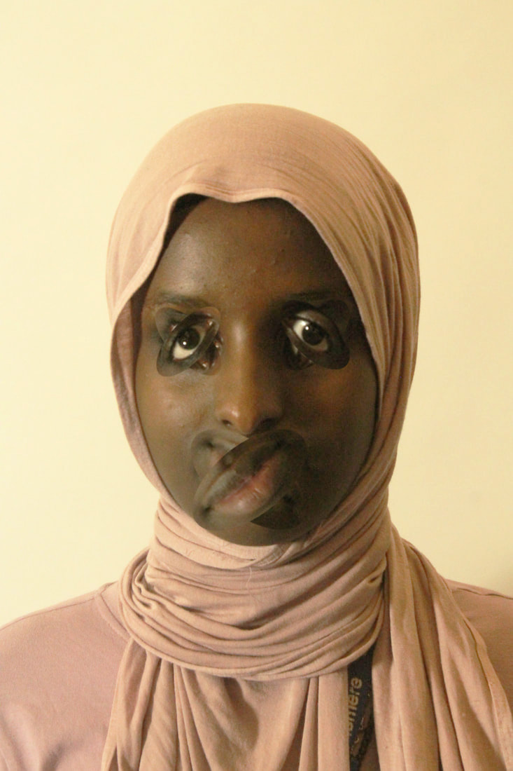
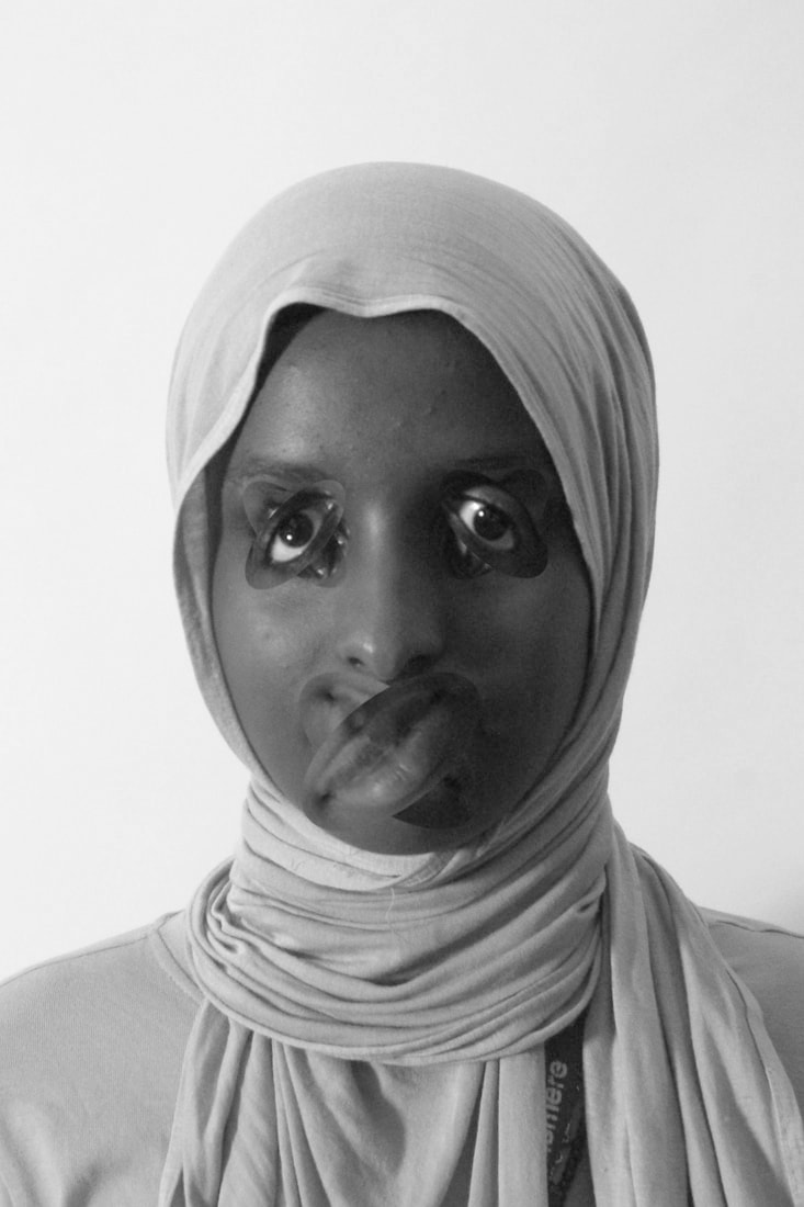
Draft:
I like how these pictures turned out because there's allot of change in brightness throughout the image. I also like the contrast between the model's hijab with the background. I think these will be good for my final edits because I can try to make the colour scheme like an African sunset to link to the Artist's heritage.
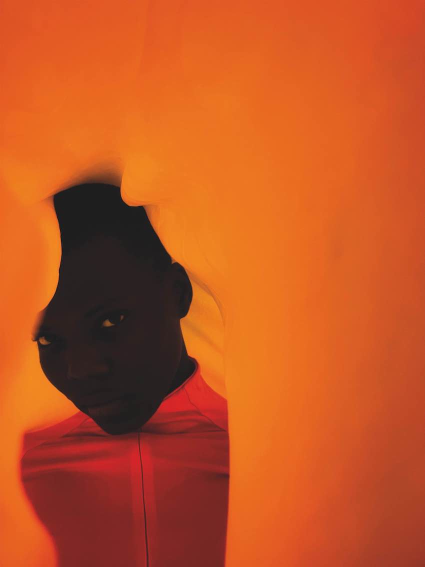
Finished Products:
I changed the color balance to be more yellow and red to make the background more vibrant and like an African Sunset. I also increased the contrast and levels to make the model stand out.
WWW: I like how these pictures turned out because they are very vibrant and the model stands out against the background. I think I was successful in making the background evoke the look of a sunset and capture the beauty of the African landscape to further link to Kebe's ideas of expressing his heritage. I'm also happy that I was able to capture the models features well without losing her expression (and features) by contrasting her with the background too much in Photoshop. I also believe that I have maintained the level of minimalism that Kebe has throughout his photos.Overall, I think that my response is successful in conveying Kebe's ideas because I've mimicked his large contrasts and his use of bold colors to create a minimalist and also vibrant portrait.
EBI: I would have like to of made the model do a range of different poses because it would've varied the different perspectives and angles I could of captured her in. I also think it might have been improved if I used different colored backgrounds in my pictures to create different levels of contrasts. I also think that a different colored background would help make the response more diverse and vibrant.
EBI: I would have like to of made the model do a range of different poses because it would've varied the different perspectives and angles I could of captured her in. I also think it might have been improved if I used different colored backgrounds in my pictures to create different levels of contrasts. I also think that a different colored background would help make the response more diverse and vibrant.
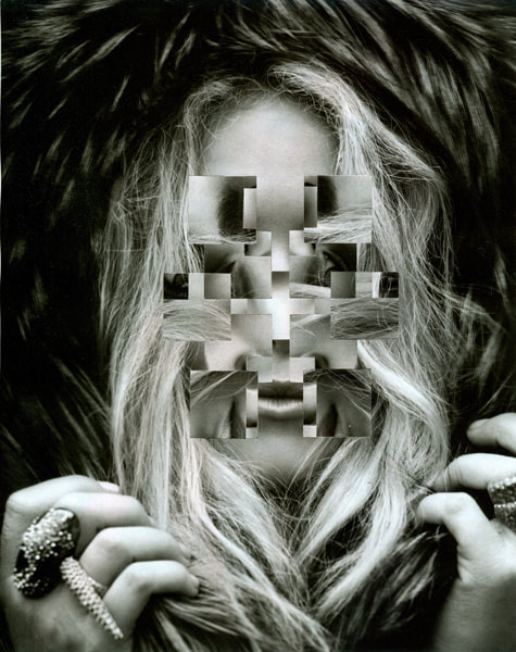
Geometric Portrait
Gordon Magnin
|

|

|
Gordon Magnin is an artist from Nevada ,based in LA, that imposes geometric systems on high fashion faces and creates unique collages called "altered found images". His skill is entirely self taught and his level of experience is less than other artists, who have had to of been manipulating images for a longer amount of time to get to his level of skill. He describes his work as "precise, intricate, geometric and destruction". He completely reconstructs the form of the original images, due to the majority of his photos being portraits the geometric shapes he uses causes deceptions at first because the eye isn't used to the features of the face being in different places.His main goal is to break down the expectations of looking perfect and to challenge the industry's perception of beauty.
Draft:
|
|
Method: With these 3 portrait photos I've taken, I'm gonna copy features from her face multiple times, layer them and rotate some of the layers. I'm going to mainly focus on distorting specific features.
First Response:


|


|
WWW: For this task I avoided copying Magnins style of photography and focused on replicating his goal.My pieces only distort the features that look best on my model to make them look unattractive, I did this because Magnin wanted to challenge the industry's beauty expectations, so I interpreted this goal in my own way.
EBI: I would've liked to of taken pictures of different models to get more diversity within the response. I also think it would've been a good idea to make my images less modern by adding a hazy effect. As well, my pieces (specifically my second and third pieces) would've looked better if my original photos had better lighting around the whole face.
EBI: I would've liked to of taken pictures of different models to get more diversity within the response. I also think it would've been a good idea to make my images less modern by adding a hazy effect. As well, my pieces (specifically my second and third pieces) would've looked better if my original photos had better lighting around the whole face.
How to:
Second Response:
Draft:
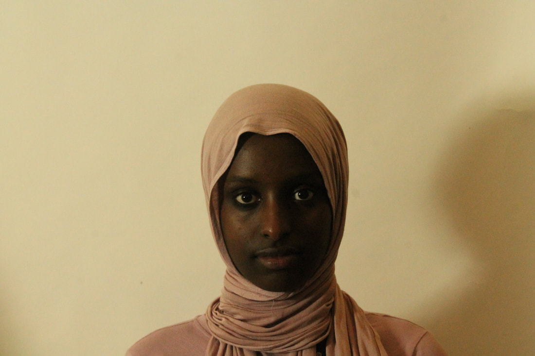
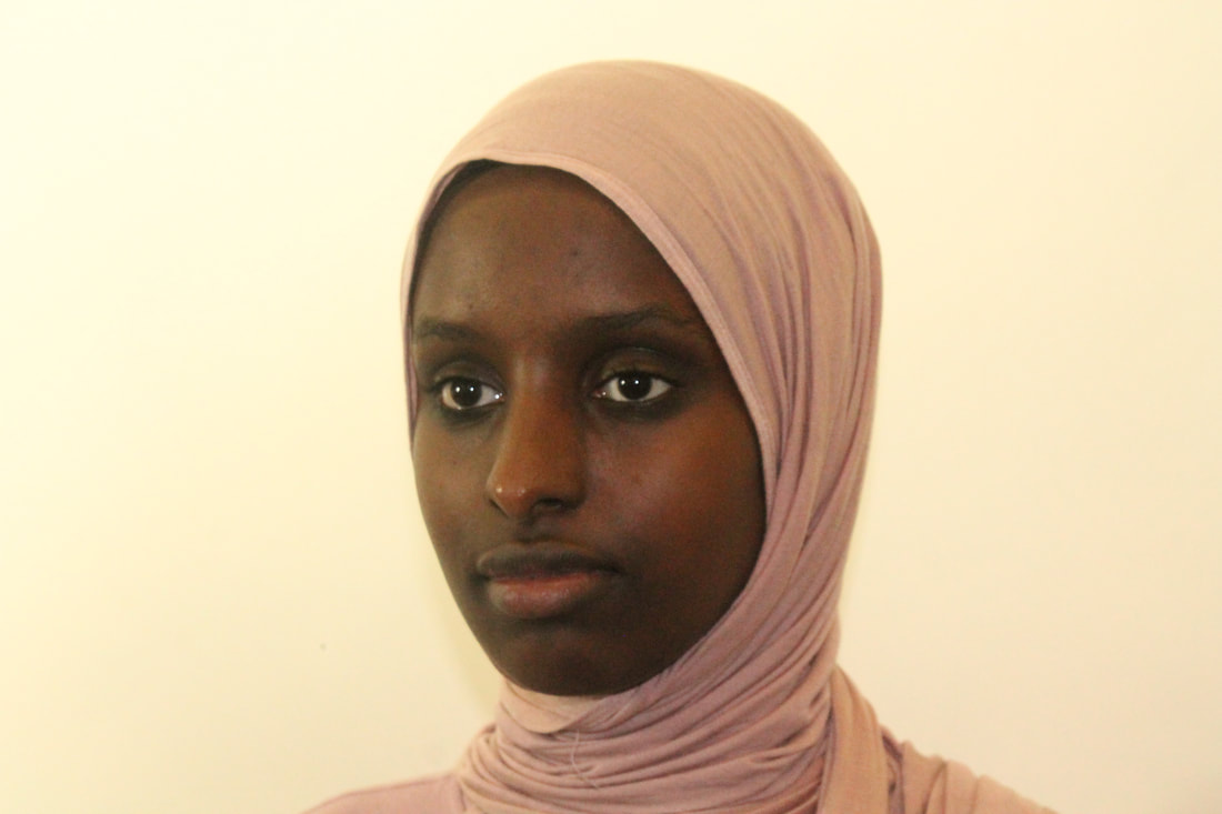
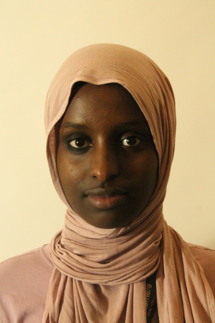
Cosmic Surgery:
Alma Hassar:
|
|

|
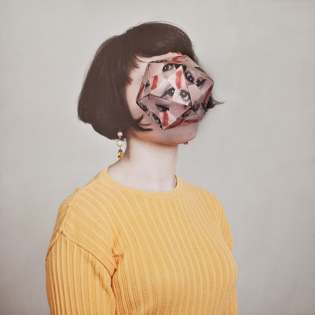
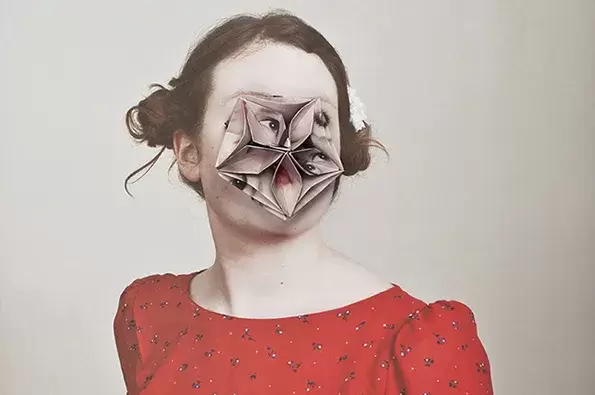
Born in 1989 into an artistic family in the Black Forest, Germany, Alma Haser is now based in London and on the southeast coast. She is known for her complex and meticulously constructed portraiture, which are influenced by her creativity and her background in fine art. Alma creates striking work that catches the eye and captivates the mind.
First Response: Representation of Cosmic Surgery
Method: I got 2 printed out versions of my photo and stuck a template for a 3D pentagon on the back of 1 of them. I then cut out the template with flaps and stuck the flaps together to make the 3D pentagon. I placed the 3D pentagon (of my first picture) on top of my second picture to create a physical geometric portrait.

|

|

|
WWW: My 3D pentagon wasn't crumpled and which allowed a clear distortion of the face.
EBI: I experimented with different photos of the same model .
EBI: I experimented with different photos of the same model .
Creation Process:
Patrick Cornillet:
|
|
|
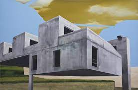
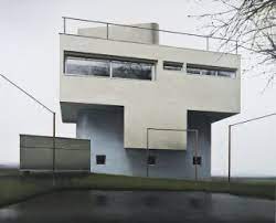
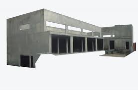
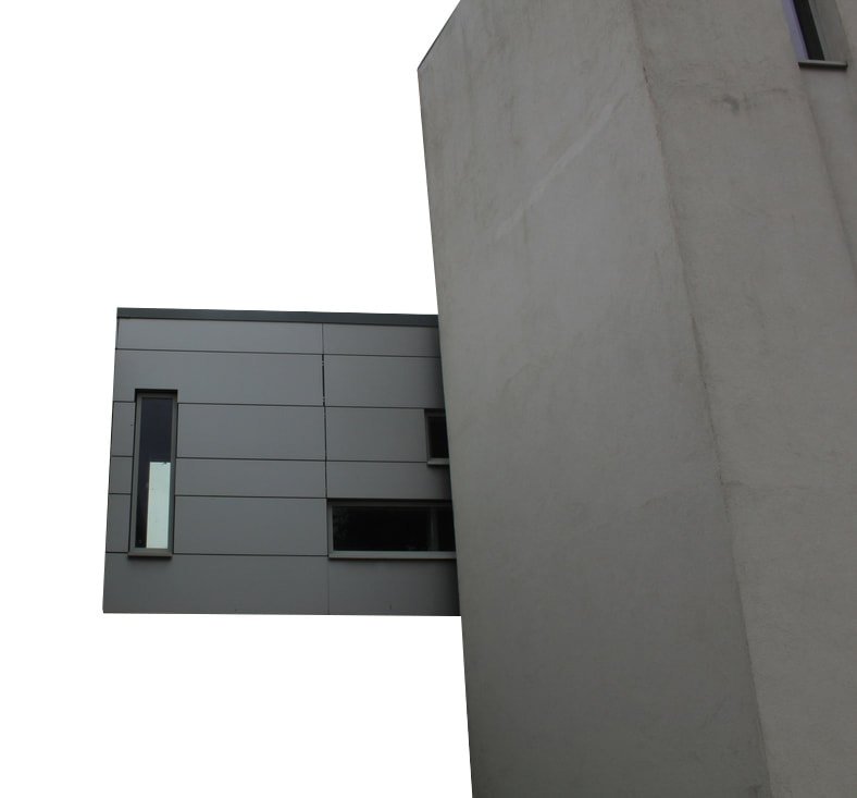
Cornillet is a French painter not photographer now based in Nantes, who was born in 1965. His work consists of architectural elements isolated from their environment and reconstituted in the form of objects on white backgrounds. Cornillet creates an eerie setting with his deserted, abandoned and austere constructions being surrounded by emptiness. This leaves the viewer in an illusory space. Most viewers struggle to give interpretations for his work as it is unclear as to what the structures purpose are: to show the concrete material being left by humans, or to show what will become of something after time passes by. The uninhabited subjects portray a mesmerizing reality of complete stillness.
Fragments of a Building:
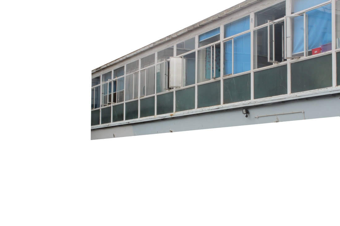
In fragments of a building I had to take a series of images of buildings that can then be photo-shopped. I had to cut out the "main" aspect of the buildings and stick it on white or sky backgrounds. Also, I needed to take interesting angles and viewpoints in order to create diversity in my work. Make sure to not include people, plants or trees in my pictures so that it can be easier to edit.
First Response:
Drafts:
I'm happy with the lighting of the pictures as they are quite dark but still clear. This means that it will be easier to create the same dim and dark setting that cornillet makes with his pictures. However, some of my pictures have bushes and trees in them which will be hard to edit out and some of the details on the building don't stick out as much as I wanted them to.
|
|
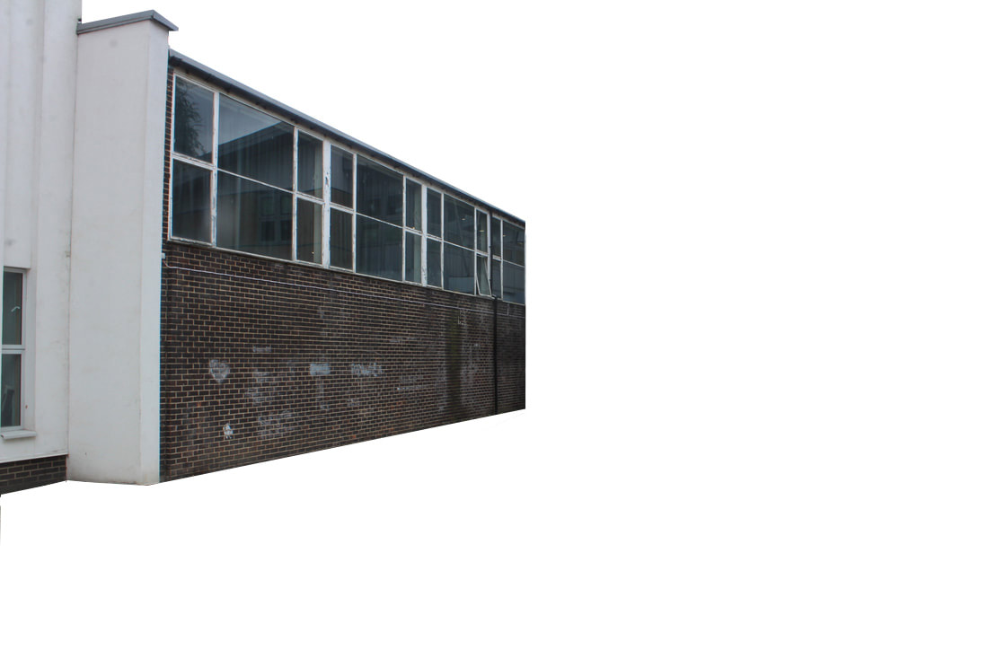
WWW: In this development I tried to capture images of simple architecture in order to convey the uninhabited setting in Cornillet's pictures. I created different contrasts with the background so the structures stand out more.I really think that the lighting of all the images was great for this assignment as it was quite dim so the buildings had a shadow like look, but also, the sky was quite white and bright so the windows on my images didn't really need any editing.
EBI: It was hard to create straight cut outs because allot of the lines on my images were at an angle, meaning that some of the cuts weren't as neat as they could of been. Also, I think it would've been good to of added filters to make the pictures more like collinets.
If I were to do this projects again I would experiment with different backgrounds to and many add more character to the buildings to make the overall image have more personality and depth.
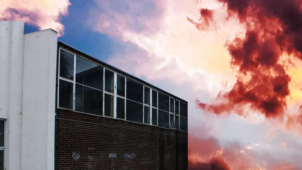
How to:

|
|
WWW:I like how the sky blends with the apocalyptic setting, I think that the second pictures good because the higher contrast actually blends the building in with the sky more.
EBI: However, I would like to improve the buildings window as it doesn't reflect the same sky that I've edited onto my image.
EBI: However, I would like to improve the buildings window as it doesn't reflect the same sky that I've edited onto my image.
Home Response:
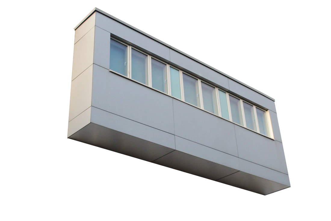
Method: for this response I found and took pictures of buildings with a unique look. I liked the flats I found at Battersea Power station because the building was in a geometrical looking structure. This made it easy to cut out the building as well it created an intricate shape on the final edit.
|
|
WWW: I like how clean the cut outs are and how the building looks like its floating in a void of white space. It was good that the day I took the pictures was cloudy because the reflections on the window were a lot lighter and go along with the colour scheme of the surroundings well. I also like the intricate shape of the building because it makes the picture look more surreal and interesting.
EBI: I think I could've tried experimenting more with colour and made the pictures more interesting. As well my pictures don't have much detail because the material of the building is very bland in texture.
EBI: I think I could've tried experimenting more with colour and made the pictures more interesting. As well my pictures don't have much detail because the material of the building is very bland in texture.
Mauren Brodbeck:
|

|
|
Mauren Brodbeck is a Swiss multi sensory artist who uses visual and auditory elements to create startling reinterpretations of common objects and experiences. Her multidimensional works invite her audience to step outside their safe and familiar realities and reconsider their relationships with the people and environments around them.
The hue used comes from the location or the season : “I am inspired by the colors of the place and the seasonal colors which can really change the feel of the pictures. I start by using the color palette of the area or the persona. Then I create my own color palette based on the original color. That maintains the authenticity at the base of the work.”
The hue used comes from the location or the season : “I am inspired by the colors of the place and the seasonal colors which can really change the feel of the pictures. I start by using the color palette of the area or the persona. Then I create my own color palette based on the original color. That maintains the authenticity at the base of the work.”
WWW: I liked how the picture included large structures that were coloured as it grabs the viewers attention. I also like how neat the colouring is and how clear the original parts of the photo are.I also think that the unique contrast in the shapes of the building makes the photo more interesting.
EBI: However I think that the colours used could've been stronger to attract more attention.
EBI: However I think that the colours used could've been stronger to attract more attention.
Gallery Visit:
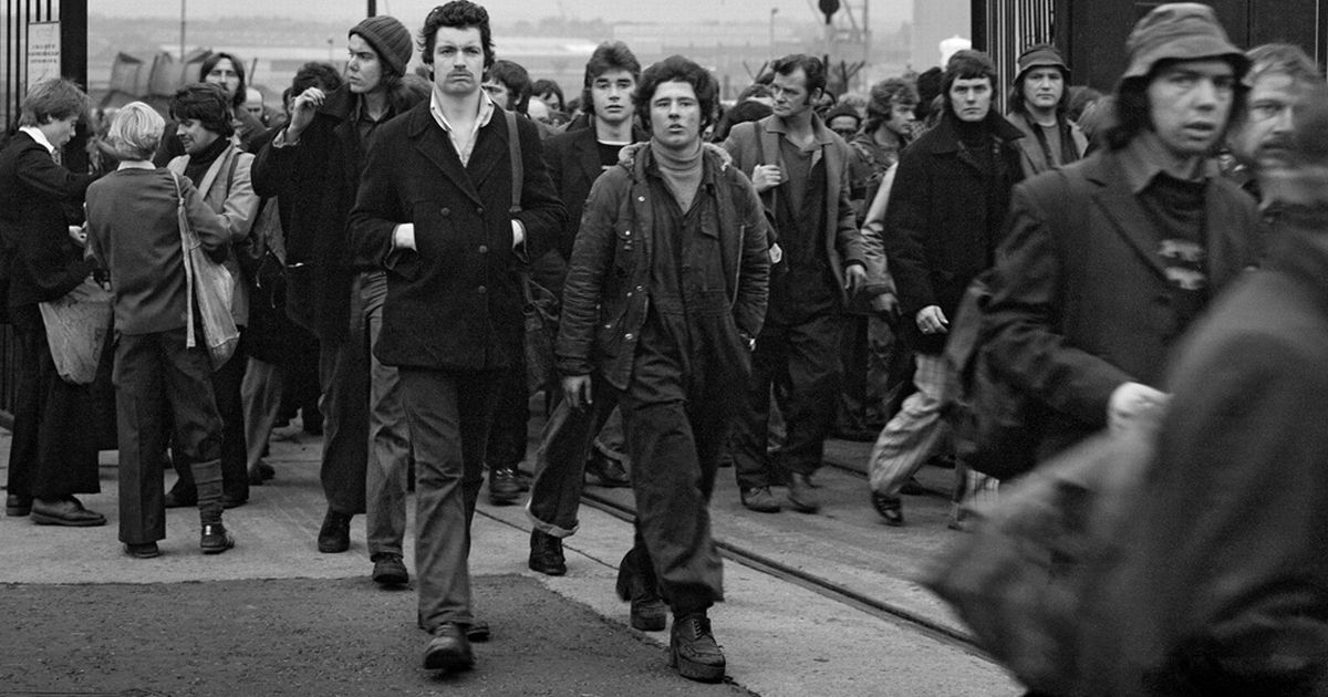
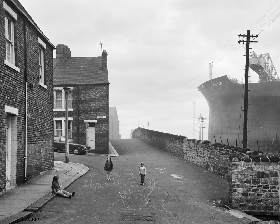
I visited the Chris Killip gallery by Oxford street on a school trip, because it gave us an opportunity to enrich are contextual knowledge of Fragments.
Chris Killip:
Chris Killip (b. 1946, Isle of Man, d. 2020, Cambridge, USA) left school at the age of 16 to pursue a career in photography. In 1964 he was hired as an assistant to photographer Adrian Flowers before working as a freelance assistant in London from 1966-69. In 1969 he ended his commercial practice, returning to the Isle of Man where he created his first major body of work. In the following years, he was founding member, curator and advisor for Side Gallery, Newcastle-upon-Tyne and its Director from 1977-9. Whilst living in North East England, Killip photographed extensively throughout the region. He committed to long term projects there, the most significant being a community of sea-coal workers, the 1984 miners’ strike, shipbuilding, and Skinning-rove, a coastal village that once thrived on ironstone mining, ironworks, and fishing. His seminal book from this period, In Flagrante, is considered one of the most important post-war photo books published to date. In 1989, he received the Henri Cartier-Bresson Award. In 1991 he took up a teaching position at Harvard University, where soon after he was named a full-time senior professor, chaired the Department of Visual and Environmental Studies for a number of years, and taught until December 2017. In 2020 he was given the Dr. Erich Salomon Award in acknowledgement of the outstanding achievements in photography, gained though his 50-year career. His work has been the subject of numerous international solo exhibitions and is held by significant collections including MoMA, New York; George Eastman House; The J. Paul Getty Museum, Los Angeles; Museum Folkwang, Essen; the Stedelijk Museum, Amsterdam; Tate, London; and the Victoria and Albert Museum, London.
Gallery:
|
|

|
|
In his exhibition the images illustrate an environment that for centuries had evolved from the industrial revolution, and he documented the individuals and communities whose lives depended on heavy industry, people who were facing a politically forced change to the landscape and the ways of life that had been settled for generations.
This retrospective exhibition of more than 140 works, serves as the most comprehensive survey of the photographer's work to date and includes previously unseen works.
His sustained immersion into the communities he photographed remains without parallel. Whilst marking a moment of deindustrialisation, Killip's stark yet tender observation moves beyond the urgency to record such circumstances, to affirm the value of lives he grew close to - lives that, as he once described 'had history done to them', who felt history's malicious disregard and yet, like the photographer himself, refused to yield or look away. His work was very important in expressing the struggles that others expierience.
Against a background of shipbuilding and coal mining, he witnessed the togetherness of communities and the industries that sustained them and stayed long enough to see their loss.
I like how all the images are in gray scale becuase it helps derive all the pictures of happiness and perfectly conveys the mood of the subject. It evokes the viewer to have a deep understanding of the struggles that the people had to go through and perfectly portrays their experiences.In the exhibition, all of the pictures had their own description making every image seem personal and important.I like how in most photos there were multiple layers, as this created depth in his images which made them more compelling.Furthermore, I like how the artist sometimes left a large part of the sky in his pictures, emptying the picture of detail and further emphasizing on the environments emotionless aesthetic.
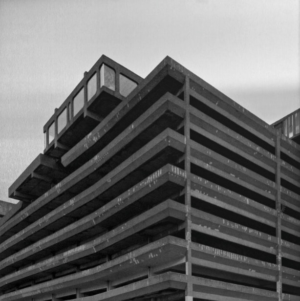
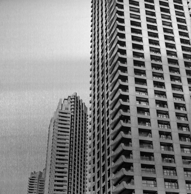
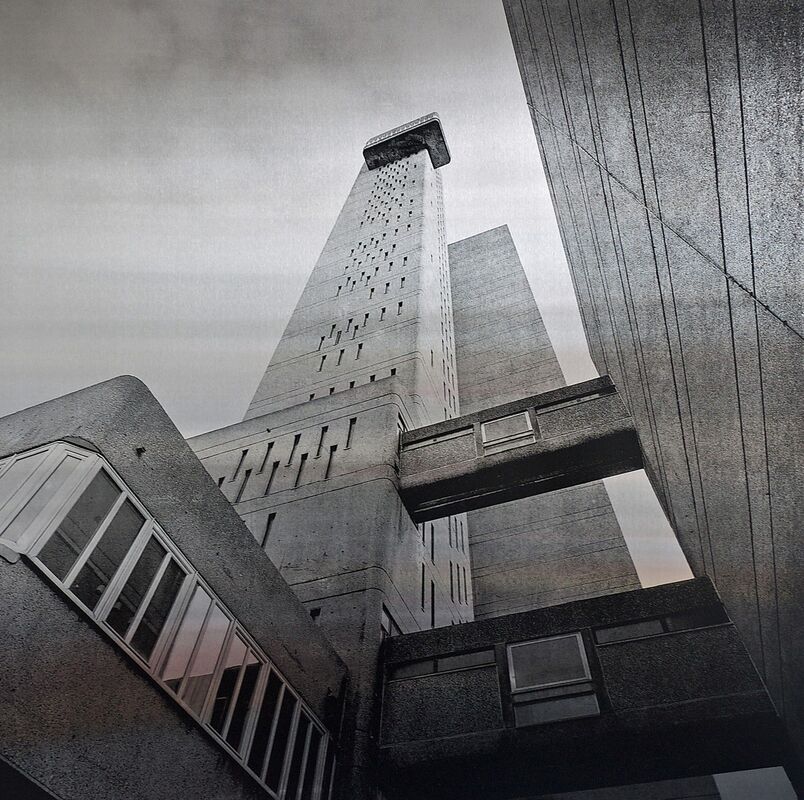
Development 1- Brutalism:
Simon Phipps:
|
|
|
Simon Phipps is a photographer ,who grew up in Milton Keynes, and is now the creator of the New Brutalism collection of photography on Tumblr, Instagram and Twitter. He graduated from The Royal College of Art and studied sculpture. His parents were architects involved in the design of the city which is possibly the reason for the Brutalism collection. Simon Phipps is a renowned photographer of post-war modernist architecture and the author of three books.
In his Brutalism collection I like how Phipps makes the buildings release an ominous feeling that is imposed on the viewer. The lower angle helps to create this effect as well as the dark colour schemes. I like how the colour scheme allows the building to be imposing without letting the sky overpower the image. The collection keeps a very similar theme throughout each picture, as each one looks like a picture from a different time- either from a post apocalyptic future, or and old soviet building. The buildings he takes pictures of look abandoned and devoid of any colour, evoking the viewer to wonder what the building is, and whether its still around today. Furthermore, the buildings he captures almost have an avoidance of all beauty and express a severe nature.
In his Brutalism collection I like how Phipps makes the buildings release an ominous feeling that is imposed on the viewer. The lower angle helps to create this effect as well as the dark colour schemes. I like how the colour scheme allows the building to be imposing without letting the sky overpower the image. The collection keeps a very similar theme throughout each picture, as each one looks like a picture from a different time- either from a post apocalyptic future, or and old soviet building. The buildings he takes pictures of look abandoned and devoid of any colour, evoking the viewer to wonder what the building is, and whether its still around today. Furthermore, the buildings he captures almost have an avoidance of all beauty and express a severe nature.
For this development I decided to explore the Barbican because of its tall concrete structures. For this development I tried to play with different angles (specifically low view ones- worms eye view) and focused on making the structures overpower the viewer.
Draft:
WWW: I like the lighting on the pictures and how clear they are. I also think that I succeeded in making the structures seem overpowering. As well I think I explored a range of different angles but I mostly focused on a worms eye view to make the buildings seem ominous (like the artist).
EBI: Some of the pictures are blurred and have a high aperture because my camera wasn't set to automatic focus. As well I think it would have been good to get a more varied range of brutalist buildings instead of the tall apartment buildings.
EBI: Some of the pictures are blurred and have a high aperture because my camera wasn't set to automatic focus. As well I think it would have been good to get a more varied range of brutalist buildings instead of the tall apartment buildings.
Final Edits:
WWW:I think that the black and whites I used for this development were very effective in conveying the same type of brutalist style as Phipps. Furthermore, I think that each of the buildings I captured were very good for this development as they are completely made out of concrete and look like the buildings Phipps captured. I also love the huge contrast in exposure and shadow. This development contains a sense of mystery and is quite a dark inspiration to explore. I'm happy that I was able to explore a range of different tones and levels of brightness to create these pieces. I also like the amount of detail in the pictures as the stains on the building are very eye drawing because of how contrasted and dark they are compared with the rest of the building.
EBI: I could use Photoshop to increase the level of graininess on the pictures to make them look more vintage and closer to the images that Phipps made. As well, I dislike how bland the sky is as it stops the buildings from standing out as much and because of how clear the sky is, it makes my pictures look less detailed and natural. I also think that if the pictures and a few clouds in them that it would make the scene more ominous.
EBI: I could use Photoshop to increase the level of graininess on the pictures to make them look more vintage and closer to the images that Phipps made. As well, I dislike how bland the sky is as it stops the buildings from standing out as much and because of how clear the sky is, it makes my pictures look less detailed and natural. I also think that if the pictures and a few clouds in them that it would make the scene more ominous.
My Favorites:

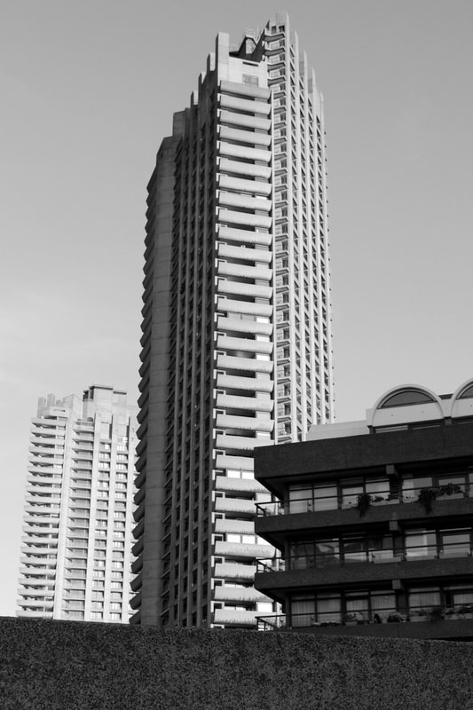
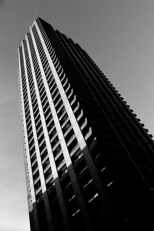

I especially like these pictures because they have the most detail and contain the best tone and contrast out of all the pieces. I also like how in the third picture I was able to explore a different type of brutalist structure. I think that overall my development on brutalism was very successful
How to: I created this brutalist effect by gray scaling my image: Image>mode>gray scale then I adjusted the contrast by clicking Image>adjustments>contrast and brightness.
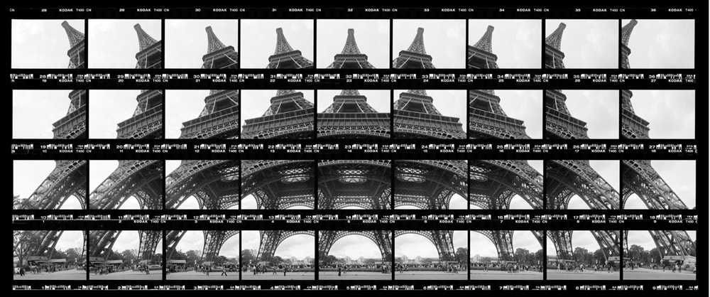
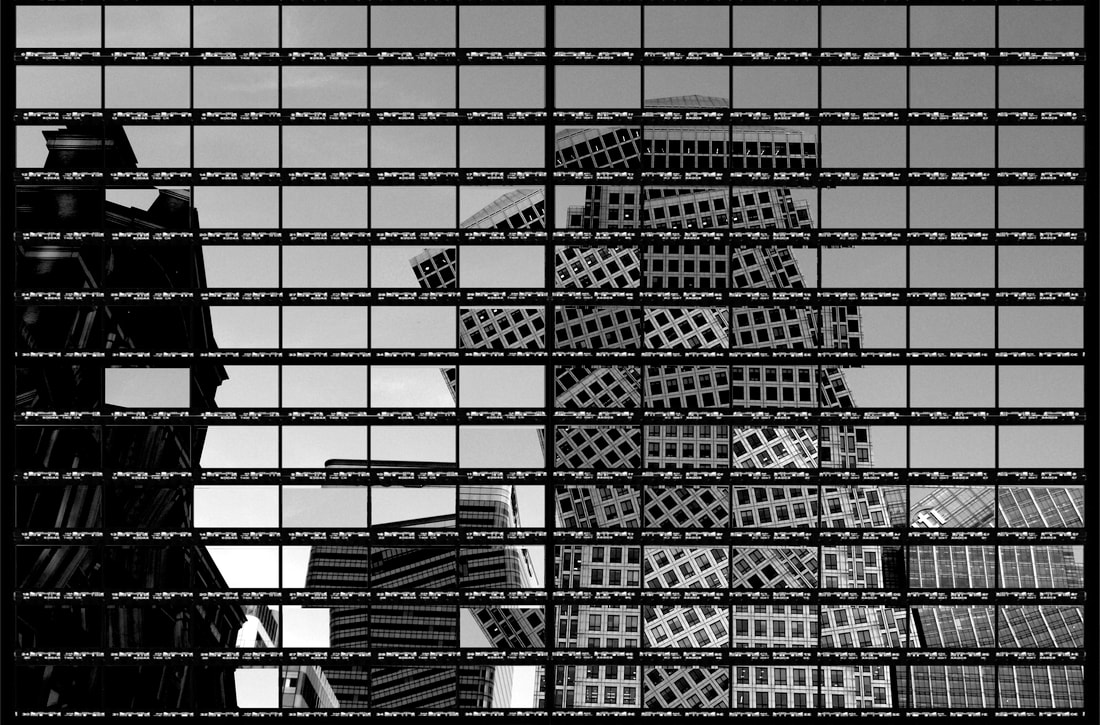
Development 2-
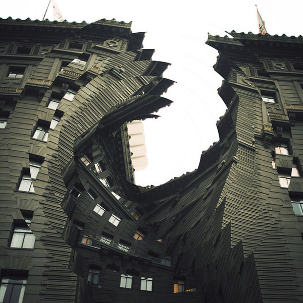
Thomas Kellner
Thomas Kellner is a German fine-art photographer who became known above all for his large-format photographs of famous architectural monuments, which, through many individual images and a shifted camera perspective, look like "photo mosaics".Thomas Kellner's fine art photography changes the object of the image and makes the audience question what they see.
A selection of Thomas Kellner's work shows analog compositions from the period of 1997 to 2021. Beginning from the idea of Cubism after Delaunay, he transfers the international movement of Deconstructivism from architecture to photography. He photographs buildings, fragments them and assembles them into a heterogeneous conglomerate of forms. And yet, his famous montages of contact sheets are just one type of his multifaceted works he uses to change our perspective and link art to our thinking. Prof. Irina Chmyreva from the Academy in Moscow defined his work as "visual analytical synthesis".
A selection of Thomas Kellner's work shows analog compositions from the period of 1997 to 2021. Beginning from the idea of Cubism after Delaunay, he transfers the international movement of Deconstructivism from architecture to photography. He photographs buildings, fragments them and assembles them into a heterogeneous conglomerate of forms. And yet, his famous montages of contact sheets are just one type of his multifaceted works he uses to change our perspective and link art to our thinking. Prof. Irina Chmyreva from the Academy in Moscow defined his work as "visual analytical synthesis".

|

|
Method: I tried to use Keller's technique to distort my images. I'm going to try to create a distorted mosaic like pattern to innovate a new perspective on my Brutalism work. After, I'll experiment with a new take on Keller's work and capture time and movement by making my pictures look there toppling over/collapsing and/or at a scene of a demolition.
First Response:
WWW: I like the patterns created as well as the distortion of the structure. I also like how there aren't any white boarders around the contact sheet.I also like the layered composition.
EBI: I think the picture could've been more detailed.
EBI: I think the picture could've been more detailed.
WWW: I like the patterns formed and how the sides of the building are rigid. I also like the layered composition. As well the building has a lot of structures.
EBI: the top of the contact sheet is cut off so the picture isn't completely framed properly.
EBI: the top of the contact sheet is cut off so the picture isn't completely framed properly.
WWW: I like how intricate the patterns are and how detailed it is due to the multiple structural lines.
EBI: I think the picture could be too distorted for some people to recognize what the type of building is.
EBI: I think the picture could be too distorted for some people to recognize what the type of building is.
WWW: I like how I experimented with different patterns by reflecting the buildings and creating a pleasing checkered layering. Furthermore, the original picture had a nice composition of layers.
EBI: The top of the contact sheet was cut off so the border around the picture wasn't completely perfect.
EBI: The top of the contact sheet was cut off so the border around the picture wasn't completely perfect.
WWW: Overall, I think I was successful at using Keller's technique to distort images and "make the audience about about what they see". I like how I was also able to experiment a bit with the London buss instead of only doing work on my brutalism pictures. I also like how I was able to explore different ways of distorting and changing the images by: reflecting, changing the angles and playing with the patterns.As well, the pictures I edited were good quality and show a lot of detail in the buildings which makes the "photo mosaics" even more intricate. I also like how I had up close views of the buildings as well as far away views showing more of a skyline.
EBI: I think I should've tried taking pictures of iconic buildings to link more to kellner's work. As well, It would've been good to of merged different perspectives together of the same building together. I also would've liked to of gotten more landscape skyline views.
EBI: I think I should've tried taking pictures of iconic buildings to link more to kellner's work. As well, It would've been good to of merged different perspectives together of the same building together. I also would've liked to of gotten more landscape skyline views.
Second Response:
For this response I focused on illustrating a demolition of a building and came up with the idea to make the contact sheet look like its filled with pictures taken at different times of the demolition.
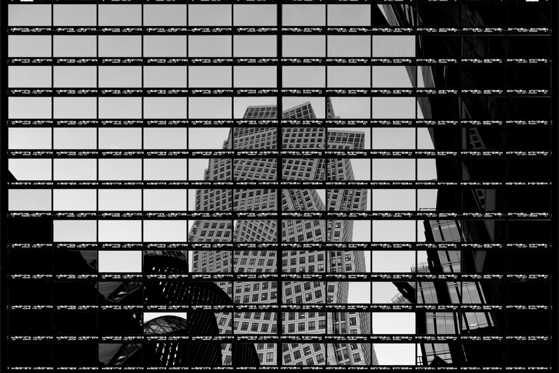
WWW: I like how I was able to portray movement and also not go to far away from the patterns made from Kellner's work. I also like how I used a much bigger contact sheet than the usual ones Kellner uses because it allowed me to release a lot more movement and distort the image more. I like that I was able to incorporate multiple themes into this response: Deconstructionism, Brutalism, Movement and Time. Furthermore, I think that changing the levels of the picture to make the building darker was a good idea because it makes the subject seem more ominous. I also think the increase in contrast helped convey the setting I was trying to portray.
EBI: 1 of the pictures shows two pictures that are half cut within the same contact frame. I sadly made the mistake of flattening and saving before fixing it so I can't go back and re-work the picture. As well, I dislike the thick bar in the middle of the image- where I merged two contact sheets- because its distracting.
EBI: 1 of the pictures shows two pictures that are half cut within the same contact frame. I sadly made the mistake of flattening and saving before fixing it so I can't go back and re-work the picture. As well, I dislike the thick bar in the middle of the image- where I merged two contact sheets- because its distracting.
Overall, I think this response was very successful in showing motion and movement in time as each frame in the contact sheets look like a single photo taken at a different time- especially in the first photo.
How to: for this task I layered an empty contact sheet on top of a few pictures. I then used the magic wand tool to highlight the frames of the layer I wanted to remove. I then rotated the layer below by clicking cntrl and t.
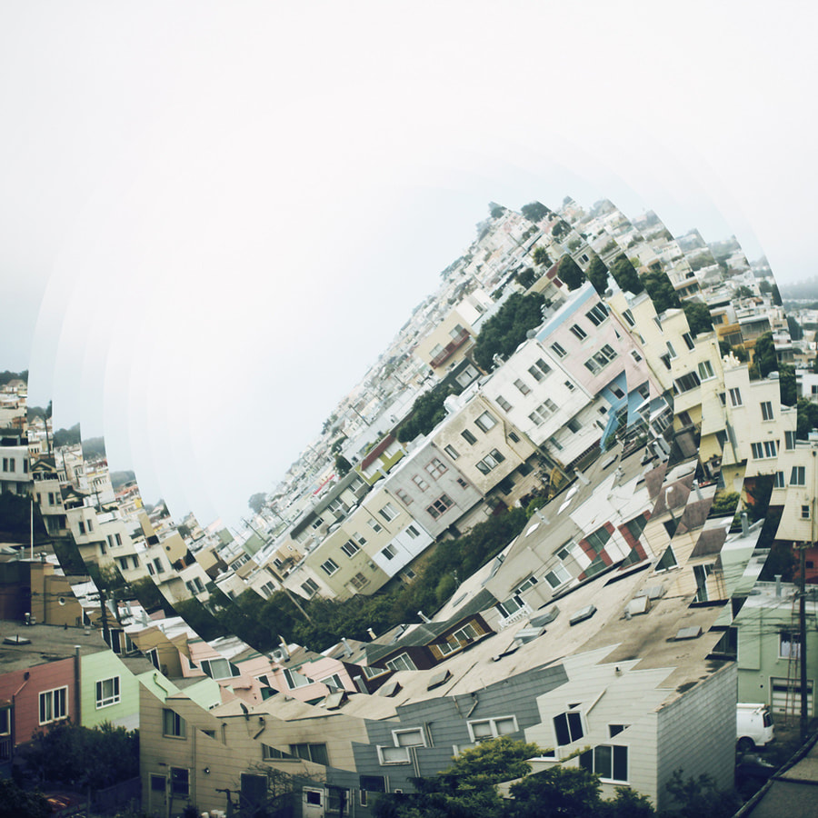
Development 3-
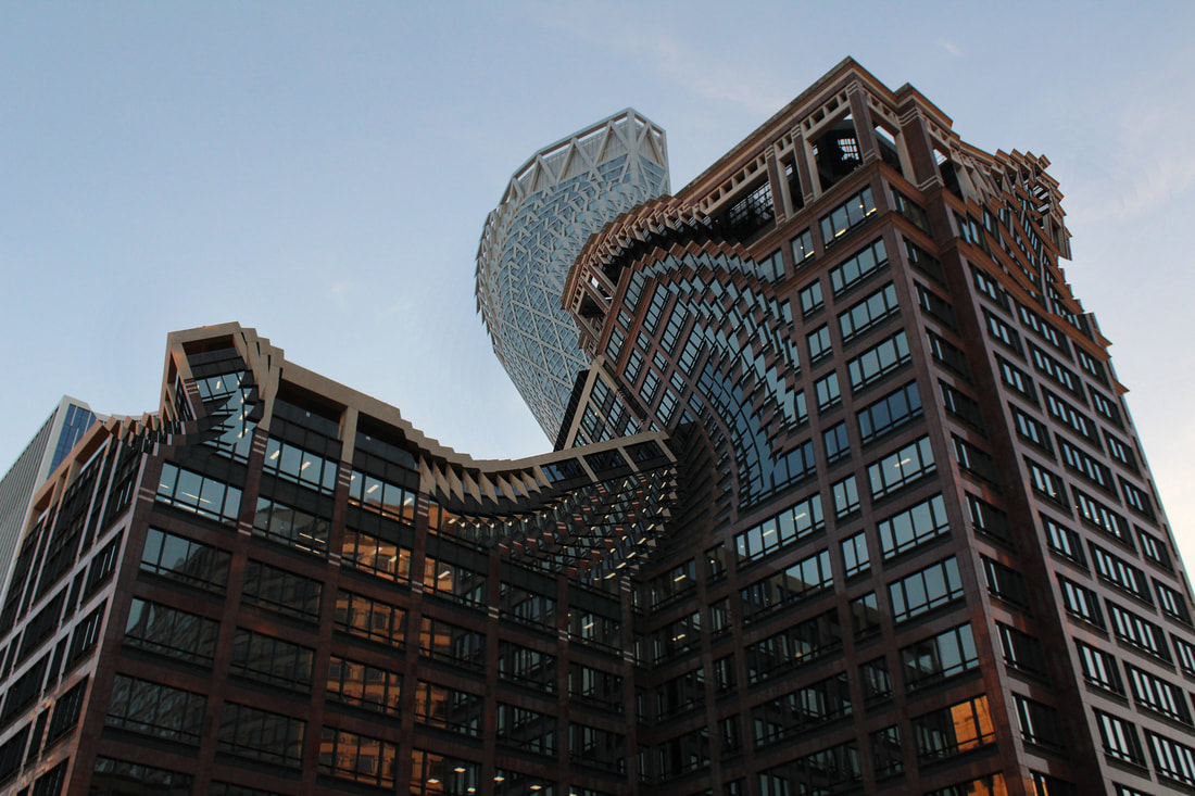
Nicholas Kennedy Sitton
Nicholas Kennedy Sitton is a San Francisco-based photographer who uses a technique. He uses an abstract form and twisted pattern that Sitton achieved through cutting and rotating the image segments slightly.
|
|
|
These photos link to the concept of distortion in architecture. Nicholas creates a sense of a setting falling into itself, like capturing a moment of demolition, Sitton destroys structures he captures and creates new twisted versions of reality. Whilst still leaving much of the original image untouched.Selections of the buildings (captured) have been rotated making the scene look like it’s spiraling into itself causing an almost hypnotic Inception-like feeling. There is a contrast between the fantasy of distortion and disorientation, and the otherwise typical scene.
Draft:
Edits:
WWW: I like that I was able to explore many different effects created from Sitton's techniques. I tried to create an effect of a building flowing downwards to convey capture the sense of a demolition. I also tried to use Sitton's technique to draw the viewers eye into a certain part of my picture and also create a fictional effect with ripples in reality. I also focused a lot at distorting the images and creating almost illusions of settings swirling into a void.
EBI: a lot of my draft pictures weren't great due to my camera having a low shutter speed and the lighting being bad because it was at the end of the day.
EBI: a lot of my draft pictures weren't great due to my camera having a low shutter speed and the lighting being bad because it was at the end of the day.
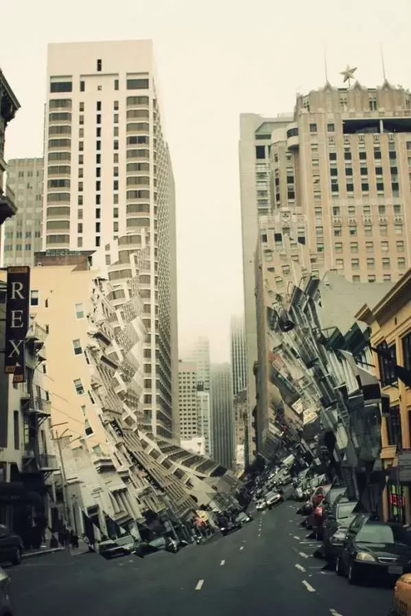
My Favorites:
I think this picture was one of my best example of exploring the effect of a building crumbling- releasing a scene of a demolition (like Sitton's work). I also like the composition of layers because it conveys are more widespread effect throughout the scene. As well I like the mostly brown colour scheme because it makes the picture seem smoother and less jagged.
|
|
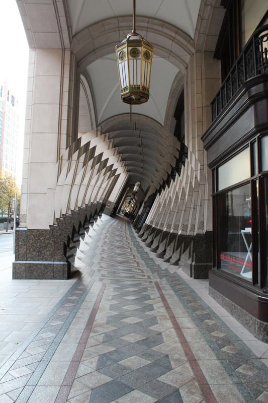
I like how I was able to explore other effects (on top of Sitton's technique) to distorted an image.As for this picture I created a gif to give more motion to the swirl. I like how the picture mimics the style of an optical illusion and makes the hallway seem never ending. I also like how the sides of the hallway in the swirls add to the optical effect.
My favorite:
WWW:I like how this picture conveys a flowing downward action, like the building is melting to the ground. I think the amount of swirls creates a mosaic like pattern that makes the picture very interesting and characteristic. I used many different tools to create this picture. I used the clone stamp tool to get rid of imperfections as some of the swirls were very spiky and drew the viewers eye away from the intentioned focus. As well used the rubber to get rid of parts on the upper layers to get rid of imperfections and I also blurred parts of my swirls that were too sharp to create a smooth effect throughout the image. The middle swirls also look like a facial side profile and traverses the structural form of the setting.
EBI: I would've like the picture to be more vibrant and I feel like I could've used more different effects to add more to the picture.
EBI: I would've like the picture to be more vibrant and I feel like I could've used more different effects to add more to the picture.
How to: use the elliptical marquee tool and outline the area you want to rotate or distort. then click cntrl c then cntrl v. To resize your copy click cntrl and t.
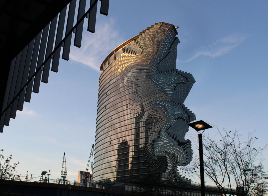
Development 4-
Fong Wwei

|
|

|
Fong Wwei is a conceptual fine art photographer based in Singapore with over a decade of experience. He creates stunning photographs that are not just colourful depictions of city life – but are also part of a visionary attempt to capture the passage of time in still images.“So I played around with the tools of digital photography and post processing to give you this series: Time is a dimension. This series of images are mostly landscapes, seascapes and cityscapes, and they are a single composite made from sequences that span 2-4 hours, mostly of sunrises and sunsets.The basic structure of a landscape is present in every piece. But each panel or concentric layer shows a different slice of time, which is related to the adjacent panel/layer. The transition from daytime to night is gradual and noticeable in every piece, but would not be something you expect to see in a still image.”
Draft 1 (trial):
For this response my aim was just to trial out the technique to see what I need to do for my final response and for me to notice what mistakes I make and how to stop myself from doing them on my final response.
WWW: I like the time intervals captured because they show dramatic change throughout the day without the intervals being too big and staying linear.
EBI: Annoyingly my camera still moved even though it was in a tripod. To combat this I'll try to resize and crop my images.
EBI: Annoyingly my camera still moved even though it was in a tripod. To combat this I'll try to resize and crop my images.
Experimentation:
These are my outcome from me experimenting with the arrangement of the fragments.
WWW: I Like the consistency in the clouds and the clear change in colour between the fragments. I also think that my cropping, nudging and resizing definitely got rid of a lot of the inconsistencys and mistakes. I like how the skyline is the focus ad the contrast between the skys attract the viewers eye.
EBI: I think the arrangement should involve more fragments so Ill try a different arrangement that involves more fragments. I think it would also be good to make the bright part of the day start in the middle and have the fragments get progressively darker on both sides. As well, not all the inconsistencys were removed as there's a half cut out tree remaining in the photo, which I've tried to fix as you can see on the photo in the second slide. But there's also a cut off in the roof between middle fragment and the middle right fragment. I could also try editing the different fragments to make them contrast more and show more colour.
EBI: I think the arrangement should involve more fragments so Ill try a different arrangement that involves more fragments. I think it would also be good to make the bright part of the day start in the middle and have the fragments get progressively darker on both sides. As well, not all the inconsistencys were removed as there's a half cut out tree remaining in the photo, which I've tried to fix as you can see on the photo in the second slide. But there's also a cut off in the roof between middle fragment and the middle right fragment. I could also try editing the different fragments to make them contrast more and show more colour.
WWW: I think that this arrangement works a lot better because it mimics sun rays and also makes the center stand out because of the bright sunlight in it.
EBI: I think I need to take pictures of city scapes and interesting views to make my pictures look more interesting.
EBI: I think I need to take pictures of city scapes and interesting views to make my pictures look more interesting.
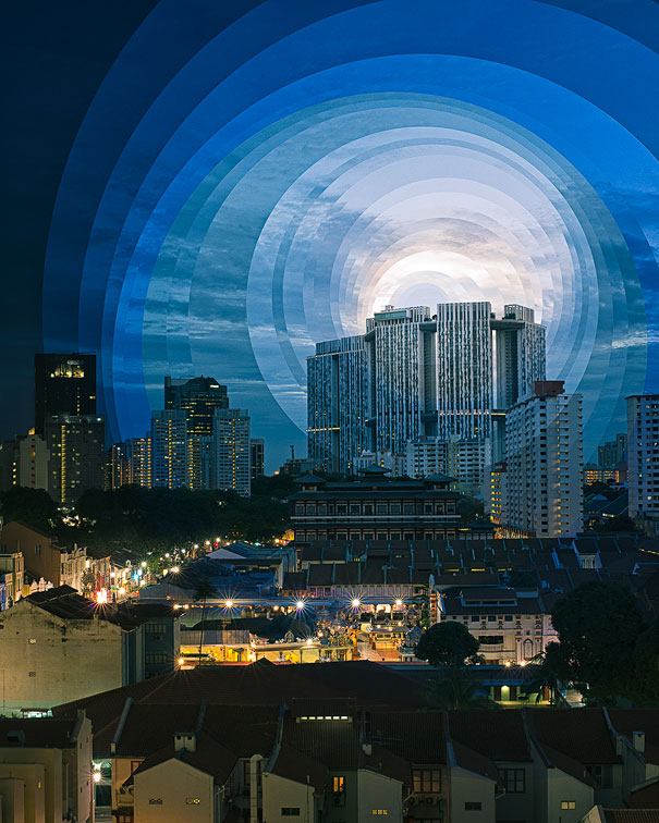
First Response:
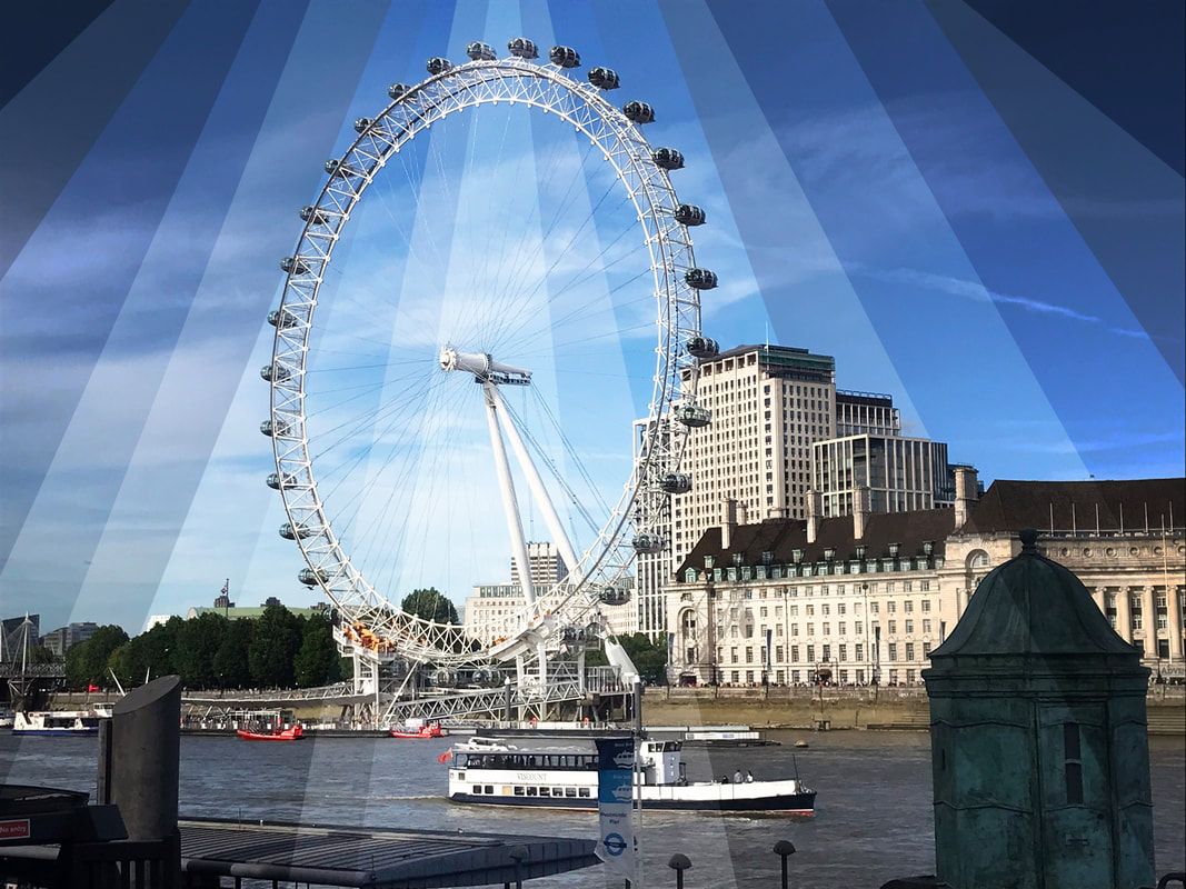
Method: I went to Alexandra Palace and took pictures of the view where you could see the city. I wanted to convey strong changes in time with detail so I prioritized using a low shutter speed so my pictures would have as much detail as possible. I also had a high ISO to stop my pictures being grainy. I used a tripod to stop my camera from moving to much so that when I edited my picture it would look like one image.
WWW: I like the how I used circles to show the different fragments of the day. I'm also happy that my photo wasn't too grainy and was relatively constant.
EBI: The photo is a little grainy and I dislike the arrangement of fragments because the fragment showing the night is in the middle of the photo so i doesn't draw in the viewer. I also think that the changes in time between the fragments is to vigourous and isnt's as smooth as i wanted them to be.
Overall, I don't like the work that I made in this response so I want to take a more digital reliant approach.
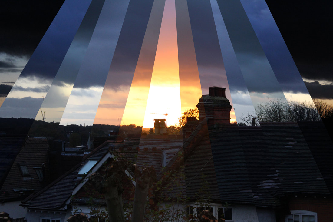
Second Response:
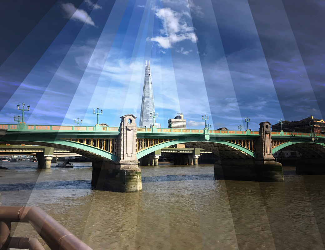
Method: For this response I wanted to edit pictures that I took in central London, by splitting the pictures into fragments and changing the brightness of each one of them to mimic the change in brightness that takes place during the day.
WWW: I like how clear the photo is and how the changes in brightness are a lot more gradual, leading to a smooth transition effect in time. I also like that the picture is kept constant because it is made up of layers of the same photo. I also like the arrangement of the fragments because they are triangular so the lead the viewer into the middle of the picture and direct the audience through the different times of the day.
EBI: It would've been better to have changed the colour balance in some of the photos to be more yellow and orange to mimic a sunset and make the image seem more natural.
EBI: It would've been better to have changed the colour balance in some of the photos to be more yellow and orange to mimic a sunset and make the image seem more natural.
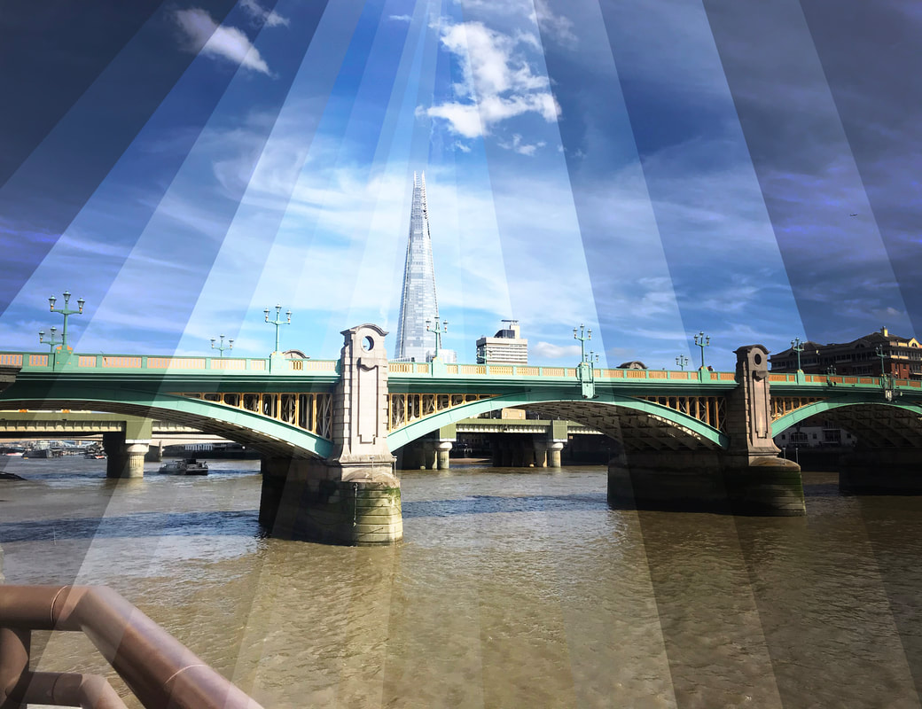
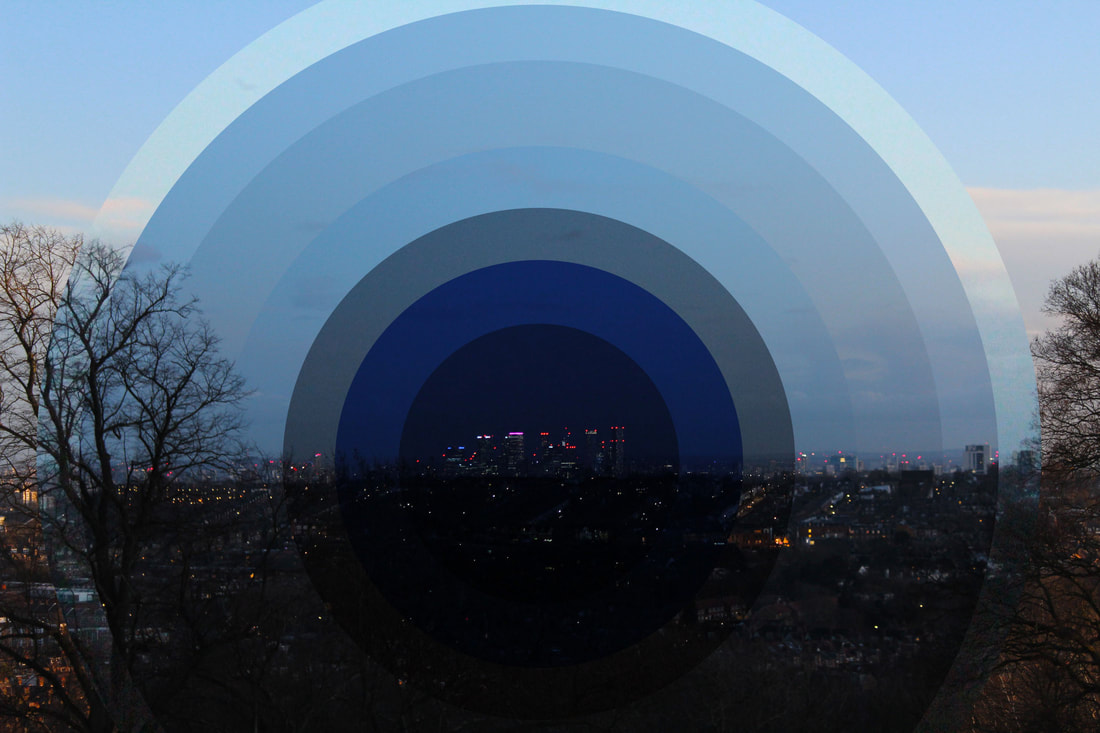
WWW: I like the arrangement of the fragments in the pictures above as the high level of brightness in the middle of the photo makes the building stand out more, which makes the picture more detailed and interesting. I'm also happy that I was able to change the colour balance of the middle fragment to be more yellow so mimic a more natural sunlight. I also like how clear the photos are.
EBI: I think that the brightness still looks a little artificial but I still think it creates a cool effect. I also think that I could've made the dark fragment a bit darker to involve a higher change in time within the picture.
EBI: I think that the brightness still looks a little artificial but I still think it creates a cool effect. I also think that I could've made the dark fragment a bit darker to involve a higher change in time within the picture.
Overall, this development was very difficult, however I'm happy with the second response and I like how I was able to experiment more with using fragments to show movement and change in time.
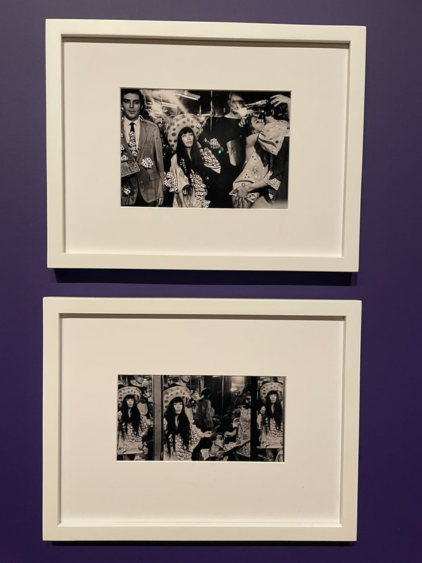
Gallery Visit: Yayoi Kusama - Infinity Mirror Rooms
I originally came to this exhibition with my friends for fun but I loved the artists ideas of merging perspectives and physically distorting the world around the viewer. I liked her different techniques: such as merging different pictures together and reflecting settings to convey different viewpoints. I also love her ideas of distorting the world around the viewer and physically immersing the audience in a multi-dimensional space.
Yayoi Kusama:
Kusuma was born in Matsumoto, Japan, in 1929. This was a time of economic crisis and growing nationalism, when Japanese traditions and social conservatism were strongly promoted. She started making art as a child, though her family discouraged it she went on to study painting in Kyoto.Looking for "unlimited Freedom and a wider world" Kusma moved from Japan to the United States in 1957, and settled in New York. Due to her early life being overshadowed by the second world war, when she moved to the US she was faced with anti Japanese propaganda and racism. This racism carried through into the criticism of her art "no matter how I may suffer for my art, I will have no regrets, this is the way I have lived my life and it is the way I shall go on living". She spent the 1960s in New York, immersing herself in the fast-moving art scene there. However, in 1973 she returned to Japan. Kusama has experienced mental health problems throughout her life and around this time she began to have acute hallucinations. In response she admitted herself to Tokyo hospital in 1977 and still loves there to this day. " I write novels and Poems, and I also paint in the hospital. They are my saviors".
|
|
|
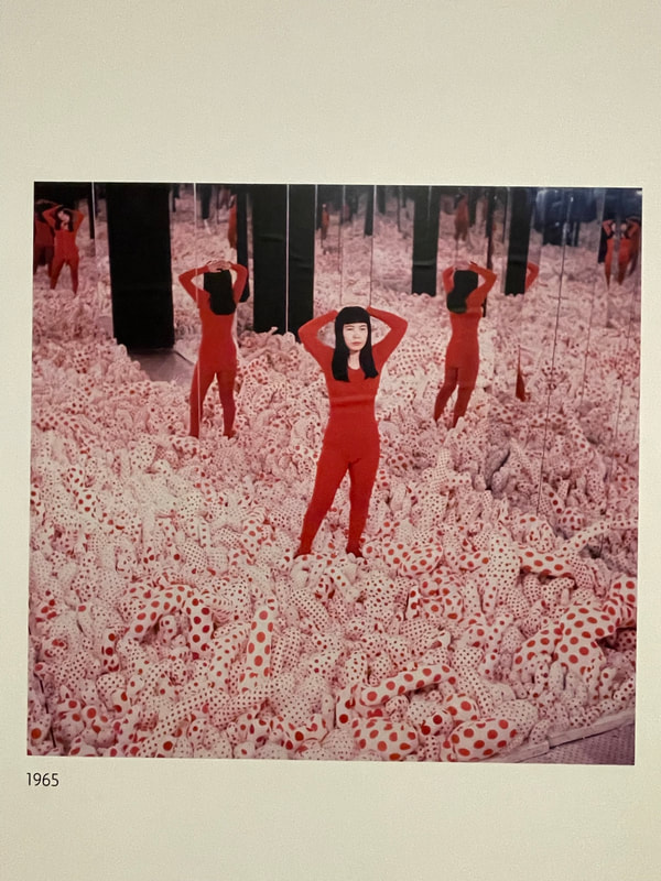
Kusama has been fascinated with ideas of endlessness in space and vision throughout her career. Her work, executed across a range of media, is characterised by its investigation of pattern, repetition and accumulation. From childhood Kusama suffered from anxiety and hallucinatory episodes, often in the form of nets or spots multiplying to dominate her field of vision. Forms from these hallucinations became the basis of her visual vocabulary. Early in her career, she began covering different surfaces – including walls, floors, canvases, objects, animals and people – with polka dots, which became a trademark of her work. Her large-scale environments, such as Infinity Mirrored Room, combine this hallucinatory motif with an ongoing concern with perspective, space and optical experience. The work exemplifies Kusama’s examination of repetition and infinity, while the interactive character of the room is typical of the way in which her practice engages the viewer directly, breaking down boundaries between subject and object.
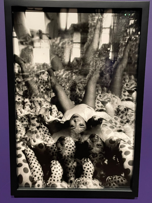
Chandelier of Grief:
The elegiac and ambiguous title of the work, though not representing any particular event in Kusama’s personal life, is consistent with her interest in representing complex psychological states through her artwork, such as mourning; in this regard. The name suggests that we can experience sadness and beauty at the same time.


The Chandelier of Grief is an example of Kusama’s persistent inquiry into the phenomenological potential of art, in which self and environment become indistinguishable and repetition of forms is employed to assert the overwhelming multiplicity of the universe. As such, the perspective of the room is multiplied and the viewer can no longer reconcile with reality as there perspectives are distorted in what seems like a never ending eternity of light. This distortion inspired me with ideas of creating pictures that distort different perspectives within time and create a new reality by joining different viewpoints together.
Infinity Mirrored Room:


The effects Kusama creates relate to her own visual hallucinations. Kusama has experienced these from early in her life. In them she becomes ‘obliterated’ by repeated dots. Here she invites us to share this ‘self-obliteration’. The dots surround and engulf you, making it hard to tell where you end and where the rest of the room begins. Usually, when we experience art, there’s a clear distinction between us and the artwork. But Kusama confuses this on purpose. To experience her mirror rooms, she asks us to become part of them.

|
|
|
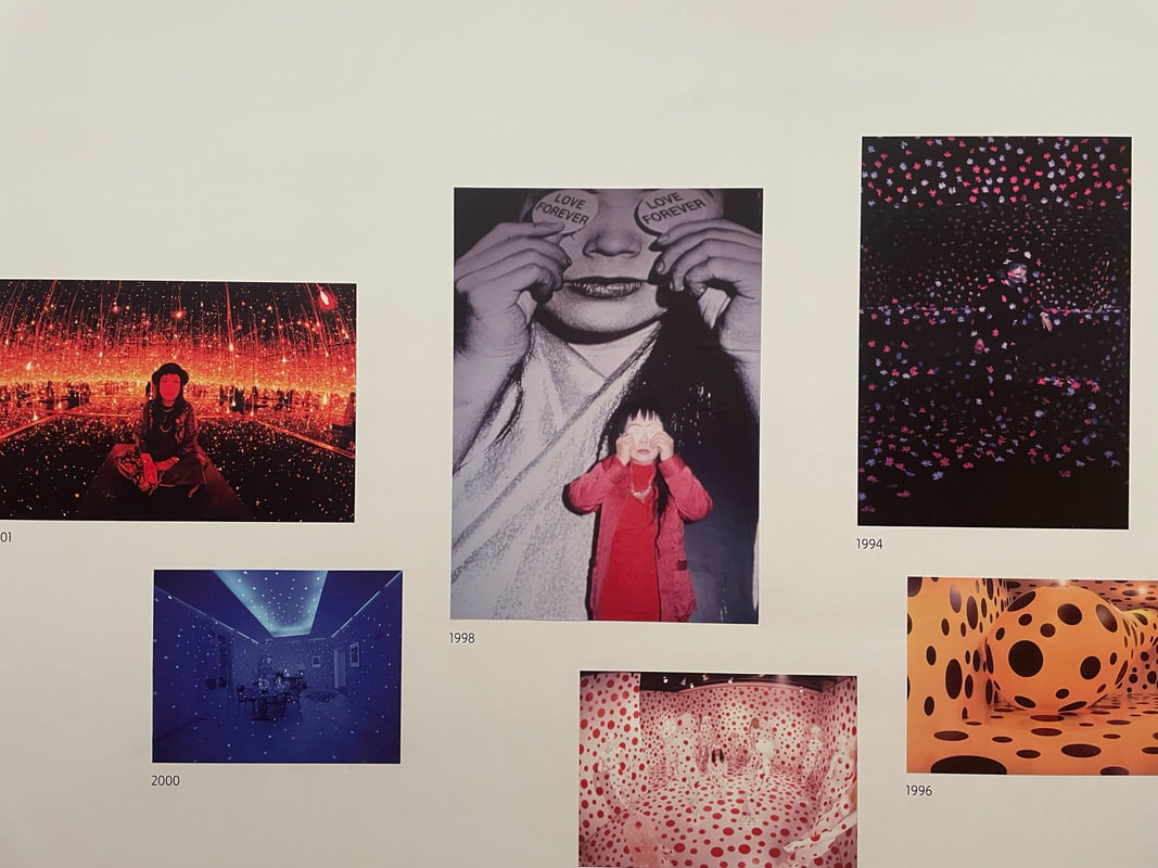
Across her career she has made paintings, sculptures, performances and installations. For Kusama, the experience of art is more than looking, it is about stepping into the artwork and being immersed in it, as in her infinity rooms.
|
|
I really enjoyed the exhibition and learning about Kusama but I was mainly inspired by her work on perspectives and distortion. I think that I want to include her techniques in future developments and experiment with her ideas on distorted perspectives.
Development 5-
Daniel Crooks
Daniels Crooks is a sculptor, photographer and time based artist. His work creates slippages between visual perception and temporal experience. Collating fragments of movement in his video works, Crooks poses a question of the metaphysics of the image and reality. Often this results in mesmerizing panoramas suspended in time, while his portraits destabilize their subject by splicing together multiple narratives.

|
|

|
Method: For this development I decided to go into central London ,because of the busyness and amount of crowds, and take pictures of various settings. My main aim was to explore capturing and creating slippages in movement and time.
Draft:
Finished Product:
Using 1 Image:

WWW: I like how distorted and chaotic the image is, I also like how wide the picture is meaning I could use allot of different fragments. I also like how the fragments merge together, almost making the whole piece look like just 1 picture. I also think that the lines have a good level of quality to them, as well there aren't any mistakes e.g all of the lines are the same size of the picture so there aren't any half cuts. I think that this image is successful at showing slippages between time and creating movement through the use of multiplied perspectives.
EBI: I think it would've been better to of captured more of the people moving and traversing as it would've linked to what Daniel Crooks was trying to do better. Furthermore, I dislike a few of the inconsistencies on the picture as some of the fragments stick out too much, because their are fragments of a tall building on a low rise part of the picture.
EBI: I think it would've been better to of captured more of the people moving and traversing as it would've linked to what Daniel Crooks was trying to do better. Furthermore, I dislike a few of the inconsistencies on the picture as some of the fragments stick out too much, because their are fragments of a tall building on a low rise part of the picture.
WWW: I like how chaotic the picture is because of the busy crowd at the bottom and the opposition between the tall building fragments and the low rise building fragments that are put next to each other. I also like the contrast between the sunny sky and the shadow cast over the ground floor.I feel like I have also successfully mimicked Daniel Crooks technique and applied his idea of showing slippages between visual perception and suspended movement, I also think I successfully showed movement by distorting the perspective of the picture. I also think that the image is quite sharp too.
EBI: I don't like how some of my fragments are similar because it reduces the variety of movement and patterns in the image which disrupts the motion of chaos I was trying to convey.
EBI: I don't like how some of my fragments are similar because it reduces the variety of movement and patterns in the image which disrupts the motion of chaos I was trying to convey.
Using 2 Images:
WWW:I like how I explored capturing different time zones more and linked more to the artist's theme of time suspended panoramas. I also like how the different pictures are taken from different angles because it distorts the completed image more and creates a more hectic setting. I also feel like there is a good flow of motion captured as well.Overall , I like that I was able to convey more change in time and portray movement in time by merging two perspectives of the same viewpoint.
EBI: I would've liked to of created more fragments and slippages and made the picture more hectic and chaotic.
EBI: I would've liked to of created more fragments and slippages and made the picture more hectic and chaotic.
2nd attempt: I decided to edit the picture above more to fix a few of the things I didn't like.
WWW: I like that I was able to create more slippages to increase the amount of chaos in the image and due to the pictures being taken at different times I was able to portray multiple narratives (like the artist). I also think it was a good idea to increase the contrast to make the slippages stand out more. I also like how I was able to show different objects at different times e.g the Lego sign and some of the people.
EBI: I would've like to of kept the same angle when taking the original pictures, to make the only differences in the slippages be between the crowds at different times. I also would've like to of captured the setting a a larger time interval to explore more with creating slippages in time.
EBI: I would've like to of kept the same angle when taking the original pictures, to make the only differences in the slippages be between the crowds at different times. I also would've like to of captured the setting a a larger time interval to explore more with creating slippages in time.
WWW: In this photo I like how I focused more on distortion and showing different perspectives. I also liked tat I was able to experiment with a different arrangement of the slippages. I like how clear the photo is and I like how the slippages merge with the background layer. I think this image creates a cool optical illusion and a hectic atmosphere that evokes a sense of chaos. I also like the width and amount of slippages used because it looks very neat. I also like how there is a somewhat bustling atmosphere which releases a level of vibrance in the picture.
EBI: Its fairly monochrome and it could include a lot more colour to make it look more interesting.
EBI: Its fairly monochrome and it could include a lot more colour to make it look more interesting.
Experimenting with more layers:
I liked experimenting more with a different amount of layers however I think this photo is too hectic and distorts the perspective too much.
Overall, I think this development was successful at conveying movement and movement in time by applying Crook's idea of creating visual slippages in reality.
How to: use the rectangular marquee tool to outline the area you want to copy, then click cntrl c then cntrl v and move the copied cut to where you want. Make sure you get your copys from the background layer.
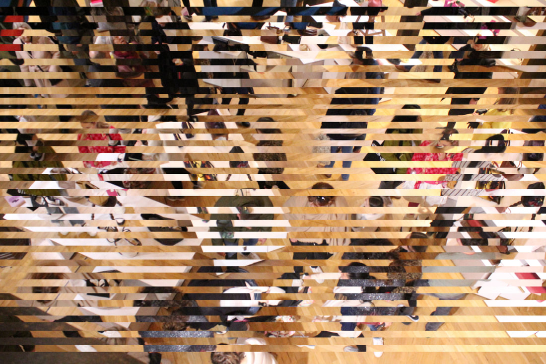
Development 6- Physical (woven) Development:
Ed Spence
Ed Spence is a multidisciplinary artist based in Vancouver,Canada.Ed's work spans many disciplines, utilizing performance, text, sculpture, photography, and public installation. It can be found in private and public collections internationally.
The work I'm inspired by are his woven pictures that he distorted by cutting up his pictures and physically weaving them into one another.
The work I'm inspired by are his woven pictures that he distorted by cutting up his pictures and physically weaving them into one another.
|

|
|
I chose this artist to draw inspiration from because I like the intricate patterns he created and I wanted to involve his technique into my last development.
Method: for this development was to print off two pictures of the same setting and cut them both up into lots of strips and weave them into each other to create a physical two layered image that captures motion and time (like the last artist I looked at). I decided to do this development because I wanted to explore different techniques for capturing different perspectives in time and movement.
First Response:
WWW: I like how the contrast in the picture make the audience focus more and the intended subjects (the top half of the picture). I also like how the tree, lanterns and fairy lights at the top look. As well, I liked that I was able to experiment with perspective as the two pictures I wove were from two opposite views. I also think that the weaves are very neat.
EBI: the picture was printed off in a small frame so the quality of the physical picture wasn't great so there isn't as much detail as I wanted to capture. The picture's level of darkness ,though helps make the audience focus on the subject, also makes the picture loose detail and makes the image look less vibrant. Next time I want to try and capture more movement in time and create a more vibrant image.
EBI: the picture was printed off in a small frame so the quality of the physical picture wasn't great so there isn't as much detail as I wanted to capture. The picture's level of darkness ,though helps make the audience focus on the subject, also makes the picture loose detail and makes the image look less vibrant. Next time I want to try and capture more movement in time and create a more vibrant image.
WWW: I like how the image conveys a lot of movement and releases a busy atmosphere. I also like the vibrance in colour becuase it adds to the hectic nature in the photo.
EBI: The picture doesn't have a lot of detail and there are a few gaps between the slippages.
EBI: The picture doesn't have a lot of detail and there are a few gaps between the slippages.
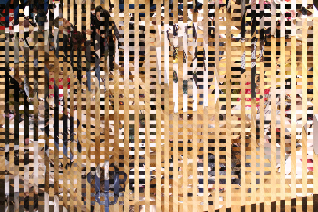
WWW: I like how the picture looks because the different layers don't clash because there the same photo at different times, this means that its better looking to the viewer because its less confusing. I also like how this links to Crook's theme of capturing motion, though I especially like how I've done this by using another artist's technique. Furthermore, I think that the its very neat and that each square is very neat and its clear to see each different slippage. I also think that the different perspectives of the scene merge well together and show a good amount of movement in the picture.
EBI: I think it would've been better if I was able to weave more slippages into the top area of the picture because there's quite a big gap. As well I think that the sides could've been better woven as the final vertical slip on the right side isn't woven through each horizontal slip.
EBI: I think it would've been better if I was able to weave more slippages into the top area of the picture because there's quite a big gap. As well I think that the sides could've been better woven as the final vertical slip on the right side isn't woven through each horizontal slip.
WWW: I like how neat the weaves are and how there are no visible mistakes. I like how the picture is quite contrasted as the crowd is very dark whilst the top of the picture is quite bright and colourful due to the billboard and London bus. I also like how defined the figures of the people are in the darkness as it makes them look like shadows. This distorts there identity and allows the picture to convey more movement because each shadow could be linked together.I like how the bustling scene vigorously evoked the sense of movement and change time.
EBI: I think the crowd could've of been more dominant in the picture to make sure that the picture conveyed more motion. I also think the bright billboard attracts too much attention away from the focus of the picture.
EBI: I think the crowd could've of been more dominant in the picture to make sure that the picture conveyed more motion. I also think the bright billboard attracts too much attention away from the focus of the picture.
Overall, I liked physically experimenting with photos of different perspectives that captured movement and movement that took place over time in a scene.
Development 7-
Alessio Trerotoli:
|
|
|
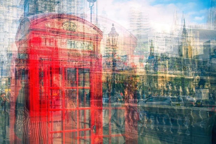
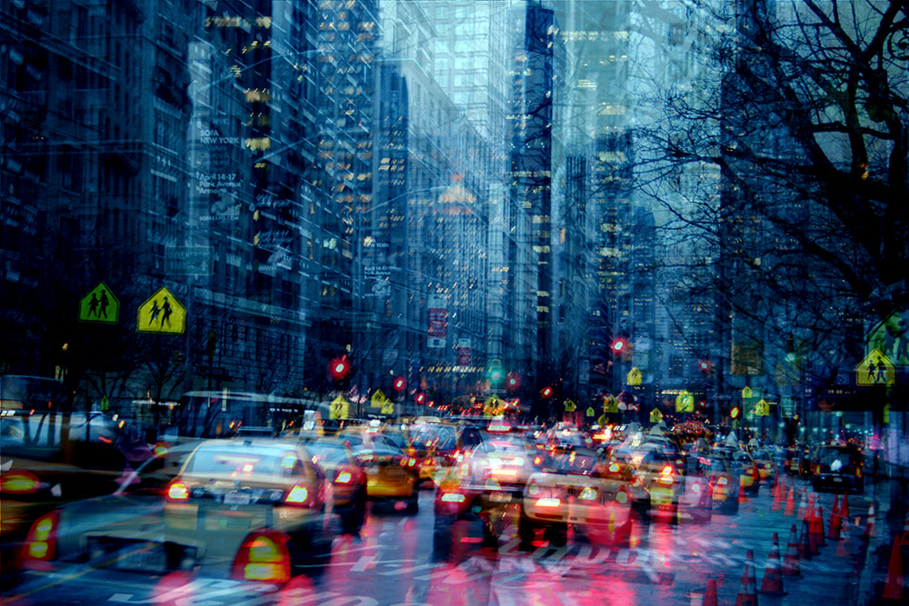
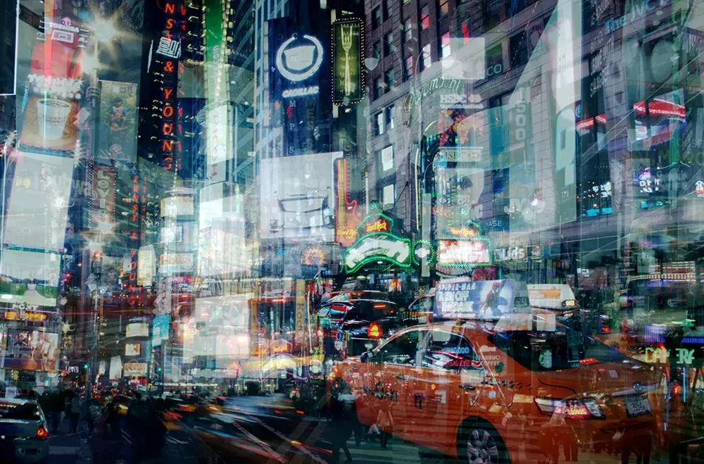
I found this artist through pinterest when looking for ideas around time fragments and layering.Alessio Trerotoli, is a photographer whose style is based on multiple exposures. Through his varied exposures and urban photography Trerotoli creates an abstract representation of cityscapes and urban atmospheres. By layering different images, Trerotoli aims to show a usual image in a conceptual way, where everything is duplicated- to emphasis on features of the city like the lights- and he creates a more bussling representation of his urban scenes. In his images the lights and the structures multiply and create a distorted vision of urban life: “ In my life I always try to look for something beautiful around me and if in my Urban Melodies you can find something beautiful in a traffic jam or in a building in ruin, maybe it’s possible to find beauty everywhere". Alessio graduated from art and cinema school in 2009, and after he travelled around the United States and Europe. It was during this time that he captured these images. In an interview he shared that his Ubran Melodies series takes inspiration from the interesting works of a Turkish photographer named Jak Baruh, who works also with multi layered images. Trerotol shares, "I tried to put my style and my sensibility in this project, that I see like melodic images: similar to the musical notes in a melody, each picture can stand by itself, but layered with the other pictures, the new image expresses a richer meaning. All of them, if linked to one another and concatenated in a bigger context, can create something different and, most importantly, something unique. They can reach a different meaning and become part of the melody: this is why my project is named Urban Melodies”. I really like the use of colour in his images, the contrasting lights, the reds and the blues, the colours that build up the setting he is portraying.
Trial:
Method: for my trial I first wanted to get to grips with how the photographer creates his vibrant images. I experimented with a variety of scenes and lights, and with some pictures that I've taken from other developments and projects- on top of new ones for this response. I wanted to prioritize using different shutter speeds to capture movement in light.


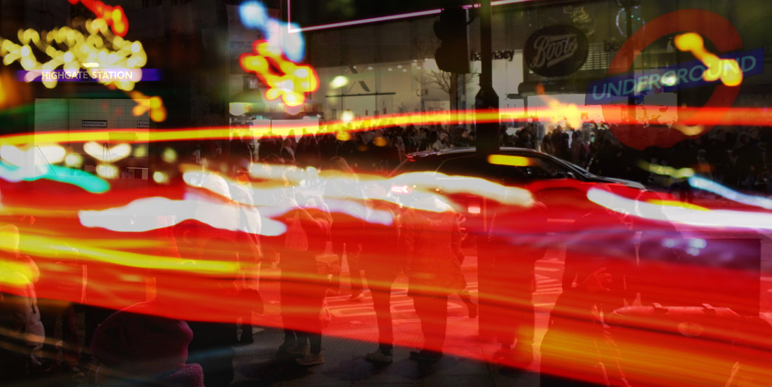
WWW: I Like how I captured a lot of lights and movement with my low shutter speed, I was also able to get a lot of practice out of using the burn tool to reduce the contrast between the pictures that I edited in ( the high gate station and the underground sign).
EBI: I think I need to use more layers and reduce the opacity on the layer with the lights because it blocks out a lot of the details from the background. I also think it would be a good idea to capture different scenes with lots of lights rather then edit layers of lights over pictures.
EBI: I think I need to use more layers and reduce the opacity on the layer with the lights because it blocks out a lot of the details from the background. I also think it would be a good idea to capture different scenes with lots of lights rather then edit layers of lights over pictures.
First Response:
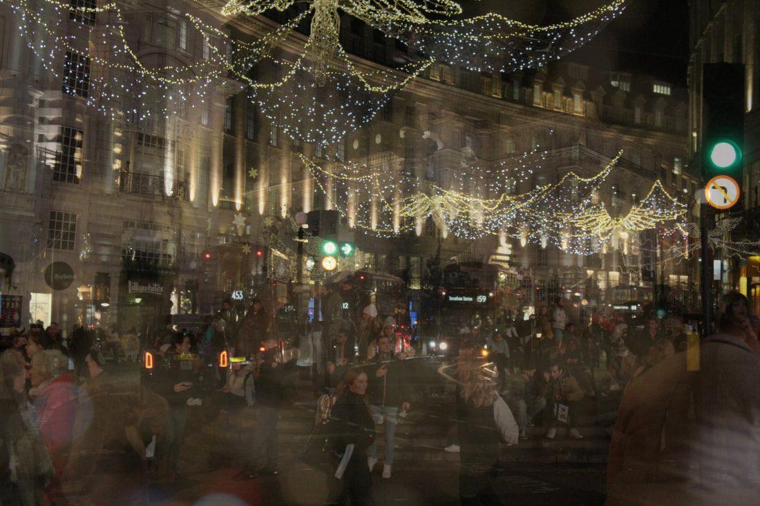
Method: For my first response I'm going to go to central London to capture different settings (like regents street ect...) to capture lots of different scenes that include a lot of lights. I'm going to aim to have around 3-5 layers per piece. I also want to capture some movement but I want to focus more on structures to link back more to my early developments. I also want to carry on experimenting with different shutter speeds and levels of focus. My take on Alessio's work will be less vibrant and more focused around showing different perspectives in the same image. In London right now the Christmas lights are up and I want to use the lights to include my theme of capturing time - by capturing the time of the year. I'll try to stick to warm colours and make crowds of people the focus of my images to convey the festivity at this time of the year.


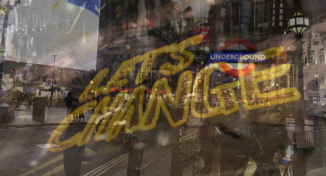
WWW: I like how colourful the image is and how the neon sign in the middle stands out. I like that I was able to layer 4 pictures to portray a lot of perspectives. I'm happy with how the layers are ordered as the layers that I wanted to stand out aren't too dark and blurred over by other layers. I'm also happy with the main scene being portrayed (Piccadilly circus) because its one of the scenes that Alessio captured in his urban melodies collection.
EBI: I think the picture could've been a bit brighter and it would've of been good if the billboard by Piccadilly circus wasn't white because its very eye catching and draw the viewers eye away from the subject. I also would've liked to of included more low shutter speed layers to portray movement more.
EBI: I think the picture could've been a bit brighter and it would've of been good if the billboard by Piccadilly circus wasn't white because its very eye catching and draw the viewers eye away from the subject. I also would've liked to of included more low shutter speed layers to portray movement more.


WWW: I like the simplicity of this picture as it isn't very busy and there wasn't any movement captured. I like this because it makes the audience focus on the beauty of the image and lights, as well the windows and architecture that the light is shown with don't look like what you'd see in London so they help transport the viewer out of the known world and into the reality of the picture.
EBI: I would've liked to of gotten more perspectives of the building to make the picture more detailed and somewhat distorted. This phot is also still and doesn't capture movement. I also think the picture could've been brighter.
EBI: I would've liked to of gotten more perspectives of the building to make the picture more detailed and somewhat distorted. This phot is also still and doesn't capture movement. I also think the picture could've been brighter.


WWW: I like how this picture has a unique aesthetic from the other pictures I've taken in this development. I like how there are a lot of perspectives of the scenery surrounding the window display and how all of the layers involve the same colour scheme making the match nicely. I also think that this picture transports the viewer away from London and into the world of Paris and fashion. I also like the subtle level of extravagance and how I was able to create a completely different styled image to Alessios even though I was using the same technique as him. I believe that this picture conveys a level of luxury and not just perspectives of setting but also a perspective of fashion.
EBI: I would've like to of contrasted the layers more to make the image less dark and more vibrant.
EBI: I would've like to of contrasted the layers more to make the image less dark and more vibrant.


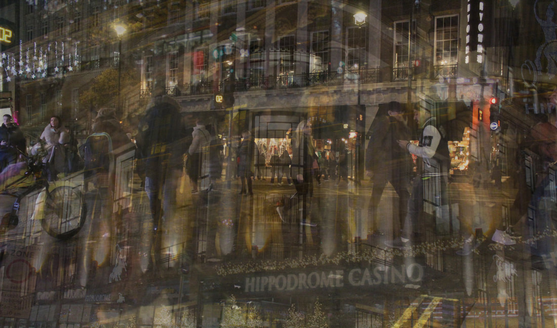
WWW: I like how I was able to capture movement as well as a variety of different setting in one picture. I like how all the pictures fit together as they all have similar colour schemes. I'm also happy with the amount of layers I was able to use because it made the picture more busy and vibrant.
EBI: I would've liked to of made the second layer stand out more to emphasis more on the movement and crowds in the image.
EBI: I would've liked to of made the second layer stand out more to emphasis more on the movement and crowds in the image.


WWW: I like how well the pictures fit in together the first layer was quite empty with the relatively no people around whilst the second layer is quite crowded so they merged well together, showing off exactly what I wanted them to. I like how I was able to showcase the Christmas lights to portray the time of the year, the festivity and socialness and to make my picture more vibrant and lit up.
EBI: I would've liked to of added more layers to make the picture more busy and to of captured more movement.
EBI: I would've liked to of added more layers to make the picture more busy and to of captured more movement.
Overall, I like how these photos successfully convey multiple perspectives and create new atmospheres by distorting and adding to the original scene. However I feel like they could've conveyed more motion and change in time.
Second Response:
I wanted to convey more movement in my pictures by using adding a layer of exposed light.
For this pictures I re-worked one of my photos from the last development I did and tried to portray more movement and experiment with different shutter speeds to create more movement in the picture.
WWW: I improved this photo by adding the layer of red light that I captured with a low shutter speed. I also contrasted some of the layers more to make each layer stand out more and make the picture more hectic. I feel like I successfully made the picture portray more movement.
EBI:The white billboard in the top left corner is still quite distracting to the viewer.
EBI:The white billboard in the top left corner is still quite distracting to the viewer.
Third Response:
Method: for this response I'm going to focus more on capturing movement in layers of crowds and I'm aiming for the layers to be more refined.


WWW: I like how there is blur in the crowds because it creates a sense of motion in the picture. I also like how bustling the picture is and how hectic and chaotic the image looks. I also like how I've portrayed a usual scene in the city in a conceptual way like Allesio.
Fourth Response:
Method: I thought that the London underground would be a good place to capture my themes as it there's a lot of movement in the tube. I also thought this would be a good iconic scene to capture- as Alessio's scenes were all iconic places around the world.I also want to experiment more with low shutter speeds to capture movement in time when the trains come into the stations.I also wanted to convey the usual scenes in the London underground in a conceptual way.


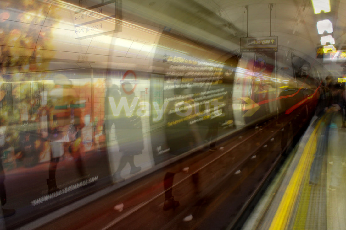
WWW: I like how all the movement is in the same direction and follows the direction that the sign points to. I also love the movement I captures as there are two long exposed pictures of tubes leaving a station. I like how each layer is clear and I like how all the layer merges in together cohesively to make it look like 1 image. I love how the picture contains a sense of everyday chaos in the city.
EBI:I think the picture could be brighter and more vibrant.
EBI:I think the picture could be brighter and more vibrant.


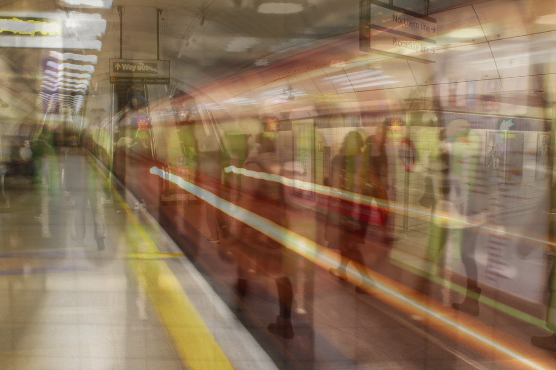
WWW: I like how all the movement in the picture is in the same direction. I also like the vibrance and brightness of the photo along with its good level of saturation because is makes the layers merge together a lot more smoothly and clearly. I also think that picture releases a good sense of everyday chaos in the city. However, I think this picture is more focused around the movement of the train as the bright red colour perfectly attracts the attention of the viewer to its movement.
EBI: I think I could've added another layer including a crowd to make the picture more hectic.
EBI: I think I could've added another layer including a crowd to make the picture more hectic.
Overall, I think this response was very successful at conveying movement through the use of long exposures and layered perspectives.
How to:
Development 8-
Alessio Trerotoli- Physical Development:
Method: I printed off the photos I took around London from my last development and put them on top of each other on a light box.This created a similar effect to the digitally layered photos I did.My aim was to capture a similier effect in movement as the photos from my last development did.

Paper Print:
WWW:I like the simplicity of the picture and how glamorous it looks, it evokes a luxurious sense. I also love how both layers show the same setting but in different perspectives because it was my main goal in this development- to experiment with perspectives. I also think that the layers look a little like a reflection from the shop window.
EBI: I think it would be a good idea to print off the pictures on acetate paper so more light can be let through the layers meaning I can use more layers at a time to make my picture more detailed and interesting.
EBI: I think it would be a good idea to print off the pictures on acetate paper so more light can be let through the layers meaning I can use more layers at a time to make my picture more detailed and interesting.
WWW: I like how the sign shows well through the paper. I also like how the ink on the paper creates a glittering effect on the sign and makes the picture look a lot more retro and vibrant.
EBI: I think it would've been better to include more layers to make the picture more hectic and capture more movement to link to the other developments I've been doing more.
EBI: I think it would've been better to include more layers to make the picture more hectic and capture more movement to link to the other developments I've been doing more.
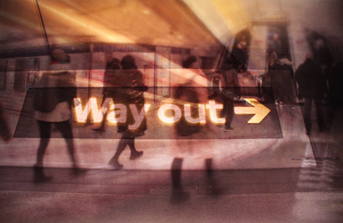
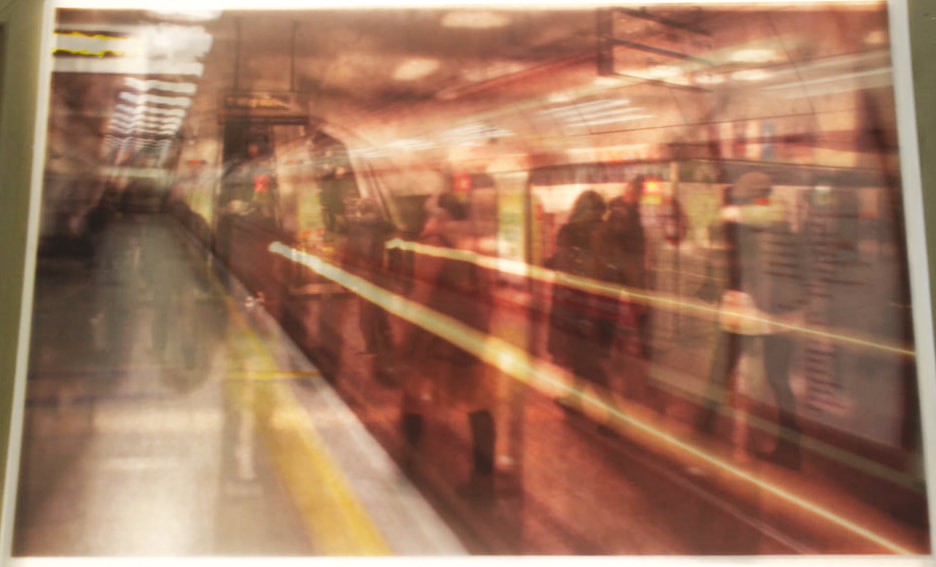
Physical Response -on acetate Paper:
Method: for this response I'm going to print my pictures off on acetate paper so I can include more layers and make my images more detailed and interesting. As well I want to include the photos from my second response in the last development to further develop my theme of capturing movement.
Acetate Print:
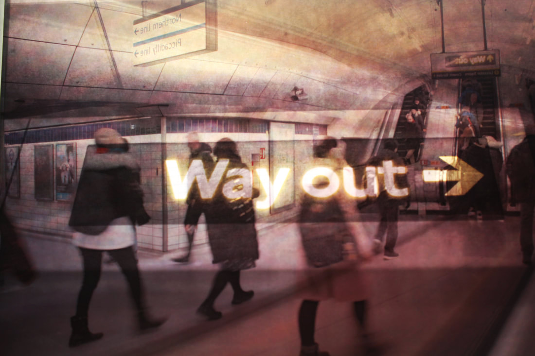
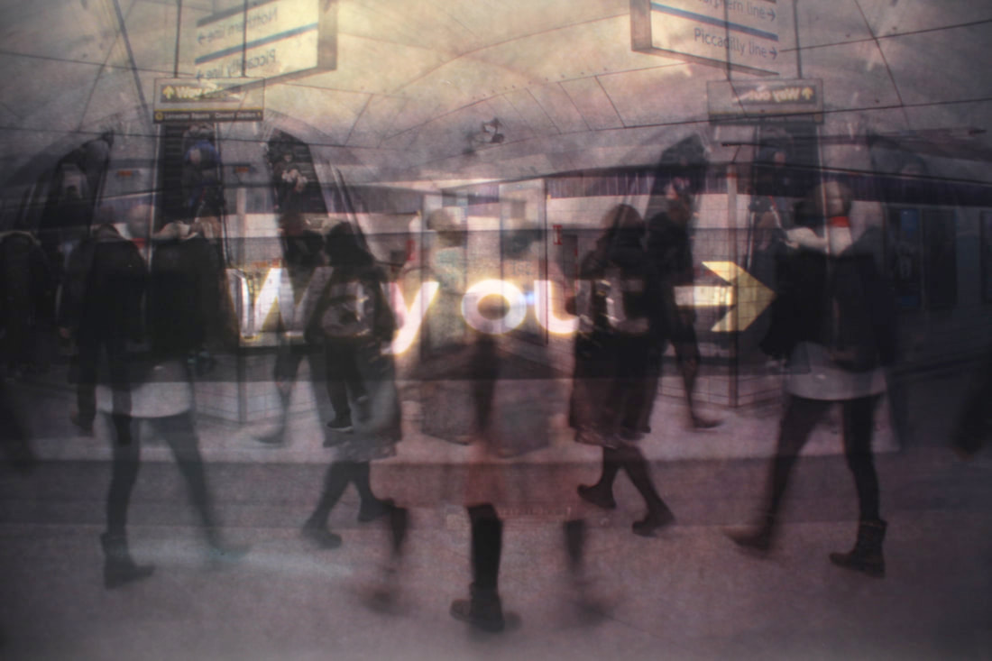
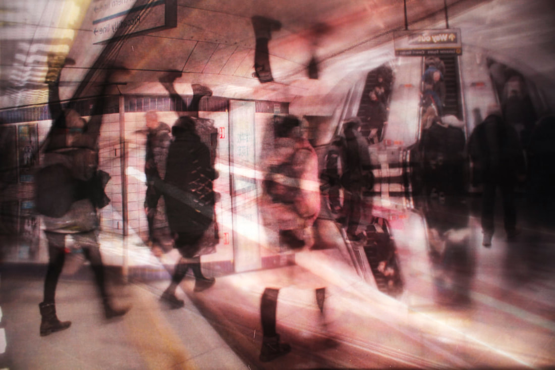
WWW: I like how the pictures contain a few distorted perspectives that release a chaotic atmosphere within the photo, as I rotated some of the acetate layers. I also like how the layers are a lot more clear when using acetate paper. I think that the pictures successfully convey movement and portray a bustling atmosphere. I'm also happy that I kept the flow of movement in a constant direction as the crowds would always travel towards the escalators.
EBI: the pictures were a little grainy and it was hard to photograph the pictures as the light from the light box would ruin the focus of the camera. I also think that I re used some layers too many times.
EBI: the pictures were a little grainy and it was hard to photograph the pictures as the light from the light box would ruin the focus of the camera. I also think that I re used some layers too many times.
WWW: I think this picture especially turned out well because the picture is clear, bright and nicely coloured. It also looks very similier to the digital version and conveys a nice flow of movement.
EBI: I took the picture at an angle to the sides of the light box are included in the photo.
EBI: I took the picture at an angle to the sides of the light box are included in the photo.
Final Development:
For my final development I wanted to merge, innovate and en-capture all my themes that have been carried through all my developments on this unit to perfectly conclude my work on fragments.
First Response:
Method: for my first response I wanted to link back to my first developments on fragment, Brutalism and Thomas Kellner's contact sheets, as well as layering my pictures. My aim was to create a new atmosphere with my photos, instead of conveying a deserted setting I want to head in the way of portraying an emotionless dystopian scene.


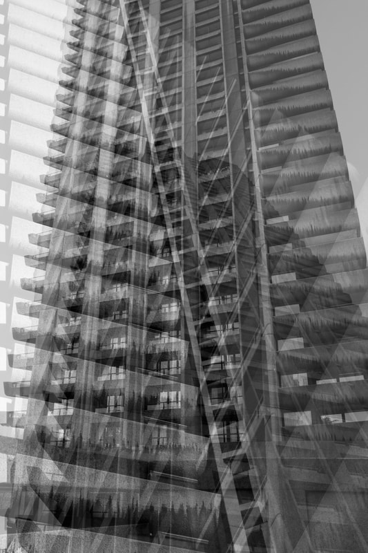
WWW: I like how the layered perspectives make the picture look like an endless scene of devoid brutalist structures, creating a draining atmosphere. I also like the different angles used in each of the layers because its gives a varied perspective.
EBI: If the layers were more contrasted and strong so the detail in the buildings would stand out more.
EBI: If the layers were more contrasted and strong so the detail in the buildings would stand out more.


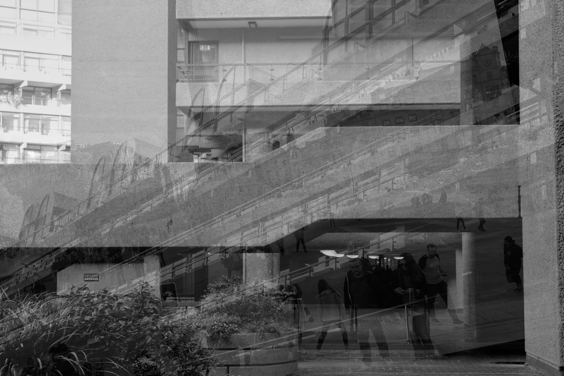
WWW: I like how I've shown multiple different scenes as it makes the picture more detailed and interesting. I also like how the horizontal and different vertical axis of the layers move the viewers eye around the picture. The images layered on mimic a reflection whilst looking imprinted into the concrete.
EBI:I think the picture is too still and it could convey more movement.
EBI:I think the picture is too still and it could convey more movement.


WWW: I also like how this scene conveys an endless world of brutalist structures. I also think the use of Kellner's contact sheet further devoids the picture of substance because it interrupts the image and separates it into split images conveying an emotionless objective perspective of concrete.
EBI: The picture is very still and doesnt show any movement or change in time.
EBI: The picture is very still and doesnt show any movement or change in time.
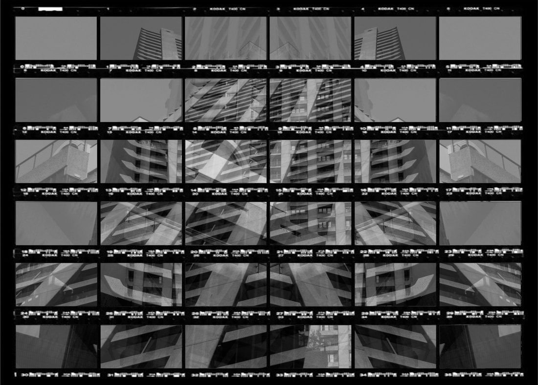
WWW: I like how this picture looks like a mosaic as the layers add more detail to the intricate patterns created by the distortions. I also like how the dark colour scheme releases a moody atmosphere. I like how the distortions make the viewer have to think about what there looking, however the picture stills hold its brutalist sense.
EBI: The picture is a little too grey and doesn't hold much depth.
EBI: The picture is a little too grey and doesn't hold much depth.
Third Response:
For this piece I wanted to focus more on crowds to capture movement but still use Kellner's contact sheet and Alessio's layering technique. My aim was to create a hectic scene.
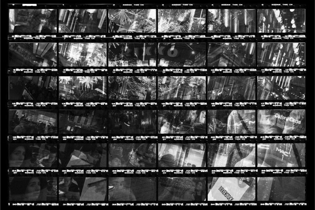
WWW: I like how busy and hectic the picture is as the are many different crowds layered onto one another. I like how each crows is defined and visible making it so the viewer can perceive lot of the movement easily. I liked the rotation of the picture because it makes the viewer create a circular motion when looking at the picture, making it seem like a never ending street of crowds and chaos.I also think that Kellner's contact sheet prevent the picture from being to chaotic.
EBI:It would have been better if I was able to capture more movement in time
EBI:It would have been better if I was able to capture more movement in time
Final Response:
For this Response I related back to my past developments on Daniel Crooks and Allesio Trerotoli, and I tried to capture movement in crowds by using Alessio's layering technique on top of Crook's digital fragmenting.


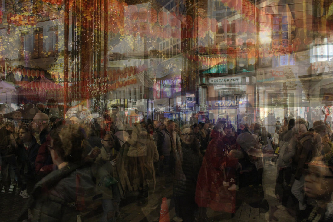
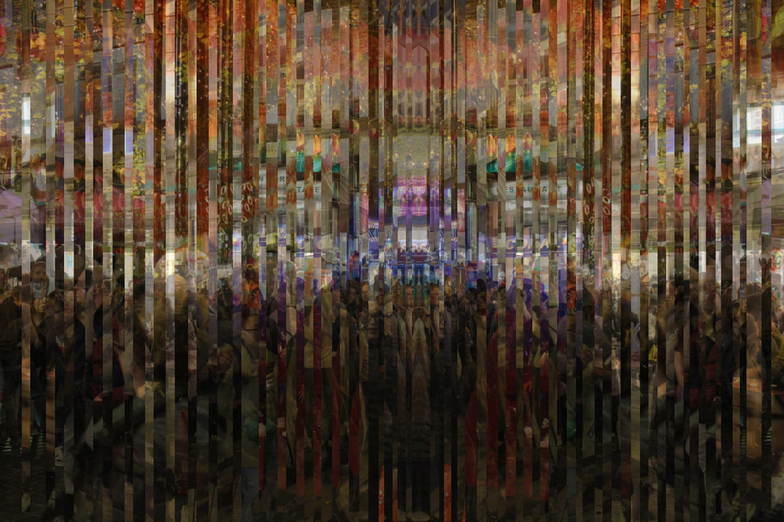
WWW: I like how vibrant the picture is and I like how it shows a lot of movement and movement in time. I also like how the background remains constant and cohesive and doesn't clash to create a messy picture. I like how neat the fragments are and I like how much detail is present in the photo. I love how the picture is layered with perspectives of the same place, taken at different times, because it shows a lot of motion without creating too much distortion. I like how the fragments create a reflected perspective of the scene because it makes the pattern of the slippages more neat and pleasing, and prevent the picture from being too hectic.
EBI: I think the crowd is a little too split up by the slippages whcih prevents a more visible movement in the picture being present.
EBI: I think the crowd is a little too split up by the slippages whcih prevents a more visible movement in the picture being present.


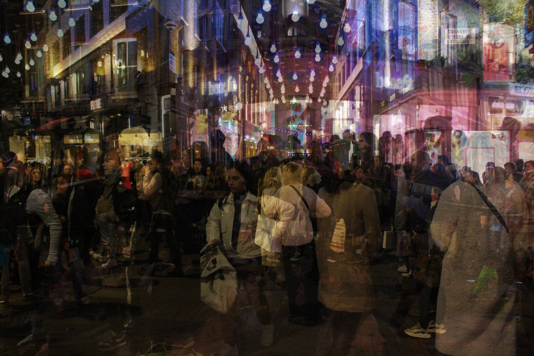
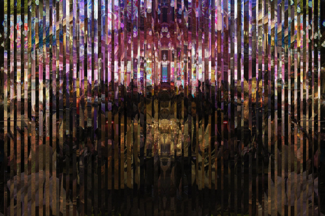
WWW: I like how colorful the picture is and I like how it conveys a lot of movement and movement in time. I also like how the background is constant and neat. I like how much detail there is in the photo. I like how the picture is layered with perspectives of the same place, taken at different times, at different angles: because it creates a lot of motion within the picture and evokes the busy atmosphere of the city. I like how the fragments create a reflected perspective of the scene because it makes the slippages more cohesive.
EBI: I think the crowd is a little too split up by the slippages which prevents a more visible movement in the picture being present.
EBI: I think the crowd is a little too split up by the slippages which prevents a more visible movement in the picture being present.
Overall, I like how I was able to convey motion and change in time by using perspectives though layering and fragmenting pictures of the same scene-taken at different angles and time.
Final Pieces:
I thought that the layered pictures from my last response conveyed my themes better than the fragmented ones, so for my final piece I decided to experiment with the layered images and explore different colour effects.
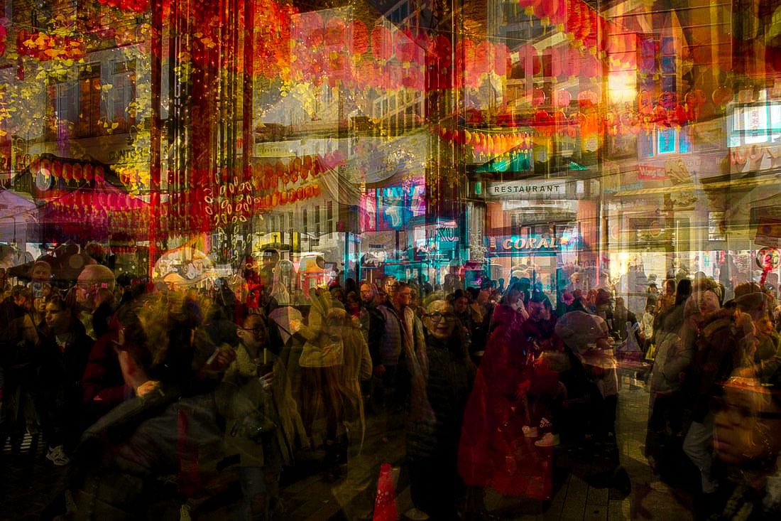
WWW: I like how the layers merge well together and make the photo look like one image. I enjoy the vibrant colours because they create a vivid atmosphere. I also think that the crowds are clear and convey motion well. The overwhelming colours help evoke a sense of chaos and release a hectic atmosphere that adds to the motion in the picture. The picture is also very neat and clear. I like how the movement present is a more social as it creates a nice intimate surrounding. The large amount of content in the picture further adds to the bustling atmosphere. I think this image perfectly conveys movement and change in time through the use of different perspectives.
EBI: The picture could be a little less grainy.
EBI: The picture could be a little less grainy.
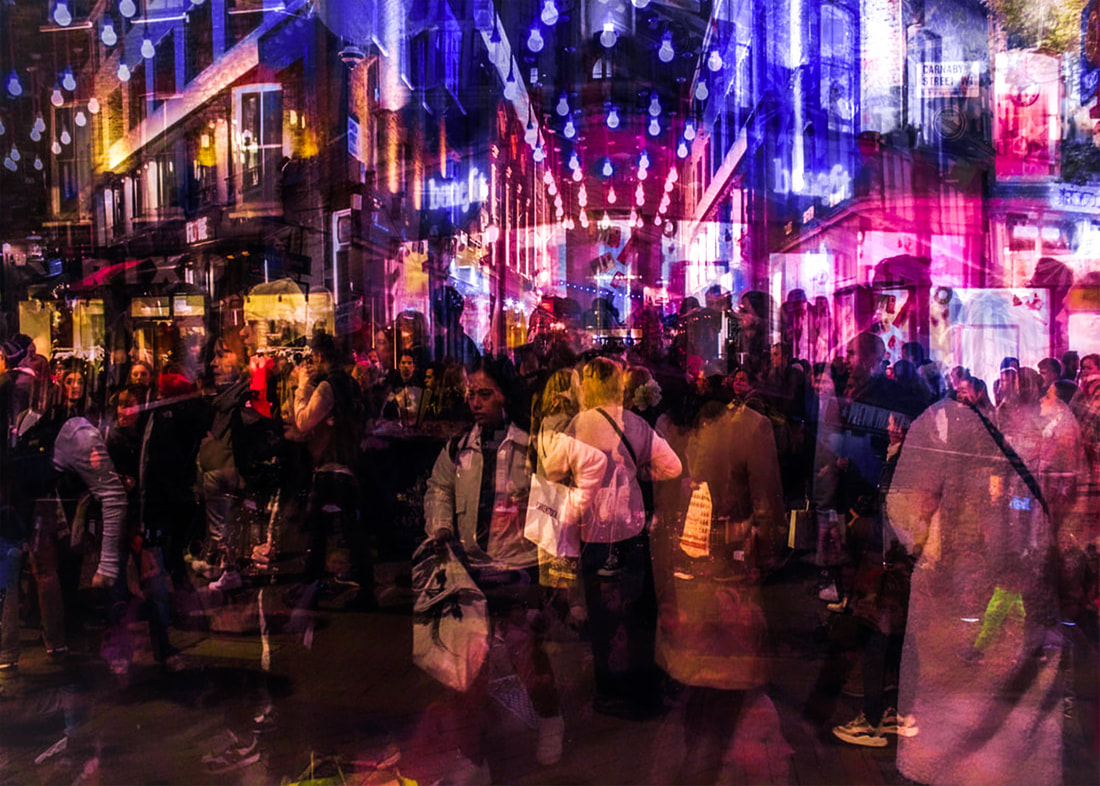
WWW: I love how vivid and colourful the picture is and how the layered crowds overlap each other to vigorously convey movement. I like how the vibrance and large amounts of colour also add to the movement in the picture. I like how the layers are clear and don't distort the image, allowing the viewer to clearly see what the image is presenting. I think the picture beautifully conveys movement and subtly shows a change in time. The neon aspect of the picture also attracts the viewer and releases an exciting atmosphere that interests the audience.
EBI:It would have been better if the picture contained a larger view of the scene so the viewer could see a larger scale of movement.
EBI:It would have been better if the picture contained a larger view of the scene so the viewer could see a larger scale of movement.
Development chart:
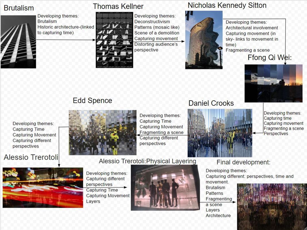
Concluding Fragments:
In Fragments I explored themes of: movement, movement of time and distorted perspectives. I tried focusing on these themes with many different techniques and that I was inspired to use by different interesting artists and photographers. Overall, this unit has been very enjoyable as I was able to expand a lot of my photography skills and experiment with lots of different techniques, environments and themes- all linking to fragments.
